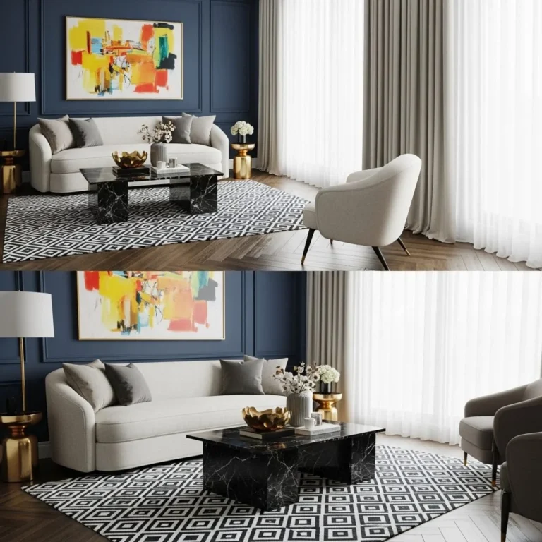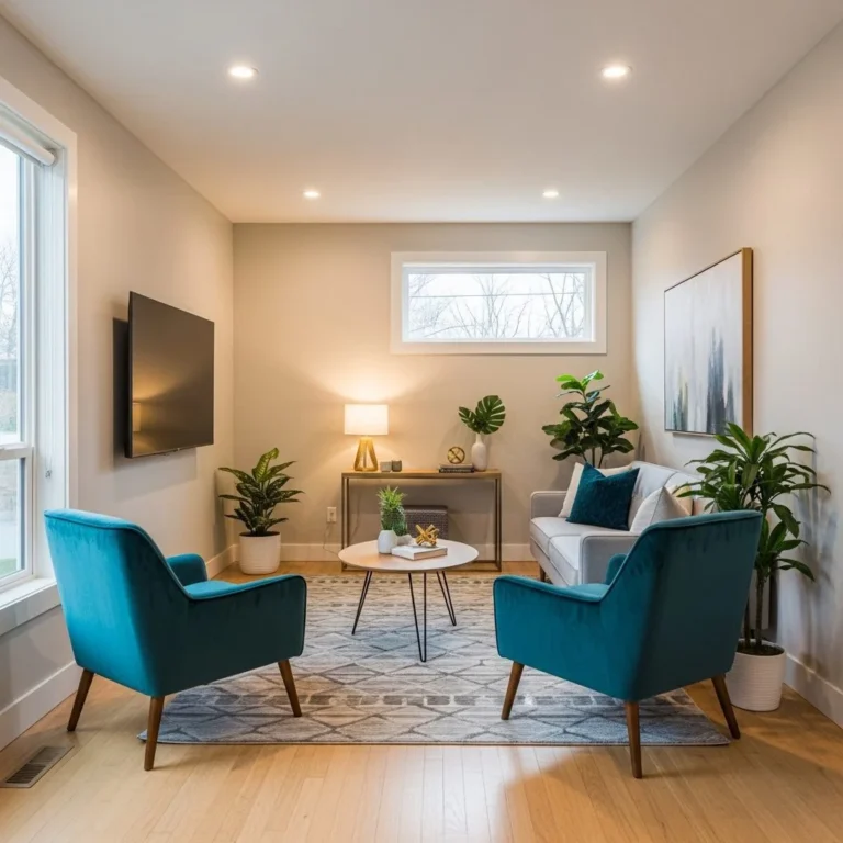
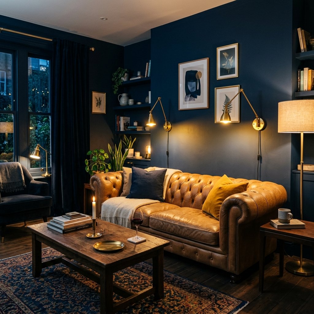
Living Room Color Combinations That Look Just as Good After Dark as They Do at Noon
Most people choose a living room color while standing in it during the day, holding a paint chip up to a sunny window. Then the sun goes down, the lamps click on, and the color they fell in love with suddenly looks flat, muddy, or oddly cold. This is one of the most common and least talked about decorating frustrations, and it has a straightforward explanation once you understand how light actually works on pigment.
This guide walks through why living room colors shift between morning and evening, how to test a shade properly before committing to it, and five color combinations that genuinely hold their character under both daylight and lamp glow. Along the way you will find practical notes on furniture, materials, and lighting choices that support each palette, plus a short list of mistakes worth avoiding before you buy a single gallon of paint.
Why Living Room Colors Change From Morning to Evening
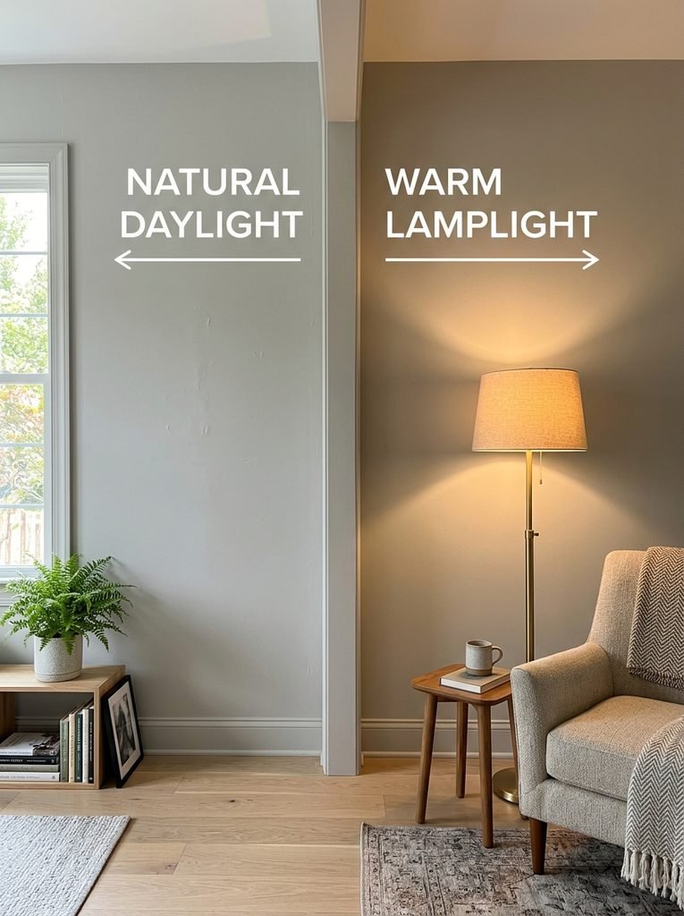
Paint color is not fixed. It is a surface that reflects whatever light hits it, so the same wall can read three or four different ways over the course of a day. Daylight is a broad, shifting mix of wavelengths that changes with the weather, the time of day, and which direction your windows face. Lamplight, by contrast, is a narrower and generally warmer light source that pushes colors toward yellow and orange.
A pale gray that looks crisp and blue-toned at noon can turn faintly purple or lavender once the sun sets and a warm bulb takes over. A soft white can start to look yellowed. Greens can slide toward olive or gray depending on the light hitting them. None of this means the color was a bad choice. It usually means nobody tested it against both light sources before painting the whole room.
Cool Light, Warm Light, and Why Undertones Matter
Every paint color, even a neutral one, carries an undertone, which is the secondary color hiding underneath the main hue. A “greige” might lean pink, green, or violet depending on the formula. Under cool daylight, a pink-leaning greige can look neutral and calm. Under a warm 2700K bulb, that same pink undertone can intensify and make the wall feel dusty rose instead of gray.
This is why two paint colors that look nearly identical on the chip can behave completely differently once they are on your walls. The undertone is the part that shifts the most as the light source changes, so it deserves more attention than the color name on the label.
How to Test a Paint Color Under Both Kinds of Light
Skipping this step is the single biggest reason living room colors disappoint their owners. A proper test takes a few days, not a few minutes, and it is worth the patience.
Paint a sample directly on the wall, or on a large piece of poster board you can move around the room, in at least two spots: one near the main window and one on an interior wall away from natural light. Look at both sections in the morning, at midday, in the late afternoon, and again after dark with your lamps on. Pay attention not just to whether you like the color, but to whether it still looks like the same color family in every condition.
It also helps to check the color next to your existing furniture, flooring, and any large rugs, since wood tones and fabric colors will pull the wall color in one direction or another. A sample that looks lovely on a blank wall can behave differently once a warm walnut console table or a cool-toned sofa is sitting in front of it.
If your living room gets very little natural light, lean toward warmer, slightly deeper tones rather than pale, cool ones. Pale cool colors depend on strong daylight to look their best, and they tend to go gray and lifeless in a dim room even before the sun sets.
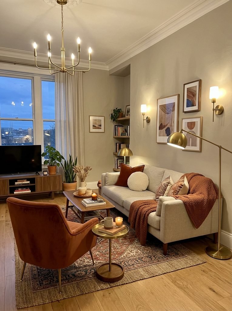
Warm Neutral and Terracotta for a Living Room That Feels Grounded All Day
A combination of warm greige walls, terracotta or brick accents, and brass or aged gold hardware is one of the more forgiving palettes for rooms that get mixed light throughout the day. The greige base stays calm under bright sun and turns gently golden once lamps take over, so it rarely feels like it is fighting the room.
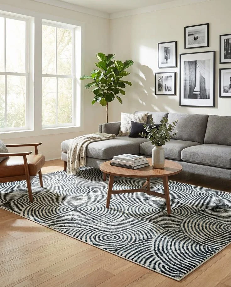
Bring in terracotta through a single upholstered chair, a set of ceramic vases, or a patterned rug rather than painting an entire accent wall in the color, since large expanses of terracotta can feel heavy in a small room. Layer in linen or boucle textures on the sofa to keep the palette from feeling too saturated, and add a walnut or oak coffee table to ground the warmth with a natural material. If you are still working out the layout itself, proper rug placement can do as much to anchor this palette as the wall color does.
This combination works particularly well in living rooms with south or west facing windows, where afternoon sun already has a golden cast that harmonizes with the palette instead of clashing with it. For north facing rooms, choose a terracotta with a slightly more orange lean rather than a dusty pink one, since cooler light can make pink-leaning terracotta look chalky.
Soft Sage or Olive Green With Walnut Wood for a Year-Round Palette
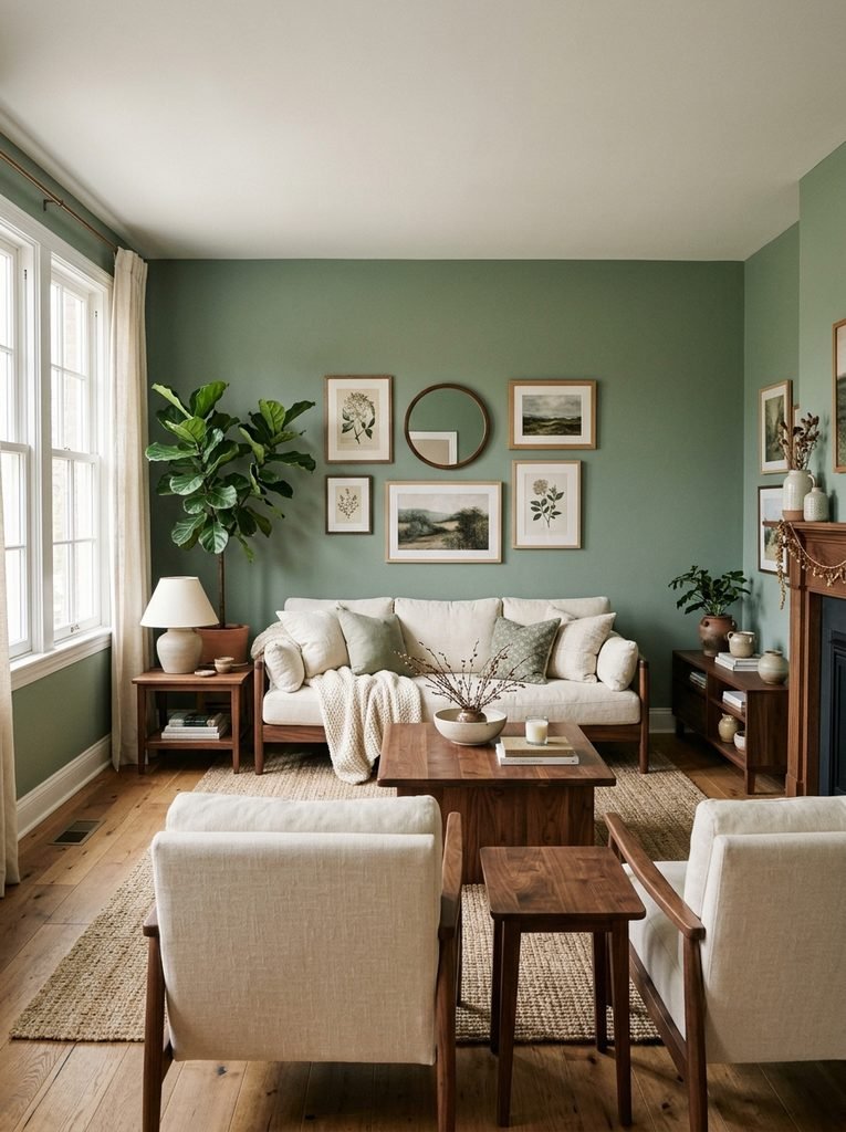
Green is one of the more forgiving colors for living rooms that need to work under changing light, mostly because it sits between warm and cool on the color wheel and can lean either direction depending on the specific shade you pick. A muted sage or deeper olive green wall, paired with medium walnut wood tones and a warm white trim, tends to hold its identity from morning through evening better than blues or true grays.
Sage green can look almost gray-green under overcast daylight and shift toward a soft, mossy warmth once lamps are on, which most people find pleasant rather than jarring. Olive, being a darker and more yellow-based green, is even more stable across light conditions and works well in rooms that do not get much direct sun.
Pair either shade with walnut furniture, cream or ivory upholstery, and woven baskets or rattan accents for texture. A brass or matte black floor lamp adds a bit of contrast without competing with the green. Avoid pairing sage or olive with cool white trim if your room leans dim, since the combination can start to look washed out once the sun goes down. A warmer off-white trim keeps the whole scheme cohesive at night.
For smaller living rooms, keep the green on a single wall or in furniture and textiles rather than covering every surface, since a fully saturated green box of a room can feel closed in once evening light takes over.
Deep Blue Walls With Warm Wood and Brass Accents
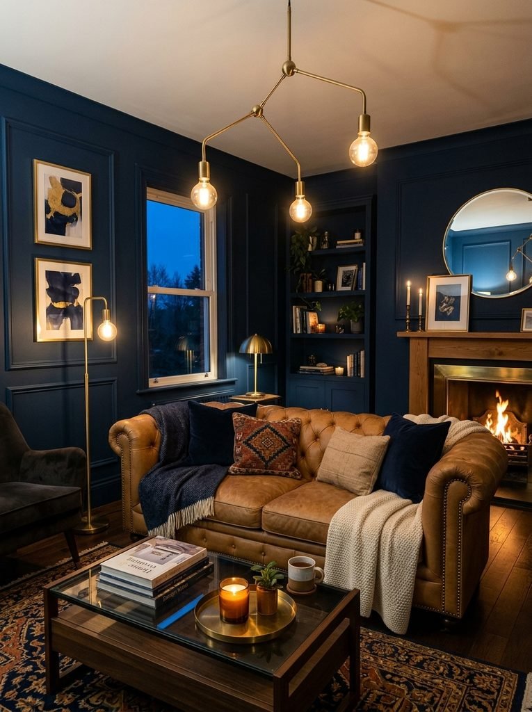
Dark, saturated colors have an advantage that pale ones do not: because they already absorb more light than they reflect, the shift between daylight and lamplight is often less dramatic in terms of undertone, even though the mood of the room changes. A deep navy or charcoal blue can look moody and sophisticated in daylight, then turn almost black and cocoon-like once lamps are the only light source, and both versions tend to feel intentional rather than off.
The key to making dark blue work well at night is making sure the room has enough layered lighting to keep it from feeling like a cave. Pair the wall color with warm wood furniture such as oak or walnut, brass or warm brushed metal fixtures, and at least two separate light sources beyond an overhead fixture, such as a floor lamp and a table lamp. Cream, ivory, or camel colored upholstery helps bounce light back into the room and keeps the space from feeling too dark once the sun sets.
Avoid pairing deep blue walls with cool white bulbs, since the combination can feel sterile and uninviting at night. A warm 2700K to 3000K bulb keeps the navy feeling rich rather than flat. This palette tends to suit living rooms used mostly in the evening, such as a media room or a formal sitting room, more than a bright, all-day family space, though it can work in either with the right lighting plan.
Clay and Warm White for Small or Low-Light Living Rooms
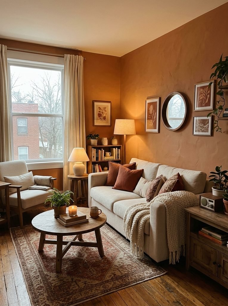
Small living rooms and those without much natural light benefit from a slightly different approach than larger, sun-filled spaces. Very pale, cool colors can look gray and uninspired in low light, while very dark colors can make an already small room feel cramped during the day. A warm clay or dusty terracotta tone, paired with a warm off-white ceiling and trim, tends to strike a useful middle ground.
Clay tones sit in a warm midrange that does not rely heavily on strong daylight to look good, which makes them a practical choice for apartments with a single window or rooms that face north. Because the color already carries warmth, it continues to look inviting once lamps take over rather than needing artificial light to compensate for a cool undertone.
Keep furniture in this kind of room relatively light in scale and color, using a cream or oatmeal sofa and light wood furniture, so the room does not feel overloaded with warm tones. Mirrors placed opposite the main window help bounce whatever daylight is available deeper into the room, and a mix of table lamps at different heights does more for a small space at night than a single bright overhead fixture.
If you are renting or hesitant to commit to a full wall of color, a clay or terracotta tone works well as an accent through curtains, an accent chair, or a gallery of framed art rather than paint, which keeps the investment low while still testing whether the tone works for your space.
Warm Black and Soft White for a Palette That Stays Sharp Without Turning Harsh
Black and white living rooms can look striking in photographs and disappointing in person, mostly because a stark, cool black paired with a bright white trim tends to feel cold and clinical under warm evening light. The fix is choosing a slightly warm, soft black, sometimes labeled as a warm charcoal or “soft black,” paired with a warm white rather than a bright, blue-based white.
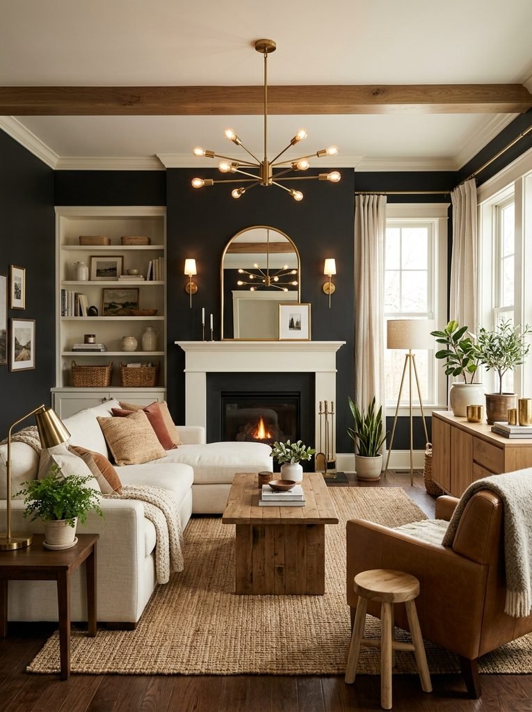
This combination photographs beautifully for Pinterest because of the contrast, but the reason it holds up in real living rooms is the warmth built into both ends of the palette. During the day, the soft black reads as a deep charcoal rather than true black, and the warm white trim keeps things from feeling sterile. At night, warm lamplight deepens the black slightly and makes the white glow rather than looking blue or gray.
Introduce texture through boucle or wool upholstery, a jute or wool rug, and natural wood tones in the coffee table or shelving to prevent the palette from feeling too graphic. Brass or aged brass fixtures add warmth that pure black hardware or chrome would not, and the kind of layered curtains and styled coffee table details covered in these living room details that read as high-end work particularly well against this kind of contrast palette. This scheme suits living rooms with good natural light during the day, since dark walls need daylight contrast to avoid feeling flat, and benefits from at least three separate light sources in the evening to keep the room from feeling closed in.
Choosing Light Bulbs That Support Your Color Palette
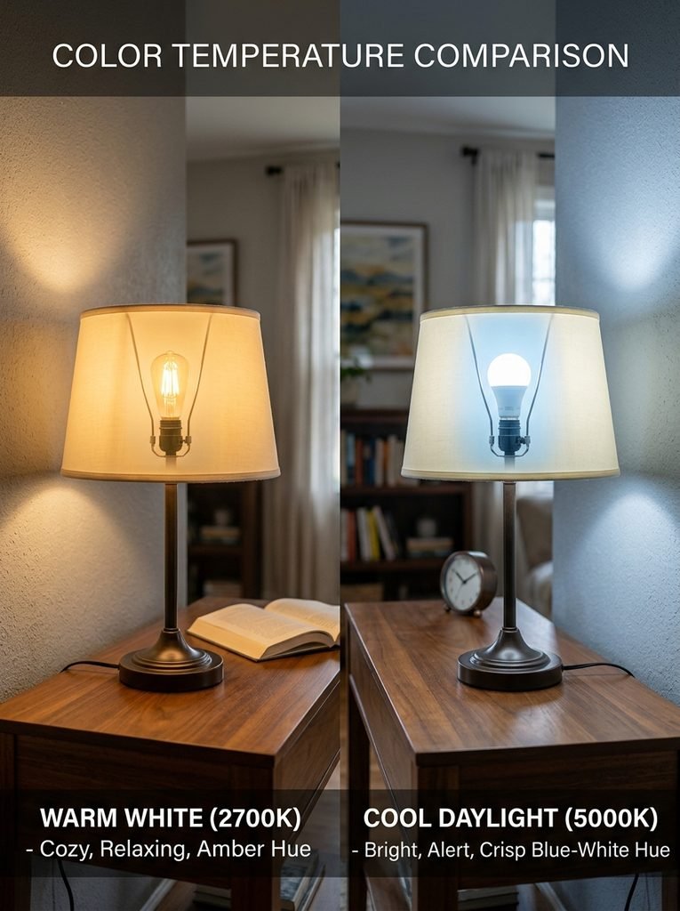
The paint color is only half of the equation. The bulbs you choose can make or break how any of these palettes look once the sun goes down. According to the U.S. Department of Energy’s ENERGY STAR program, light color is measured on the Kelvin scale, with lower numbers producing a warmer, more yellow light and higher numbers producing a whiter or bluer light, and most bulbs made to match traditional incandescent lighting fall between 2200K and 3000K.
For nearly every combination described above, a warm bulb in the 2700K to 3000K range will support the palette better than a cooler, whiter bulb, since it keeps warm undertones intact and prevents cooler colors like blue or gray-green from turning sterile at night. Reserve cooler bulbs, closer to 3500K to 4000K, for task lighting in a reading nook or a home office corner rather than the main ambient lighting in a living room.
Layering light sources matters as much as bulb temperature. A single overhead fixture creates flat, even light that can wash out a color scheme and cast unflattering shadows. Combining a floor lamp, a table lamp, and one accent light such as a picture light or a plug-in sconce gives the room depth and lets you dim or brighten different areas depending on the time of day.
Mistakes to Avoid When Choosing a Color for Both Day and Night
A few recurring mistakes account for most of the disappointment people feel after painting a living room.
- Testing a paint swatch only in a store or only during daylight, without checking it under the bulbs you actually use at home.
- Ignoring undertones and choosing a color based on its name or the way it looks in a photograph rather than in your own space.
- Relying on a single overhead light fixture, which flattens color and creates harsh shadows once natural light fades.
- Pairing a warm color palette with cool white bulbs, or a cool palette with very warm bulbs, creating a mismatch that makes the room feel slightly off without an obvious cause.
- Choosing a very pale, cool color for a room with limited natural light, then wondering why it looks gray and lifeless by late afternoon.
- Painting an entire small room in a bold, saturated color without testing how it feels once the room is fully furnished and lit at night.
Avoiding these issues mostly comes down to patience. Living with a sample for several days, in different light, costs very little compared to repainting an entire room that never quite feels right.
Budget-Friendly Ways to Test a Color Before You Commit
Not everyone wants to buy several sample pots and paint patches all over the wall. Peel-and-stick paint swatches, sold by most major paint brands, are a low-mess way to move a large color sample around the room and check it in different corners and light conditions without any painting at all.
If you are only weighing a small change, such as new lamp shades or a slipcover, testing bulb temperature is an even cheaper experiment. A pack of warm and cool bulbs from a hardware store costs relatively little and lets you swap one lamp at a time to see how the light affects your existing wall color before you decide whether the wall needs to change at all.
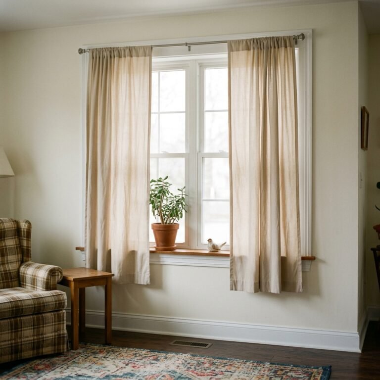
For renters or anyone hesitant to commit to paint, introducing a color through curtains, an area rug, or a set of throw pillows is a reasonable way to live with a palette for a season before deciding whether to bring it onto the walls permanently.
Bringing It All Together
The living rooms that feel right at every hour of the day usually share the same quiet logic: a wall color with a warm-leaning or well-balanced undertone, materials and wood tones that add warmth regardless of the light source, and a lighting plan with more than one bulb doing the work. None of the five combinations here require an unusual budget or a full renovation. They mostly require testing a little more carefully before committing to a whole room, and choosing bulbs that work with the palette rather than against it.
If you are still narrowing down a direction, start with a sample of your top choice in the spot where you spend the most evening time, since that is where a mismatch between paint and lamplight will bother you the most.