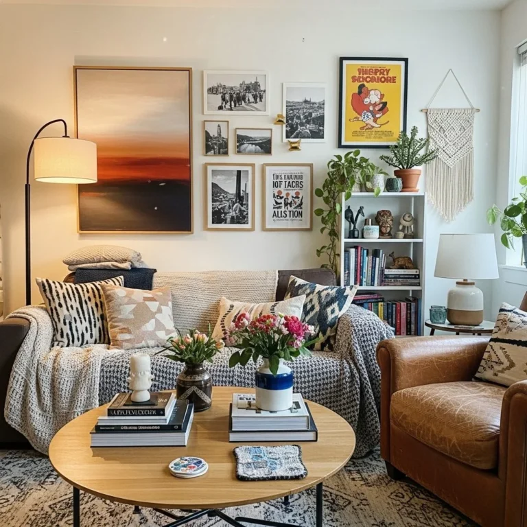
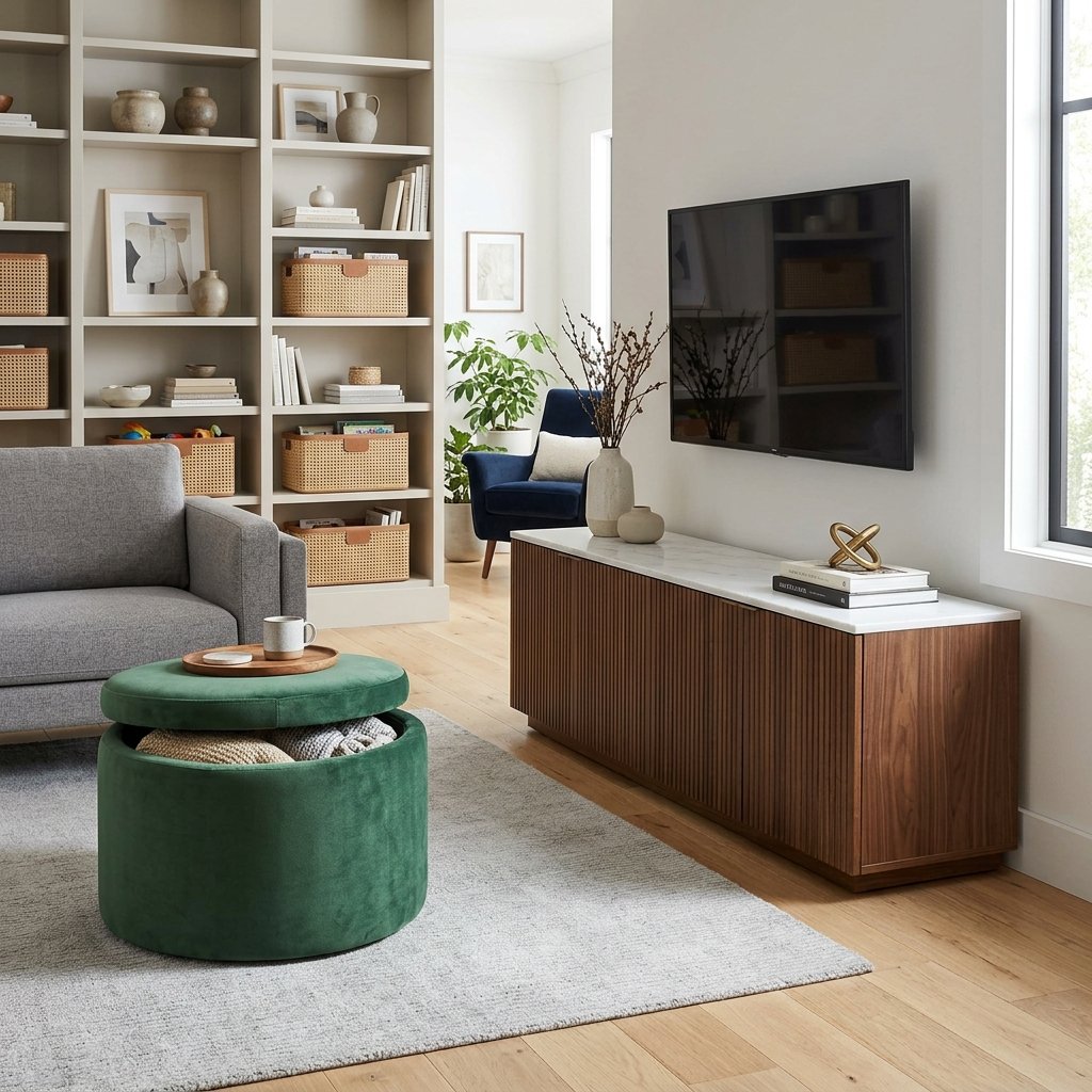
Living Room Storage Furniture That Looks Like Decor, Not Storage
The most successful living room storage rarely announces what it’s doing.
A beautiful sideboard reads as a piece of furniture first. A well-designed media cabinet feels like part of the room rather than a place to hide cables and electronics. A storage ottoman can pass for an upholstered accent piece. Even a cabinet full of everyday belongings can add something to the room once its proportions, materials, and styling have actually been considered.
That distinction matters because living room storage tends to occupy some of the most visible real estate in the house. The television wall, the space behind the sofa, the area under a window, the wall opposite the seating all of it carries decorative weight whether you plan for it or not.
We’ve covered floating storage, built-ins, bookshelves, and multifunctional furniture elsewhere on the site, along with smaller-room storage strategies in our small-space design guide and small-space organization ideas. This piece takes a slightly different angle: how storage furniture becomes part of the decorative composition itself, rather than something you’re simply trying to hide.
Done well, the result is a living room where useful furniture actually contributes to the design instead of interrupting it.
Choose Storage by Its Shape Before Its Capacity
Storage shopping usually opens with a practical question: how much can it hold?
That matters, but it shouldn’t be the first thing you ask. Start with the silhouette instead.
A cabinet with good proportions can function almost like a large decorative object in its own right. Fluted doors, curved corners, tapered legs, inset panels, natural wood grain, or a well-proportioned frame can give an ordinary storage piece real architectural presence.
Picture two cabinets with identical interior capacity. One’s a tall box with exposed hinges and chunky hardware. The other has slim legs, quiet doors, and a warm walnut finish. The second one will almost always contribute more to the room visually, even though both do the exact same job on the inside.
This matters more in a living room than almost anywhere else in the house, because storage there usually sits directly in the main sightline. Before buying, it’s worth asking:
- Does the shape relate to the sofa and coffee table?
- Does the height suit the wall?
- Are the doors visually interesting without trying too hard?
- Does the base make the piece feel heavy or light?
- Would it still look good if it were completely empty?
That last question does a lot of work. If the answer is genuinely yes, you’re looking at furniture not just an organizational product with a price tag attached.
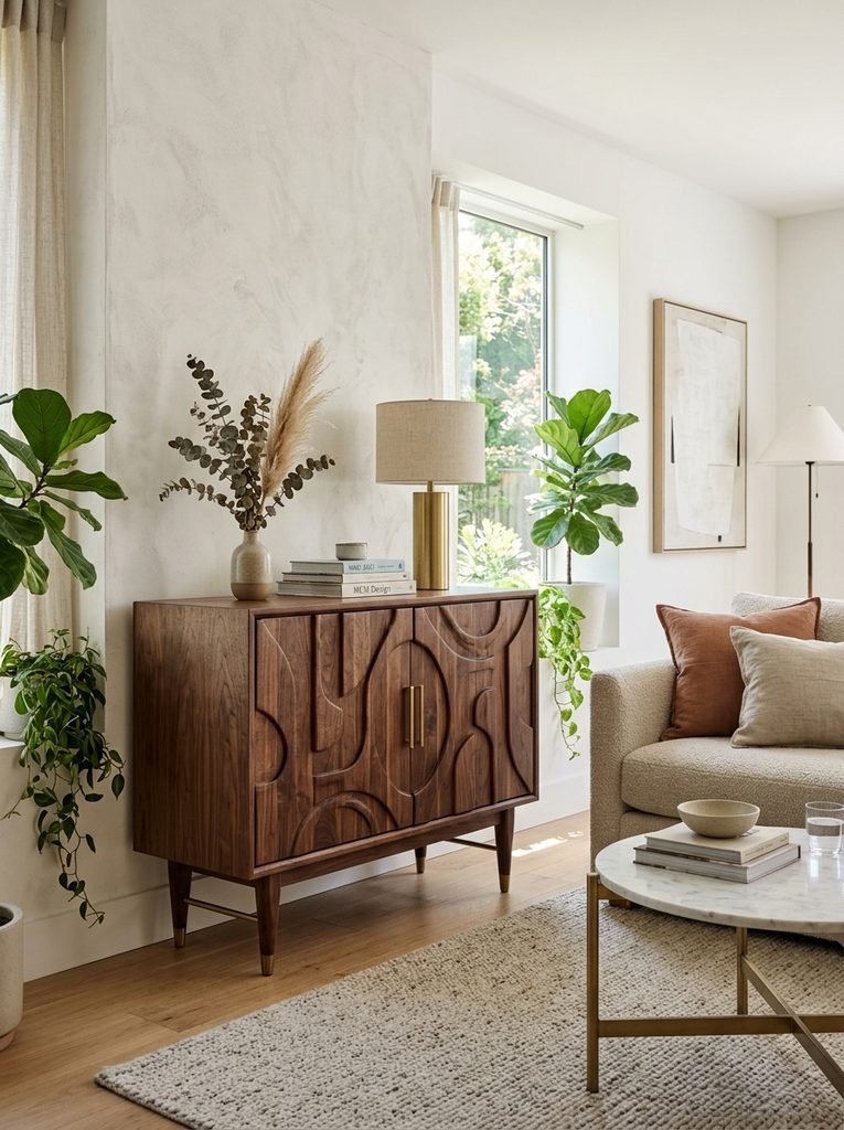
Let a Sideboard Carry the Decorative Weight
A sideboard is one of the easiest pieces to make look intentional, mostly because its proportions already resemble a console or credenza it doesn’t need much help.
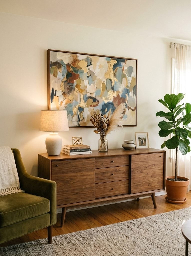
Instead of treating it as somewhere to put things away, build a small composition around it. A long sideboard beneath a large painting can anchor an entire wall on its own the art brings vertical interest, the cabinet gives you a strong horizontal line underneath, and together they don’t need a dozen small decorations to feel finished.
Keep the surface itself fairly restrained. A ceramic lamp on one side, a low bowl or sculptural object on the other, one smaller piece between them that’s usually plenty, especially if the artwork above is already doing a lot of visual talking.
Material matters here too. Walnut sits well with cream, beige, charcoal, or olive tones. Pale oak keeps a room lighter. Painted cabinetry can recede into the wall, while darker wood grounds the space more firmly.
A raised base helps in a compact room specifically, since visible floor beneath the cabinet keeps the whole piece from reading as one solid block sitting on the ground.
Make the TV Cabinet Look Like a Credenza
The television wall is often the hardest part of a living room to get right, because it’s asking furniture and technology to share the same real estate.
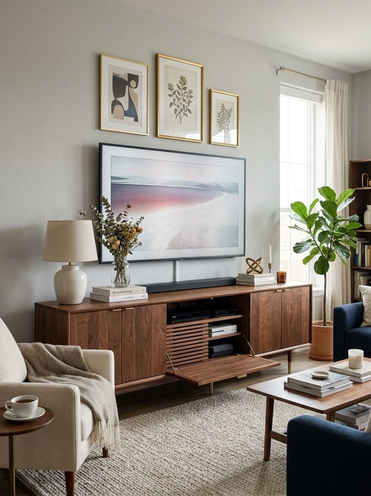
A conventional entertainment unit tends to make the room feel run by the equipment in it. A low, furniture-style cabinet changes that relationship completely look for a long horizontal piece with closed storage, restrained hardware, and a finish that actually relates to the rest of the room. Walnut, oak, painted wood, and matte finishes all work; which one depends on what’s already in the room.
Done right, the television becomes one element in a larger composition instead of the whole point of the wall.
Keep electronics behind closed doors where the ventilation allows it, but don’t block airflow just for the sake of appearance. Plan cable routing before the cabinet goes in, too a beautifully chosen console still looks unfinished if power cords and HDMI cables are visibly spilling across the floor. Interior designers quoted in a recent cable-management roundup from Ideal Home make the same point: a media console with built-in cable routing does more for the room than almost any styling trick you could add on top of it.
In smaller rooms, a wall-mounted cabinet keeps more floor visible, which is worth considering if the room is already tight. Either way, the real shift here is choosing the cabinet the way you’d choose a sideboard not by hunting specifically for something labeled “entertainment center.”
Use a Storage Cabinet to Create a Visual Pause
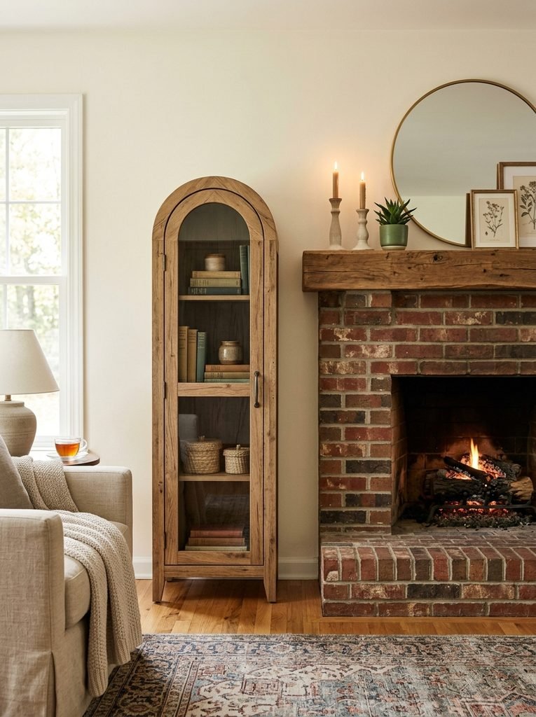
Storage doesn’t have to fill an entire wall to earn its place. A single, well-chosen cabinet can act as a pause between larger pieces of furniture beside a fireplace, between two windows, at the end of a sofa, or wherever the room transitions into the dining area.
This works especially well when the cabinet has a distinctive finish or shape. A narrow arched cabinet can soften a room otherwise dominated by straight lines. A dark wood piece adds contrast in a pale interior. A painted cabinet in muted green, clay, or blue introduces color without needing a whole accent wall behind it.
Inside, it can hold whatever doesn’t need to be looked at every day. The decorative job happens entirely on the outside think of the piece as a small architectural punctuation mark rather than one more place to store things.
Turn the Space Under a Window Into Furniture
Low windows tend to complicate storage planning a tall cabinet can block light or crowd the window opening, but leaving the whole area empty wastes usable space too.
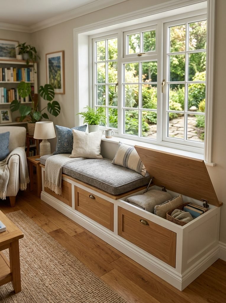
A storage bench splits the difference. With drawers or a lift-up compartment beneath a tailored cushion, it can hold blankets, board games, or seasonal cushions while doubling as extra seating.
The trick is designing it as furniture first. A thick cushion, well-chosen upholstery, a wood base, and a small side table can turn the whole thing into a reading nook add a floor lamp and a couple of pillows, and the storage function becomes almost beside the point.
Let the architecture guide the shape. A built-in bench can run the length of a window wall, while a freestanding piece makes more sense in a rental or anywhere flexibility matters more than a perfect fit.
Use Tall Cabinets as Vertical Design Elements
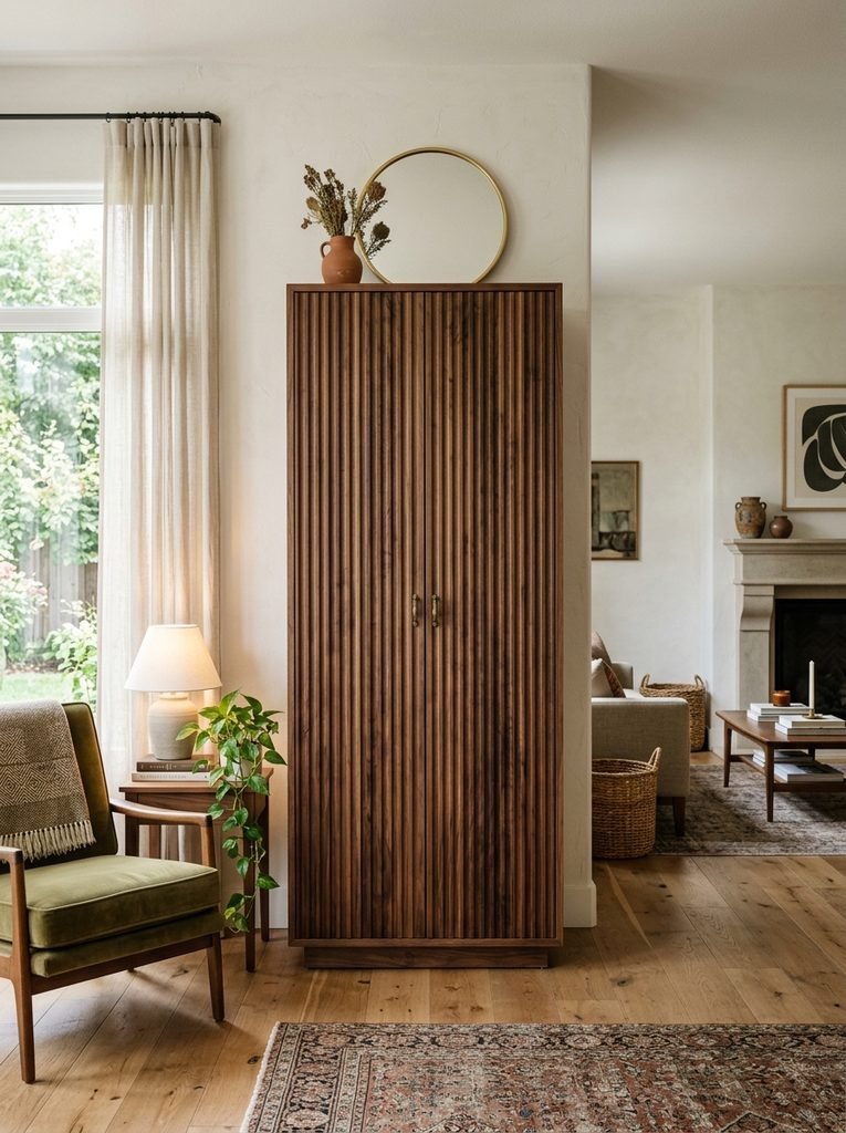
Low furniture isn’t the only route to decorative storage — a tall cabinet can bring genuine vertical rhythm into a room, particularly one with higher ceilings.
The trick is making it feel connected to the architecture rather than just tall. A pair of matching cabinets can frame a fireplace or media wall. A single narrow one can fill an otherwise awkward vertical gap beside a doorway.
Look for finishes with enough character to stand on their own — fluted walnut, painted panels, woven fronts, ribbed glass, or a subtly textured laminate can all read closer to millwork than to ordinary storage.
Give it room to breathe. A tall cabinet surrounded by other objects tends to disappear into the clutter rather than register as a shape. And instead of matching furniture across the whole wall, try pairing one tall piece with a low sideboard — the mismatch in height usually reads as more collected, not less coherent.
Combine Closed Storage With a Small Amount of Display
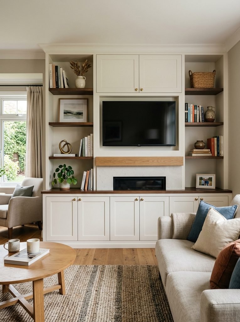
A wall of entirely open shelving gets hard to maintain over time. A wall of entirely closed cabinets can start to feel heavy. Combining the two gives you a more flexible composition than either extreme.
Reserve closed storage for whatever creates visual noise remotes, paperwork, household supplies, electronics, miscellaneous items behind doors. Save the open shelves for things that actually deserve to be seen: books, ceramics, a piece of framed artwork, maybe a plant or a small collection of objects.
Don’t pack the shelves. Leaving them a little sparse is part of what makes the arrangement feel curated instead of crammed.
A useful trick is repeating materials between the two. If the cabinet is oak, bring a few warm wood objects up onto the shelves. If it’s painted, echo that color in the ceramics and book spines nearby the storage wall then reads as part of the room’s material palette rather than a separate zone bolted onto it.
Let an Ottoman Hide Storage in Plain Sight
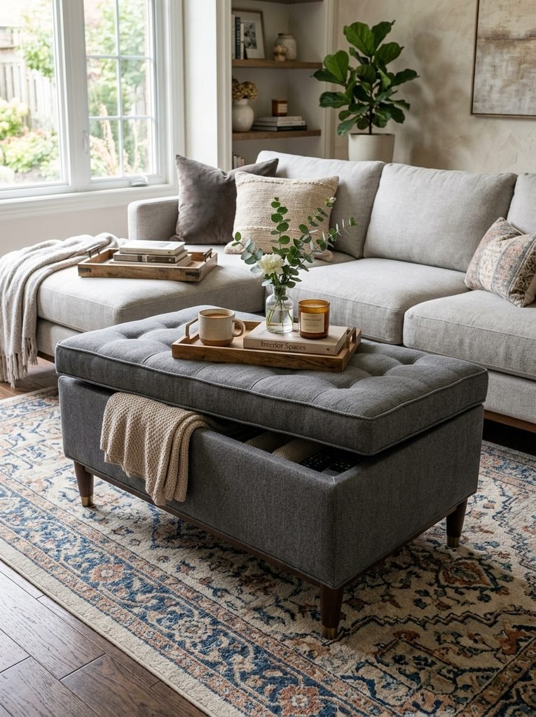
Some of the best storage furniture doesn’t look like storage furniture at all. A tailored ottoman gives you hidden space while doing triple duty as a footrest, extra seating, or a coffee table.
Look for a rectangular upholstered design with real structure to it, rather than an obviously bulky storage box. Linen, boucle, velvet, leather, or textured cotton all tie it back to the sofa and other soft furnishings in the room.
A shallow tray on top gives you a stable surface for books, a small vase, or a cup, while the compartment underneath handles blankets, games, kids’ items, or spare cushions.
This kind of piece earns its keep especially when a room needs to flex move it out of the way for a gathering, use it as extra seating when people show up, or clear the center of the room entirely when you need to.
Put Storage Behind the Sofa
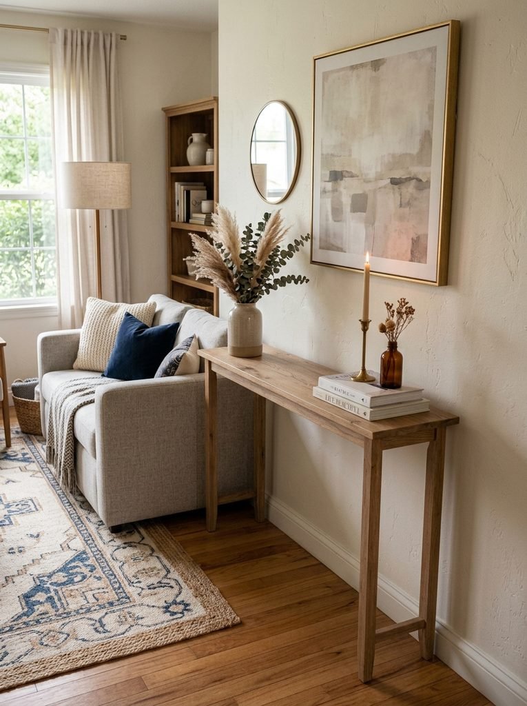
The back of a sofa is an overlooked spot for storage, especially in open-plan homes. A narrow console there gives you drawers, lamps, books, and everyday small items without claiming another wall.
It can also help define the room. In an open-plan apartment, a console behind the sofa visually separates the living area from a dining space or a walking path just make sure it’s narrow enough that movement around the sofa stays comfortable.
Height matters more than you’d expect. Too tall, and it looks awkward against the sofa back; sitting closer to the sofa’s own upper line, it tends to feel far more integrated.
For styling, two matching lamps create a clean symmetrical look, or go with one lamp plus a plant or small sculpture for something more relaxed. The drawers underneath can absorb the small objects that would otherwise migrate onto the coffee table a good example of storage genuinely improving a room without becoming a new focal point in it.
Pick Materials That Belong in the Room
A cabinet can have the right shape and still feel out of place if its material fights with everything around it.
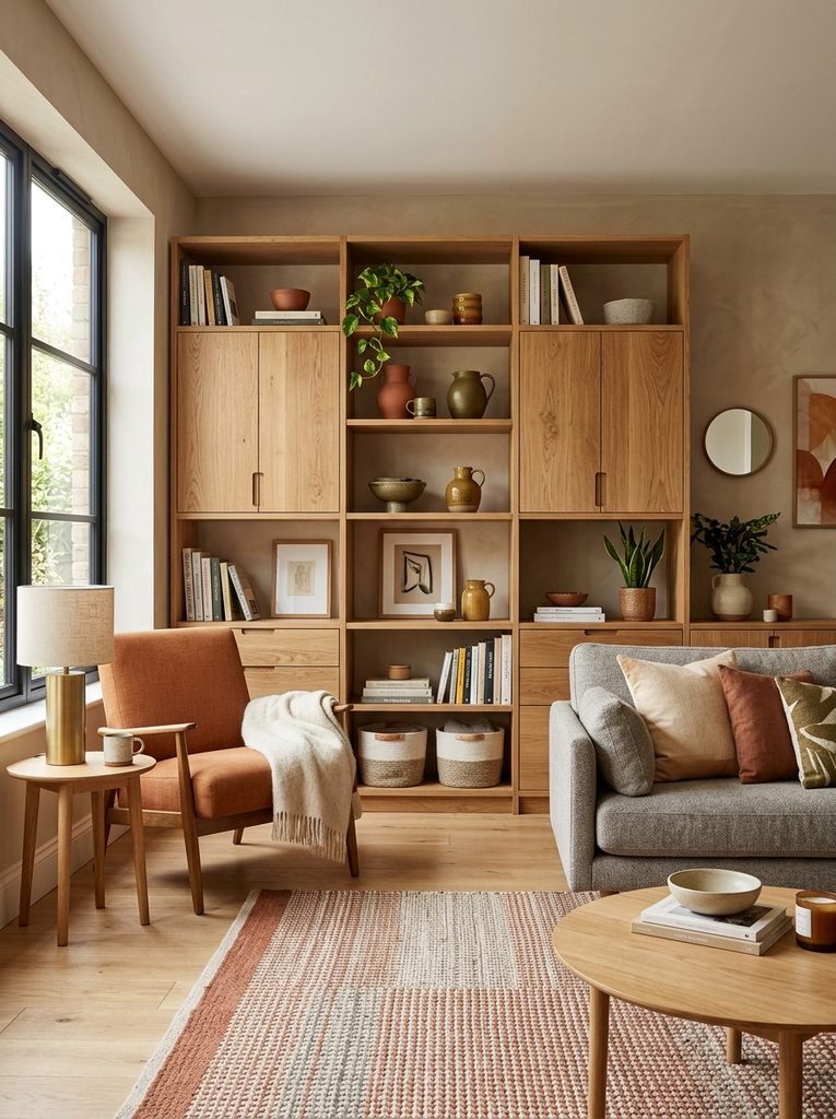
Start from the room’s existing palette. Warm ivory sofa, honey oak floor? A medium walnut cabinet adds welcome depth. Cool stone and black window frames instead? A darker cabinet with matte hardware will usually connect more naturally than anything lighter.
Texture is the other lever worth pulling. Fluted timber adds vertical rhythm. Woven panels soften a hard-edged cabinet. Ribbed glass adds transparency without exposing everything inside it. Matte painted fronts blend into the architecture rather than standing apart from it.
Try not to combine every finish available. Five wood tones, several metals, glossy cabinetry, patterned upholstery, and multiple stones in one room will lose their hierarchy fast. Instead, repeat a few materials across different objects the same walnut in the storage cabinet, the picture frames, and a side table; brass appearing only in the cabinet hardware and one lamp. That repetition does more for cohesion than a matching furniture set ever would.
Match Storage to the Architecture, Not Every Other Piece
Every storage unit in the living room doesn’t need to come from the same collection in fact, matching everything can leave a room feeling more like a showroom floor than an actual home.
Instead, look for relationships with the architecture itself. A low cabinet can echo the horizontal line of a fireplace. A tall piece can pick up the height of a nearby doorway. A painted cabinet can disappear straight into the wall color. A walnut sideboard can relate directly to exposed timber flooring underfoot.
This gives storage furniture an actual reason to be exactly where it is and it works just as well in a rental, where you can’t touch the architecture but can still choose furniture that responds to it. A narrow cabinet fills an awkward recess. A freestanding shelving unit visually frames a television. A low console gives a long wall presence without needing anything built in. Our rental-friendly apartment decor guide goes deeper into this kind of flexible, take-it-with-you approach.
Give Small Cabinets a Specific Decorative Role
A small cabinet shouldn’t just occupy an empty corner because the corner happened to be empty give it an actual job.
A narrow cabinet beside a reading chair can hold books and a blanket. A small chest near the entrance can catch living room essentials. A compact cabinet beneath artwork can act as a miniature sideboard.
This is also a good place to bring in a material or color that would feel like too much across a bigger piece a muted blue cabinet adds character without needing blue upholstery elsewhere in the room, and a vintage wood chest can warm up an otherwise very contemporary space.
Because these pieces are smaller, they’re also easier to swap out or move as the room evolves. The whole thing comes down to intentional placement: a cabinet that fills a real functional gap and adds something visually reads as part of the plan; one added just because a corner was bare tends to read as an afterthought, and usually does.
Keep the Decorative Surface Edited
Even genuinely attractive storage furniture can end up looking messy once its top becomes a landing spot for everything that comes through the door.
Keys, mail, remotes, chargers, packaging, cups it accumulates fast on any horizontal surface. A simple rule helps: the surface is for display, not overflow.
A tray can corral small items, but it shouldn’t turn into a permanent pile of unrelated things. For a sideboard, three loose zones tend to work:
- One taller object, like a lamp or a vase
- One low horizontal element, like a stack of books or a tray
- One small sculptural object or a plant
Leave some empty space between them the same principle applies to open shelves too. Empty space isn’t a gap to fill; it’s part of what makes the composition read as considered rather than crowded.
Storage Ideas for Different Living Room Styles
Whatever furniture you choose should speak the same design language as the rest of the room.
Warm Modern
Walnut or oak, softly rounded forms, linen upholstery, matte ceramics, minimal hardware.
Contemporary Minimalist
Flat-front cabinets, concealed handles, pale wood, muted finishes, fewer visible accessories overall.
Traditional
Painted cabinetry, framed doors, brass hardware, a substantial sideboard, maybe a vintage chest.
Organic Contemporary
Natural oak, woven fronts, stone surfaces, rounded edges, handmade-looking ceramics.
Eclectic
Vintage cabinets mixed with contemporary storage and collected objects — repeat one or two colors throughout to keep the mix feeling cohesive rather than random.
The goal was never to make storage invisible. It’s to make it feel like it genuinely belongs in that specific room.
Mistakes That Make Storage Look Like Storage
A few habits can quietly undo an otherwise well-designed living room.
Buying for capacity alone. A huge cabinet might solve an organizational problem while creating a visual one. Measure the wall, the pathways, doors, windows, and surrounding furniture before you shop, not after.
Filling every available surface. More storage doesn’t necessarily mean better organization leaving some open visual space is part of the point.
Mixing too many finishes. Several unrelated wood tones, metals, and cabinet colors read as pieced together rather than curated.
Ignoring hardware. Handles are small, but they sit right at eye level. A sideboard buying guide from Swyft puts standard depth at roughly 35–45cm for exactly this reason get the proportions and the small details wrong together, and a piece that looked great in the showroom can feel bulky the moment it’s actually against your wall.
Leaving electronics exposed. Routers, controllers, cables, and chargers make a beautiful cabinet look purely functional in about two seconds.
Choosing the wrong height. Too short, and it looks disconnected from the wall. Too tall, and it overwhelms a smaller room.
Treating open shelving as a warehouse. It works best with a genuine mix of useful and decorative objects, with enough negative space to let both breathe.
How to Make Storage Look Collected Rather Than Matched
A room doesn’t need a matching storage set to feel coherent. Try combining three different types of furniture instead:
One substantial piece: a sideboard, media cabinet, or built-in.
One vertical element: a tall cabinet or open shelving.
One flexible piece: an ottoman, bench, or narrow console.
Keep the materials related rather than identical. A walnut sideboard, oak shelving, and a camel linen ottoman work together because the palette is warm and the textures vary, even though nothing actually matches. Add cream upholstery, a few black accents, and a restrained selection of ceramics, and the room gains real depth without turning complicated.
This approach also suits furnishing gradually you can buy pieces over time without ever needing a perfectly matched set to begin with.
The Storage Should Support the Room’s Story
Beautiful storage isn’t really about hiding every possession it’s about deciding what deserves to stay visible.
Books can be displayed. Art can be displayed. A favorite ceramic or a plant can be displayed. Cables, spare cushions, paperwork, games, chargers, and the rest of household clutter usually need a different kind of home.
Once that distinction is clear, storage furniture becomes part of the room’s visual identity rather than something added on top of it. A long sideboard anchors artwork. A media cabinet reinforces a horizontal line. A tall cabinet brings vertical rhythm. A storage bench creates a reading corner. An ottoman adds texture and flexibility. The furniture handles the practical work quietly, while the room keeps looking designed.
Final Thoughts
The best living room storage isn’t necessarily the piece that hides the most.
It’s the piece that solves a real storage need while still contributing something worth looking at. Look for strong silhouettes, the right scale, interesting materials, sensible proportions, and finishes that actually relate to the architecture already in the room then decide, deliberately, what gets concealed and what deserves to be seen.
A storage cabinet doesn’t have to disappear. It can be the sideboard under your favorite artwork, the walnut credenza beneath the television, the window bench that doubles as a reading seat, or the well-upholstered ottoman that keeps blankets within reach.
Once storage is chosen as part of the decorating plan rather than added on afterward, the room stops feeling like it has storage in it and starts feeling like the storage was always meant to be there.