Walk down a holiday aisle and you will notice how the products are packaged. Ornaments come in boxes of twenty-four, all one size, all one finish, all one shade. Buy three of those boxes and you own seventy-two ornaments that behave like a single object. That is how most store-bought trees end up looking: lots of color, very little structure.
A professionally styled tree works differently. The palette is small, but the pieces within it vary in size, sheen, and texture. The colors also have a reason to be there, usually because they echo something already in the room. This guide breaks down that approach and gives you six complete color schemes, each with specific ornament types, ribbon choices, and a lighting recommendation, so you can copy the logic rather than guess.
What Separates a Designer Tree From a Boxed-Set Tree
Four decisions do most of the work, and none of them requires a large budget.
Palette size. Designer trees usually run on three to four colors, counting the tree itself. A fifth color tends to appear only as a tiny accent, if at all.
Finish variety. Within one color, a stylist mixes matte, glossy, metallic, and textured pieces. Seventy-two glossy red balls look flat. Twenty glossy, twenty matte, and a handful of velvet or wooden pieces look expensive.
Scale variety. Boxed sets are uniform in size. A styled tree includes a few oversized ornaments, a majority of mid-size ones, and small fillers that fill gaps.
A connection to the room. The tree sits in a space with a sofa, rug, curtains, and wall color. Designers pull one or two tones from that room into the tree so it looks planned.
Keep these four in mind as you read through the palettes. You will see them repeated in each one.
A Simple Ratio for Building Any Palette
Before the specific schemes, here is a working framework you can apply to your own colors. Think of the tree in three roles.
- Base (about 60 percent of the visual weight): the tree itself plus the most common ornament color. On a green tree, green is already doing a lot of this job.
- Support (about 30 percent): a second color that sits beside the base and gives it depth.
- Spark (about 10 percent): a small, deliberate accent such as brass, a deep jewel tone, or a single unexpected texture.
These numbers are a guideline, not a rule. The point is that one color leads, one supports, and one punctuates. When every color gets equal airtime, the eye has nowhere to rest.
Cream, Camel, and Walnut: The Warm Neutral Tree
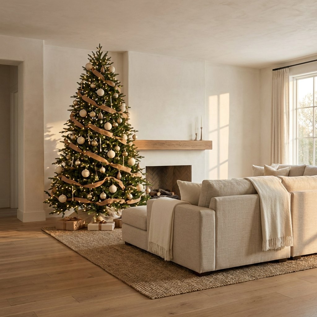
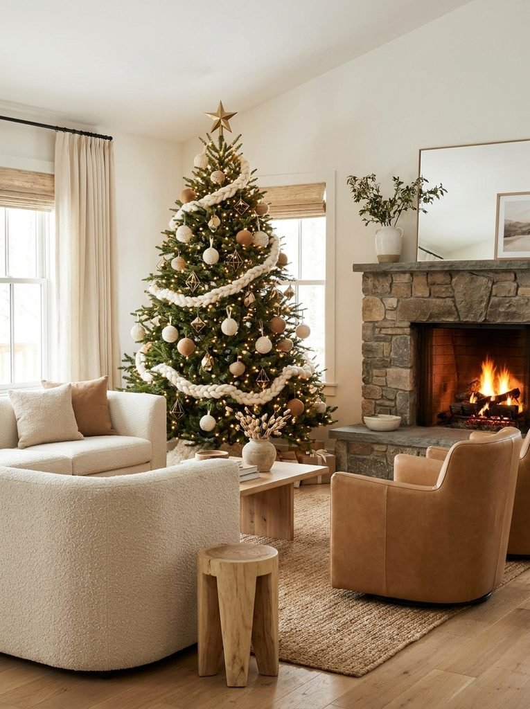
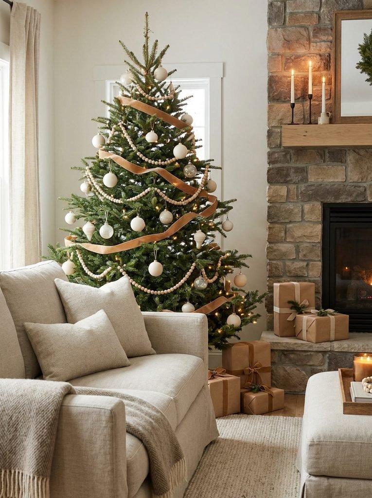
This is the scheme that most often reads as quietly expensive, partly because it avoids obvious holiday colors. The green of the tree acts as the base, cream and ivory provide the support, and camel or caramel tones supply the spark.
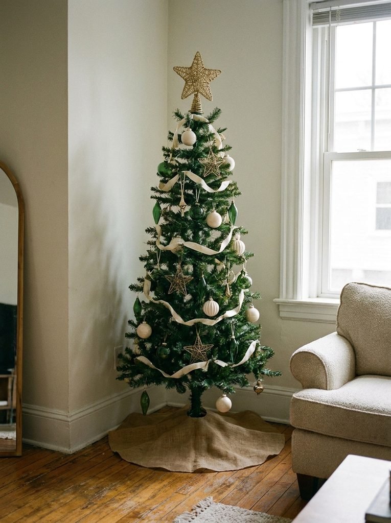
Look for ornaments in matte ivory, ribbed cream glass, and unglazed ceramic. Add wooden beads or carved wood pieces in a walnut finish, then a few leather or suede tags in camel. A wide cream ribbon with a soft, woven texture ties it together better than shiny satin.
This palette suits rooms with oatmeal sofas, jute rugs, and wood furniture. If your living room already leans warm and earthy, the tree will look like part of the room rather than an addition to it. For help refining those underlying tones, the guide to living room color combinations that hold up after dark is a useful companion.
One caution: an all-neutral tree can look washed out without contrast. Include a few darker walnut or bronze pieces so the cream has something to stand against.
Forest Green, Oxblood, and Antique Brass: The Library Tree
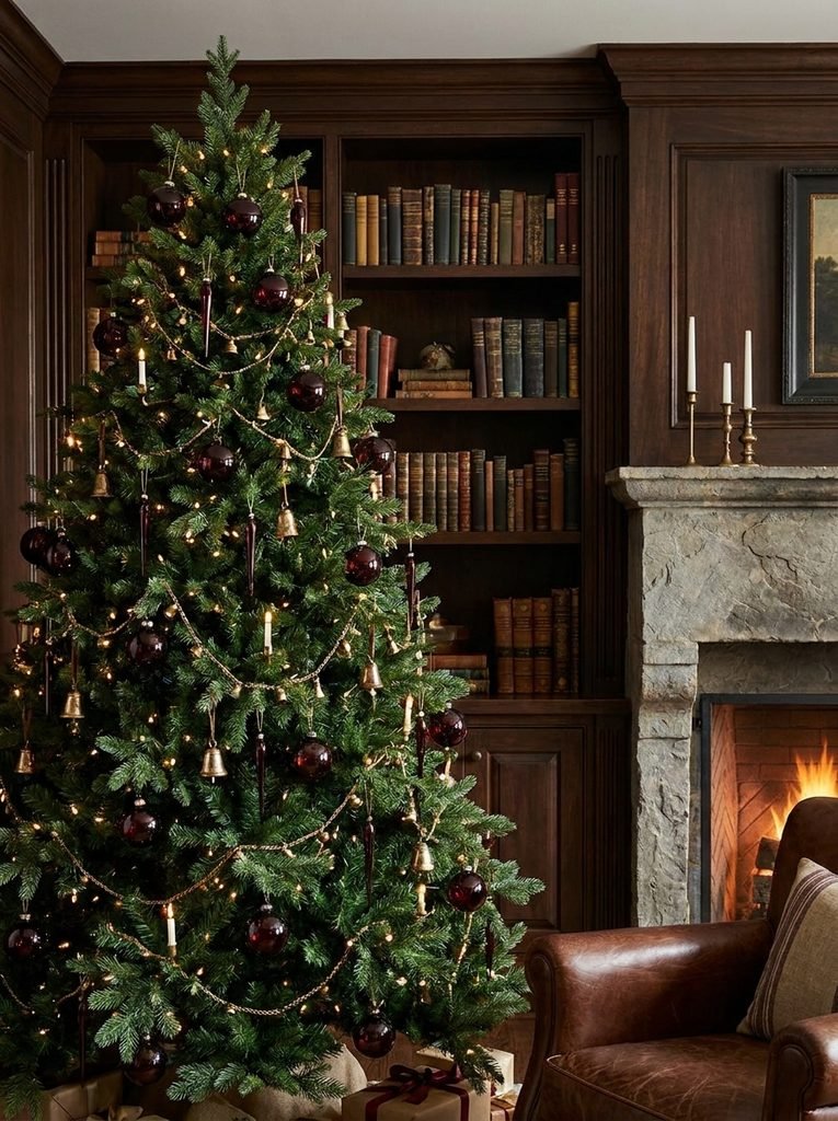
For a moodier look, think of an old study with leather-bound books and brass lamps. Deep red replaces bright Christmas red, which is the key move. Oxblood, burgundy, and wine tones feel richer and less toy-like than a primary red.
Use dark red glass in both glossy and matte finishes, then bring in antique brass rather than shiny gold. Brass with some age to it, or a brushed finish, looks more like a collected piece. Add small gold-toned bells, vintage-style glass birds, and a dark green velvet ribbon that echoes the tree itself.
This scheme works well in rooms with dark wood, built-in shelving, or a deep wall color. It also pairs well with a mantel styled in the same tones. For a mantel that supports the tree without competing with it, see how to avoid an overdone Christmas mantel.
Skip the bright silver here. A single silver ornament among brass pieces will draw the eye in the wrong way.
Smoke Blue, Pewter, and Frosted White: The Winter Dusk Tree
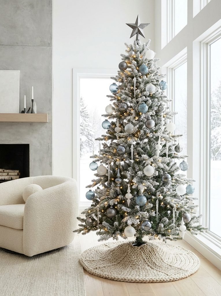
Blue and silver is a familiar pairing, but it can feel icy and generic. The designer version softens it. Replace bright blue with dusty, grayed tones such as smoke blue, slate, and soft steel. Replace shiny silver with pewter.
Frosted glass ornaments in white and pale gray create the base layer. Add a few smoke blue velvet ornaments, pewter-toned stars, and some pieces with a mercury glass finish. A flocked or lightly frosted tree works especially well here because the white branches make the cool colors look intentional rather than cold.
Choose warm white lights, even though the palette is cool. Cool white bulbs on a blue and silver tree can look clinical, while warm light gives the cool colors a gentle glow. This palette suits rooms with gray sofas, white walls, or navy accents.
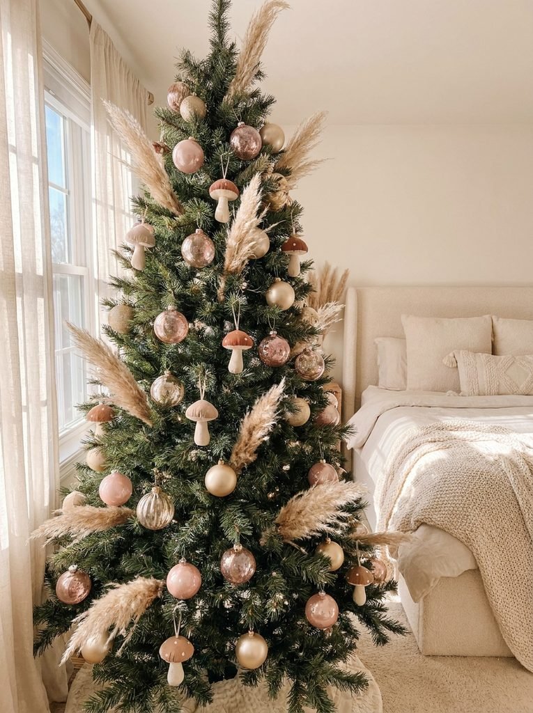
Blush, Mushroom, and Champagne: The Soft Romantic Tree
Pink on a Christmas tree usually evokes a single reaction, so the trick is to keep it muted. Blush should lean toward dusty rose or pale peach rather than bubblegum. Mushroom, a gray-brown neutral, grounds the pinks, and champagne adds a gentle metallic glow.
Combine matte blush balls, pearl-finish pieces, and champagne glass in varied sizes. Silk or velvet ribbon in a mushroom tone, tied in loose bows, adds softness. Dried elements such as pampas grass or bleached grasses tucked into the branches add texture and keep the look from becoming too sweet.
This palette works in bedrooms, nurseries, and living rooms with white or cream walls and light wood. It is also friendly to small apartments, since the pale tones keep the tree from feeling heavy.
Black, Ivory, and Brushed Gold: The Graphic Tree
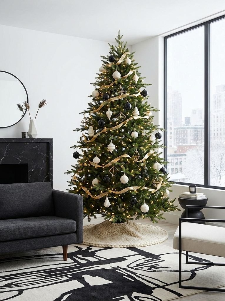
Black sounds surprising on a Christmas tree, but it creates one of the strongest contrasts you can build. The key is proportion. Black is the spark here, not the base. Use ivory as the main ornament color, brushed gold as the support, and black in small, deliberate amounts.
Try ivory matte balls, a few large black glass ornaments, and brushed gold geometric pieces. A black and white striped or checked ribbon can add a graphic punch, though a plain black velvet ribbon is a safer choice. Keep the number of black pieces low. Too many will pull the whole tree toward heavy and gothic.
This scheme suits modern rooms with black window frames, monochrome art, or sleek furniture. It also gives a bright white room a sharper edge. If the fireplace wall is a feature in your space, the ideas in fireplace wall styling that creates a focal point can help you coordinate the tree with the surrounding architecture.
Terracotta, Olive, and Natural Straw: The Earthy Tree
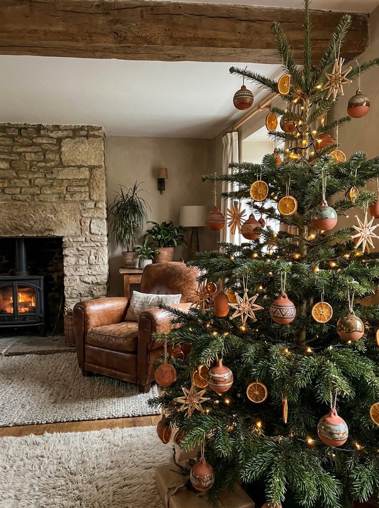
This is a good choice for anyone who wants to avoid traditional holiday colors without losing warmth. Terracotta provides the base, olive green blends with the tree, and straw or raffia tones add the natural texture.
Use terracotta-toned ceramic ornaments, dried orange slices (which you can make at home), woven straw stars, and olive-colored glass. A raffia or jute ribbon replaces satin. Wooden beads can be strung as garland in place of glossy strands.
This palette is a natural fit for rooms with rattan, clay pottery, or Mediterranean-style details. It also works well in homes with plenty of wood and plants, where a glossy traditional tree might look out of place.
How to Match a Tree to the Room You Already Have
A tree reads as designed when it connects to its surroundings. Before choosing a palette, do a quick audit.
Look at the largest color blocks near the tree: the sofa, curtains, rug, and wall behind it. Pick one of those colors, or a closely related tone, and let it appear in the tree as either the support or the spark. This creates a quiet visual link without forcing the tree to match everything.
Also consider the wall color directly behind the tree. A dark green tree against a dark green wall will disappear, while the same tree against cream stands out clearly. If the wall is dark, consider lighter ornaments and brighter lights to create separation. If the wall is pale, deeper ornaments will have more impact.
Finally, think about the room’s metals. If your lamps, frames, and hardware are mostly brass, a silver-heavy tree will feel disconnected. Match the dominant metal and the tree will settle into the room.
Texture and Finish: Where the Expensive Look Comes From
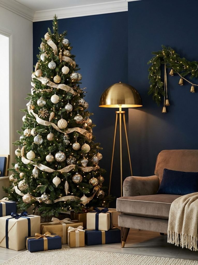
Color gets the attention, but texture does the quiet work. Two trees in the same palette can look very different depending on the surfaces.
Aim to include at least four finishes in any scheme:
- Matte (painted or ceramic pieces that absorb light)
- Glossy (classic glass that reflects it)
- Metallic or mercury glass (for a soft, aged shimmer)
- Natural or soft materials (wood, velvet, linen, paper, or dried botanicals)
A practical test is to photograph your tree from across the room. If everything has the same sparkle, it will look flat in the picture. If some pieces glow and others sit back, the tree will look layered. Mixing finishes within a single color family is the easiest way to get that depth.

Ribbon, Toppers, and Tree Skirts That Finish the Palette
These three items often get chosen last, yet they affect the final look more than people expect.
Ribbon. Wide ribbon, around two to three inches, reads as more deliberate than thin ribbon. Choose a fabric with some body such as velvet, linen, or wired taffeta so the loops hold their shape. Tuck lengths vertically down the tree or drape them in loose waves.
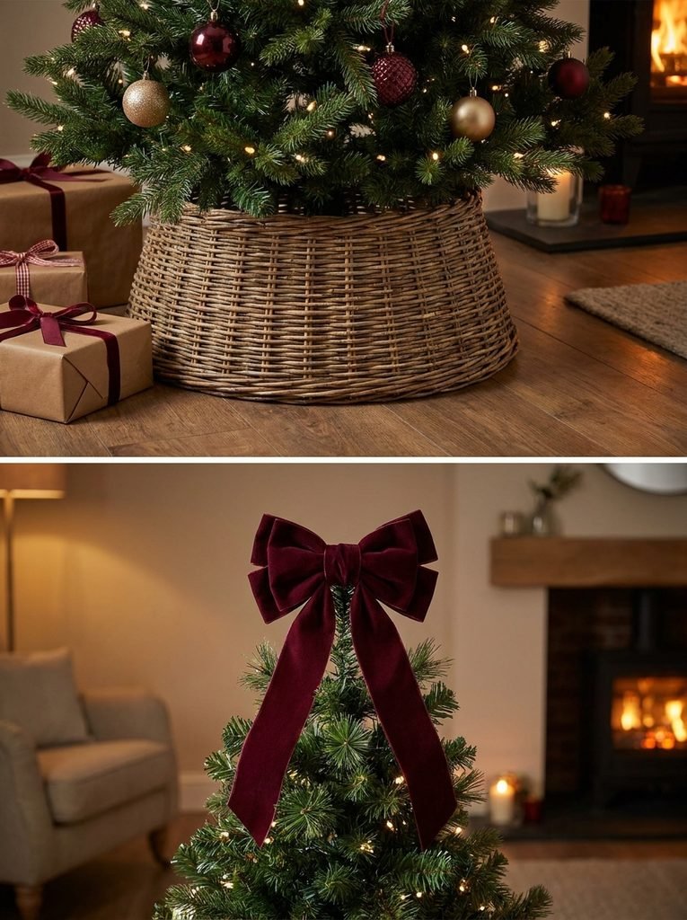
Toppers. A topper should relate to the palette. A traditional star works in the library or earthy schemes. A bundle of dried grasses or a large velvet bow suits the neutral and blush schemes. Avoid a topper that introduces a new color nobody else on the tree shares.
Tree skirts and collars. Choose a skirt in a neutral or a tone that already appears on the tree. A woven basket or a metal collar often looks more designed than a fabric skirt, particularly in modern spaces.
Lighting That Supports the Color Story
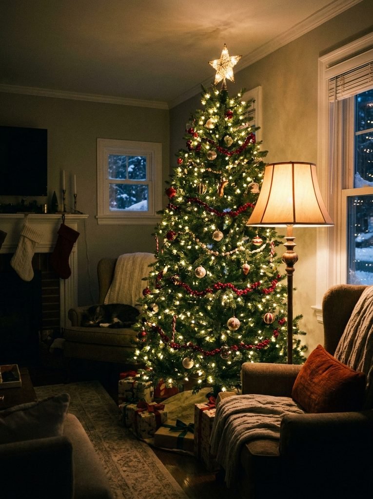
Light changes how every ornament looks, so it deserves as much thought as the palette. Warm white lights, often labeled around 2700K, work with nearly every scheme here because they flatter metallics, wood, and warm neutrals. Cool white tends to make warm palettes look dull.
Consider light density too. A common starting point is around 100 lights per vertical foot, though some people prefer more for a fuller glow. Wrap lights deep into the branches, not just along the surface, so the tree looks lit from within.
Keep the lighting consistent with the rest of the room. If you are layering floor lamps, table lamps, and the tree, the idea of layered lighting in apartments applies here as well. The tree should be one warm source among several, not the only light in the room.
A quick safety note: the National Fire Protection Association recommends keeping a tree at least three feet from heat sources, using lights that carry an independent testing laboratory label, watering live trees regularly, and turning lights off when you leave home or go to bed. You can find more at the NFPA holiday safety resources.
Building the Look on a Budget or in a Small Space
A designed tree does not require buying everything new. A few strategies stretch what you have.
Edit before you shop. Lay out your existing ornaments by color. You may find that a good half of them fit one scheme. Store the rest for another year or use them on a small secondary tree.
Buy in one finish, then vary the rest. Inexpensive plastic or shatterproof ornaments in a matte finish can look surprisingly refined when paired with a few glass pieces. Prices vary widely by store and season, so compare before you commit.
Make instead of buy. Dried orange slices, paper stars, and wooden bead garlands cost little and add the texture that boxed sets lack.
Choose a slim tree for tight rooms. In apartments, a slim or pencil tree frees floor space. Because it has fewer branches, use smaller ornaments and keep the palette to three colors so it does not feel crowded.
Use removable elements in rentals. Ribbon, fabric collars, and battery-powered lights add polish without touching the walls or floors.
A Decorating Order That Keeps the Palette Controlled
The sequence you follow affects the result. This order helps prevent the common problem of running out of the right pieces halfway through.
- Fluff and shape the branches first.
- Add lights, working from the trunk outward.
- Place ribbon next, so it sits behind the ornaments.
- Hang the largest ornaments, spaced across the tree and set deeper in.
- Add mid-size ornaments in clusters, varying finishes.
- Fill gaps with small ornaments, picks, and botanicals.
- Finish with the topper and skirt.
Step back every few minutes and look at the tree from across the room. Squinting slightly shows you where color is clustering or where a dark patch needs something to break it up.
Before You Hang the First Ornament
A useful final check is to describe your tree in a single sentence. “Warm neutrals with a bit of brass” or “deep green and wine with aged gold” are clear. If the sentence needs a long list of colors, the palette is probably too crowded.
Choose the sentence first, buy or edit toward it, and let the ratio, finishes, and lighting do the rest. A tree built that way rarely needs more ornaments. It usually needs a few better ones in the right places.