Kitchen Cabinet Colors That Feel Timeless Instead of Trendy for One Season
Kitchen cabinet color is one of those decisions that looks simple on a paint chart and gets surprisingly complicated the moment the cabinets are actually installed.
A shade that looked sophisticated in the showroom can suddenly read too yellow next to your countertop. A fashionable green can start to feel tiring once it’s sitting in a room with several other colors competing for attention. Even white isn’t really one choice some whites are crisp and cool, others carry enough warmth to sit comfortably with oak, brass, limestone, or a creamy wall color.
None of this means you need to avoid color or default to “everything neutral.” A kitchen can have real personality and still age well. The trick is picking a cabinet color that gets along with the permanent parts of the room, holds up as the light changes throughout the day, and leaves you room to redecorate later without a full renovation.
That’s really the question worth asking about timeless kitchen cabinet colors not which shade is popular right now, but which one can comfortably coexist with your countertops, flooring, backsplash, lighting, hardware, and the rooms next to it, for years rather than months.
According to one industry survey, more than a third of homeowners who renovated their kitchen ended up regretting their color choice usually because the color felt right in isolation but didn’t hold up once it had to live alongside everything else in the room. This guide takes a narrower approach than “here are some pretty colors”: choosing cabinet colors based on longevity, undertone, how well they coordinate with other materials, and how much room they leave the kitchen to evolve. If you’re also thinking about backsplash and layout, our guides to custom-look kitchen backsplash ideas and smart small-kitchen remodeling are worth pairing with this one.
What Actually Makes a Cabinet Color Timeless?
A timeless cabinet color isn’t necessarily boring, pale, or traditional. It’s just a color that can absorb change without falling apart.
Picture repainting the walls three years from now, swapping the pendant lights, replacing the bar stools, or laying down a new runner. If the cabinets still look right after all that, the color did its job.
That’s why the most dependable cabinet colors tend to have a little bit of complexity built in. Warm whites, soft greiges, muted taupes, natural wood tones, dusty blue, restrained sage, and deep charcoal all work well for the same reason they have enough character to feel intentional, but not so much that they dictate every other decision in the room. Warm mushroom, putty, and soft greige in particular hold up as flexible foundations even in tighter kitchens, especially when the stronger personality comes through hardware or lighting instead of the cabinets themselves.
A cabinet color starts to lose that flexibility once it’s extremely saturated, tightly tied to one decorating moment, or hard to coordinate with the finishes that are already permanent in the room.
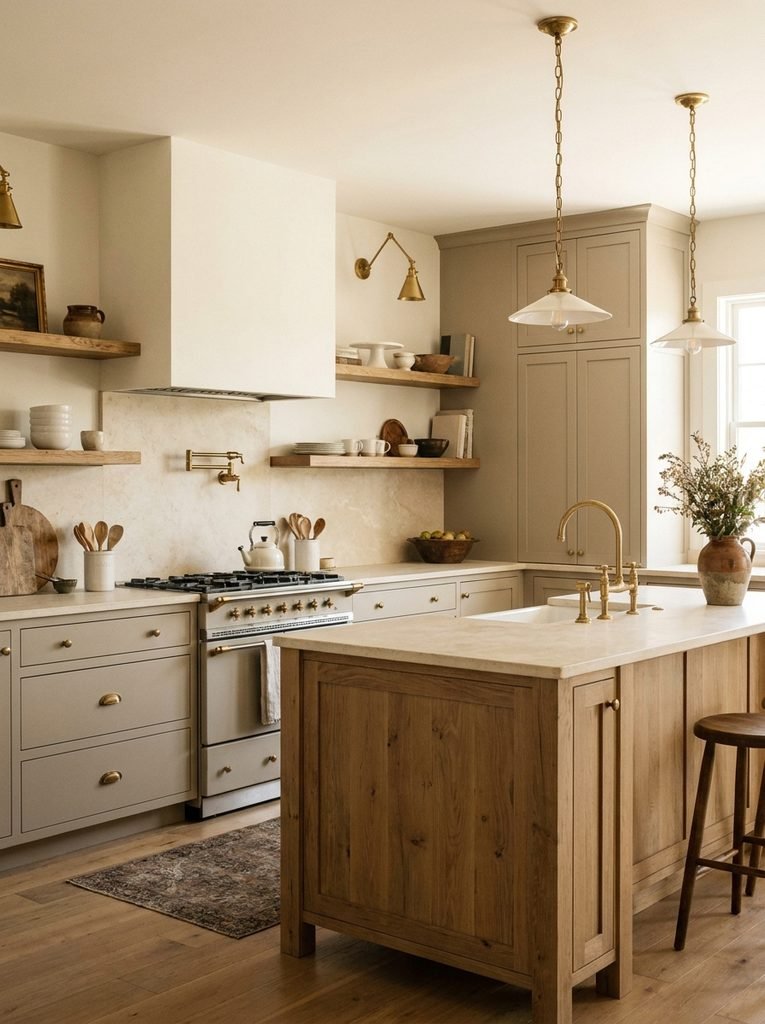
Look at the Permanent Finishes Before You Look at Paint Chips
Cabinets get most of the attention, but they’re not the only large surface in the room.
Countertops, floors, backsplash tile, appliances, and often the island are going to outlast whatever decorative choices you make this year so pick the cabinet color in relation to those, rather than falling for a favorite chip first and hoping it works out.
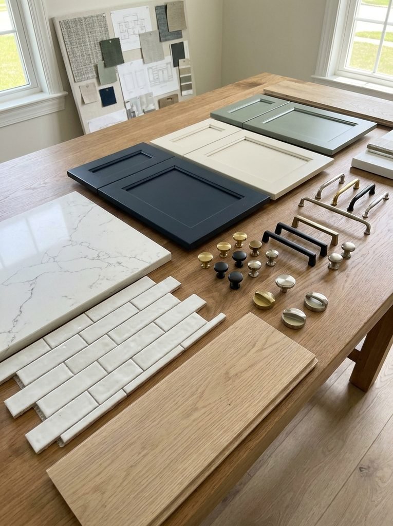
Lay your samples out together, in the actual kitchen. Look at them in the morning, again around midday, and once more after the lights are on at night. A color that reads neutral in bright daylight can quietly reveal a yellow, pink, green, or blue undertone once the sun moves or the bulbs kick in.
This matters most with white and gray. Two shades that look nearly identical in the store can behave completely differently next to a warm stone countertop.
A useful sample set to bring together:
- Cabinet paint or stain sample
- Countertop sample
- Backsplash sample
- Flooring sample
- Hardware finish
- Wall paint sample
Don’t judge a cabinet color against a blank sheet of white paper. Judge it against the materials it’s actually going to live beside.
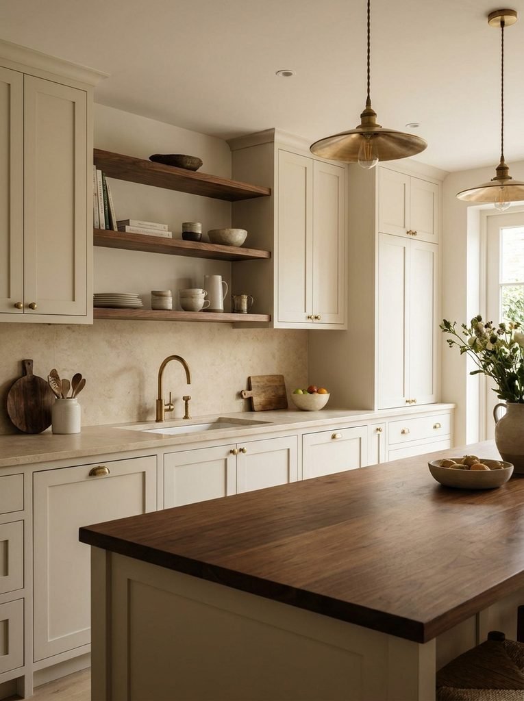
Warm White Works As Long As It’s the Right Kind of White
White cabinets stay useful because they give a kitchen a broad, adaptable foundation. But “white cabinets” is really a huge range of colors dressed up as one option.
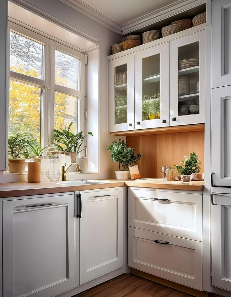
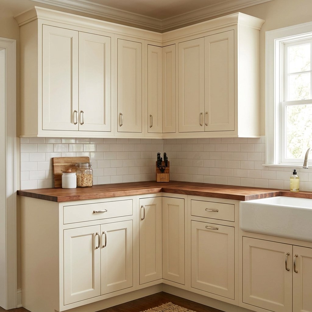
A crisp blue-white looks sharp against cool gray stone and stainless steel. A warmer ivory or soft white sits more comfortably with creamy countertops, natural wood, aged brass, and beige walls. If you want a kitchen you won’t need to rethink in five years, a slightly softened white is generally easier to live with than a bright optic white.
A few combinations worth trying:
Warm white + natural oak + brass — relaxed enough to move between traditional, Scandinavian, transitional, and contemporary furniture without looking out of place.
Soft ivory + limestone + dark bronze — quieter, and well suited to kitchens already built around natural stone and warm architectural finishes.
Creamy white + walnut + black hardware — the darker wood and hardware give a pale cabinet enough contrast that you don’t need a bold accent color anywhere else.
The most common mistake is assuming every white belongs to the same family. If your countertop leans creamy or yellow, a very cool cabinet white can make the two surfaces look like they were never meant to be together.
Greige Does More Than a Flat Gray Ever Could
Greige sits in the space between gray and beige, which makes it useful in a kitchen where neither a cool palette nor a strongly warm one feels quite right.
Its real strength is how easily it bridges other materials — it looks comfortable next to oak, walnut, stone, brushed metal, black accents, and warm whites alike, which is more than most single neutrals can claim.
The part that actually matters is undertone. A greige with a noticeable purple or blue cast can get difficult next to a warm countertop. One with a soft beige base coordinates with natural materials far more easily.
If the kitchen doesn’t get much daylight, be careful about choosing a gray that turns visibly cold once the lamps come on at night. A warmer greige keeps that quiet, neutral quality without tipping the room into feeling icy.
It also leaves you room to move later — terracotta, olive, blue, brass, black, and natural wood can all be layered in over time without forcing the kitchen into one fixed color story. That flexibility is the actual reason to choose it, not just because it happens to be popular right now.
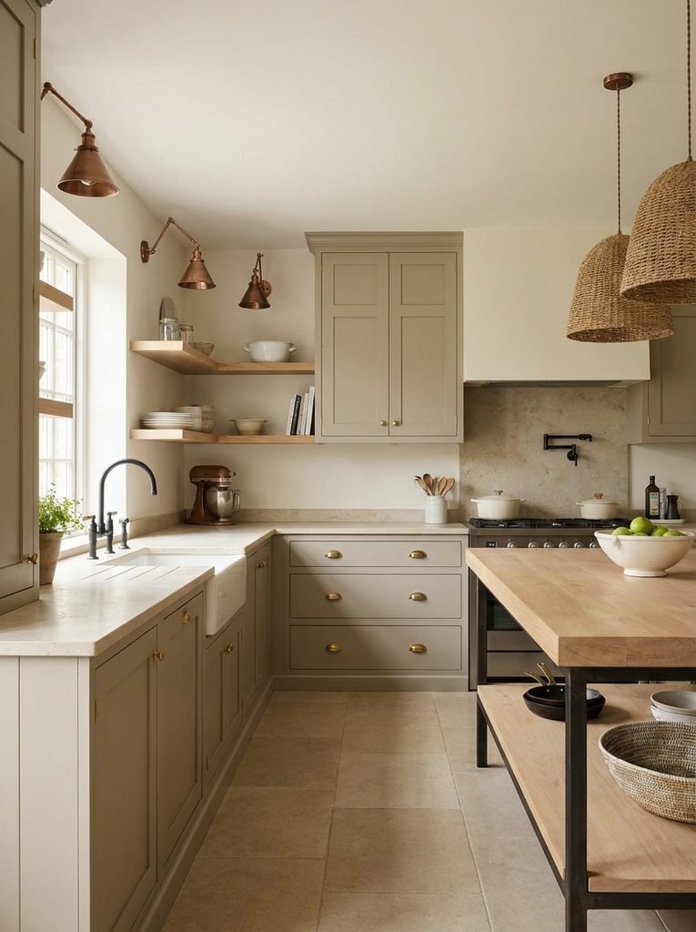
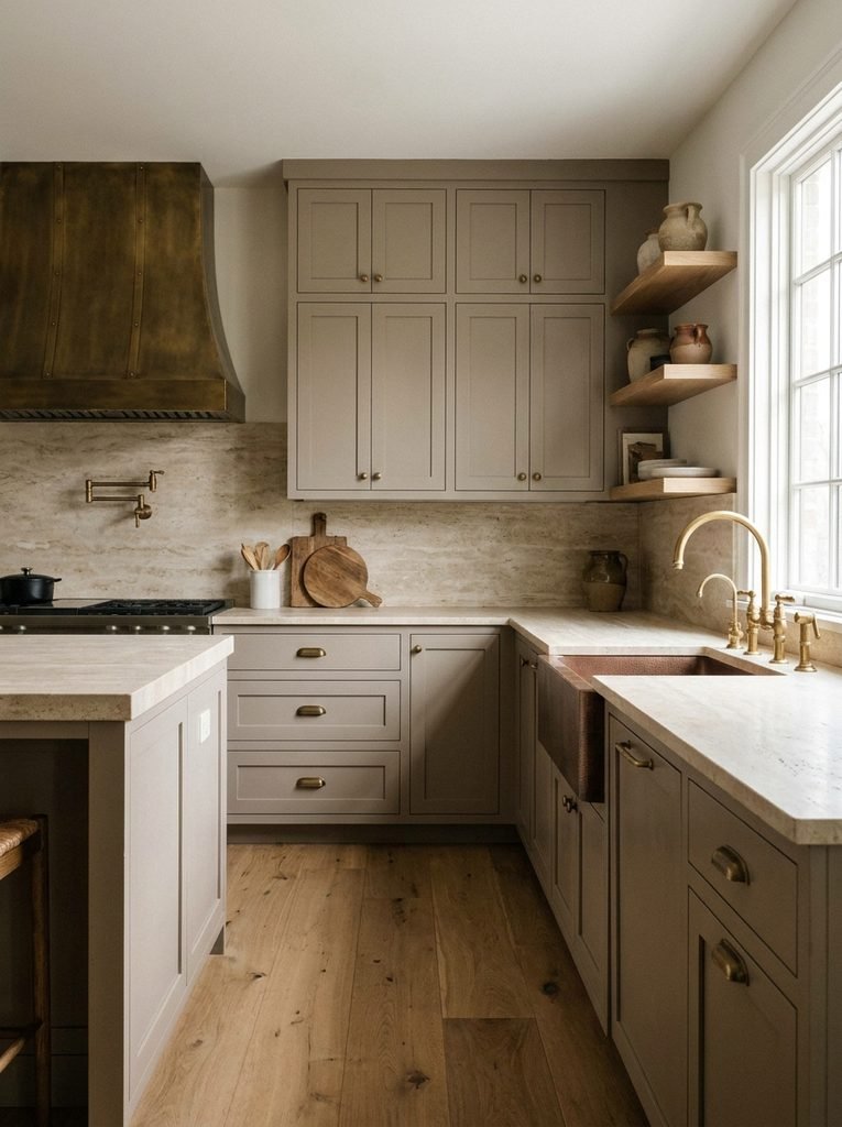
Taupe and Mushroom Add Depth Without Getting Loud
If beige feels too yellow and gray feels too cold, taupe or mushroom is worth a look.
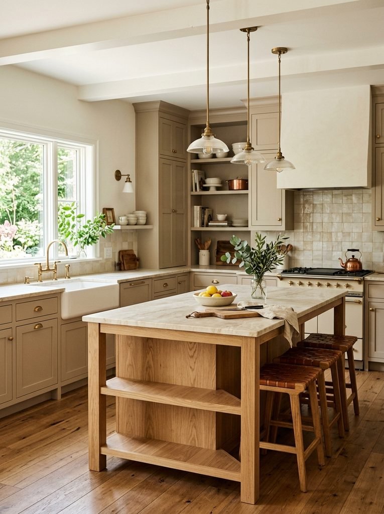
Both have enough depth to make the cabinetry feel substantial, while staying relatively quiet which is why they work so well in kitchens with natural stone, wood, aged metals, and other textured surfaces already in play.
Mushroom cabinetry looks especially good against creamy white walls and light countertops. Taupe can push slightly darker and give the kitchen more architectural weight without going all the way to a statement color.
A palette that tends to work:
- Mushroom cabinets
- Warm ivory walls
- Light oak flooring
- Cream stone countertops
- Aged brass hardware
- Darker wood accessories
That combination has real visual variation built in, without needing a bright accent color anywhere to carry interest which is also why warmer neutrals like these keep showing up as the foundation in kitchens that otherwise lean on stronger decorative accents elsewhere.
Muted Sage Can Outlast the Trend That Made It Popular
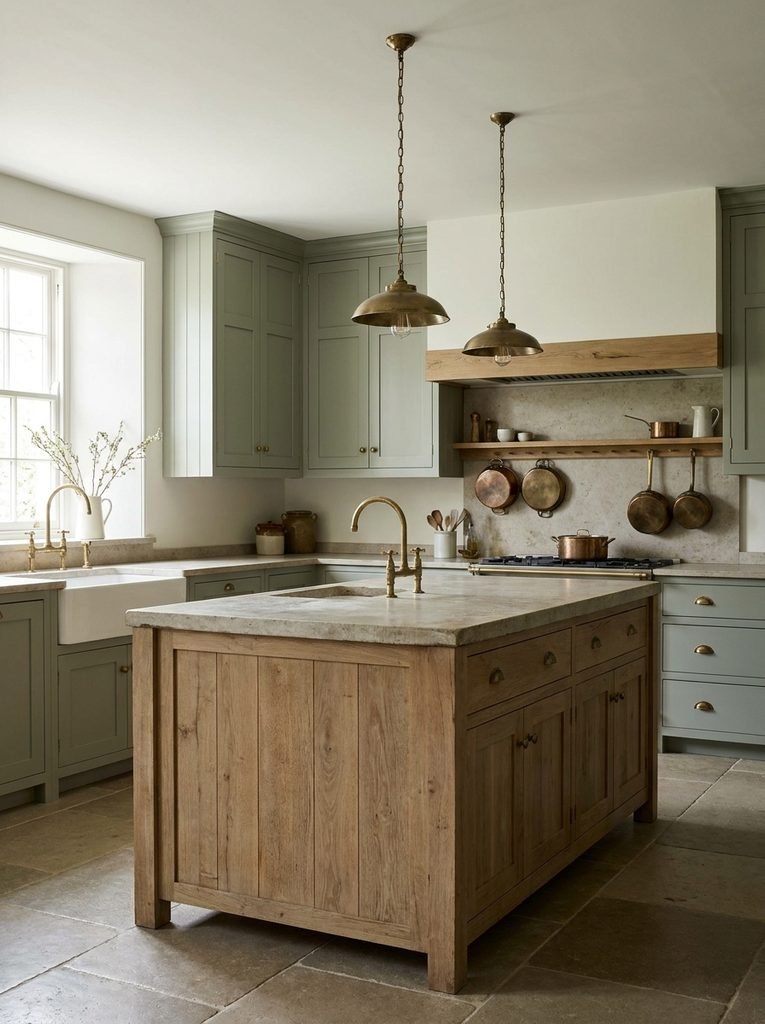
Green deserves a bit more nuance than most cabinet colors.
A fully saturated emerald kitchen makes a real statement we’ve covered emerald green kitchens in more depth elsewhere, including islands, traditional layouts, and two-tone approaches. But if you want something with more staying power, muted sage or olive is a different proposition entirely.
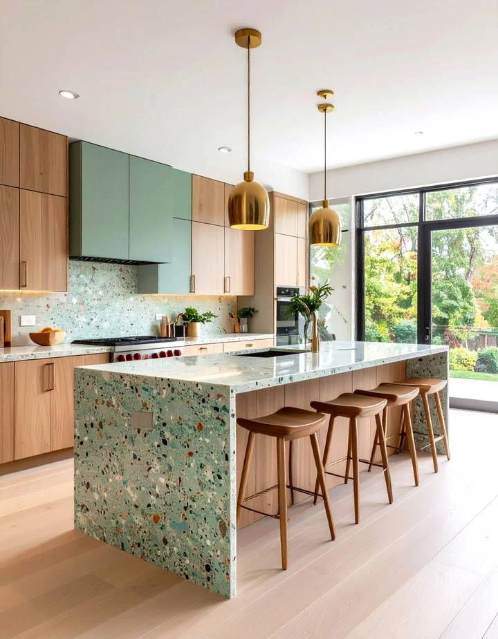
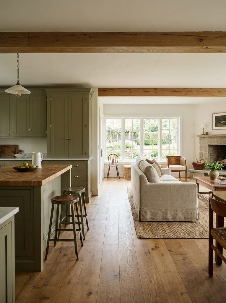
These shades behave more like softened neutrals than a true accent color. They sit comfortably with cream, oak, walnut, stone, brass, black, and woven natural materials without pushing the whole kitchen into “botanical theme” territory.
The safest way to choose green is to resist picking it just because a particular shade is having a moment find a muted version that actually works with what’s already permanent in your kitchen.
Sage + oak + cream keeps things light and natural.
Olive + walnut + warm white adds more depth and tends to hold up well in kitchens that get a lot of evening use.
Dusty green + limestone + aged brass softens the whole look and leans more traditional.
The color should be supporting the architecture of the room, not becoming the only thing anyone notices when they walk in.
Dusty Blue Behaves More Like a Neutral Than Bright Blue Ever Will
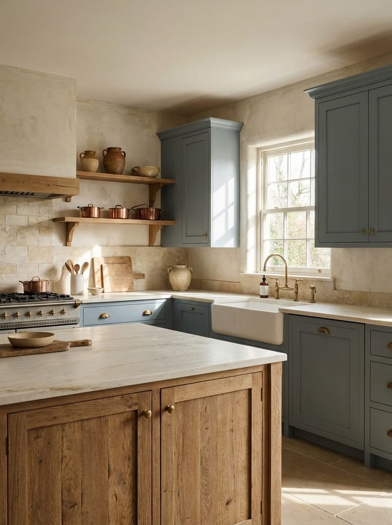
Blue cabinetry can be beautiful, but the exact shade decides how flexible it ends up being. A vivid cobalt makes the cabinets the main event in the room. A dusty blue, blue-gray, or muted navy has a much quieter relationship with everything around it.
Soft blue-gray gets along well with:
- Warm white
- Natural oak
- Carrara-style stone
- Brushed nickel
- Aged brass
- Cream upholstery and textiles
Deep navy takes things in a more formal direction, especially paired with white countertops and brass hardware though it works best when the room gets good daylight or has a lighting plan that’s already accounted for the darker cabinets.
If your kitchen needs to bridge traditional and contemporary at the same time, dusty blue is usually the more forgiving choice, since it acts almost like a neutral rather than a statement color. Finish matters here too matte or satin keeps a stronger color from turning reflective or feeling aggressive in the room.
Natural Wood Is a Color Decision, Even Without Paint
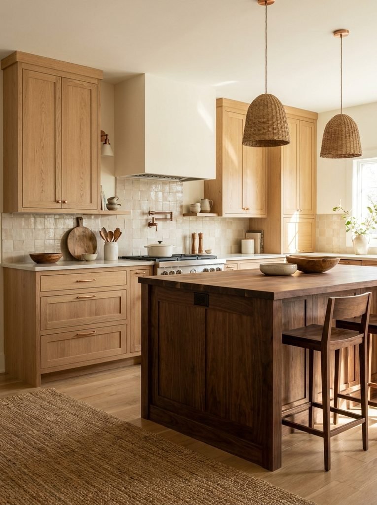
Paint isn’t the only path to a lasting cabinet palette. Natural wood brings color through grain, stain, and tone instead and oak, walnut, and ash can create very different moods even on the exact same cabinet design.
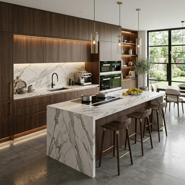
Light oak feels fresh and casual. Walnut adds depth. Medium oak tends to bridge traditional and contemporary spaces especially well.
The upside of natural wood is that its variation keeps a kitchen from feeling dependent on one flat color. The downside is that wood tones need real coordination mixing several almost-matching woods across the flooring, cabinets, island, and dining furniture usually reads as accidental rather than intentional, even when each piece looks fine on its own.
Pick one dominant wood tone and let everything else either match it closely or contrast on purpose. Light oak cabinets pair well with a darker walnut dining table; walnut cabinets sit comfortably next to lighter oak flooring when the contrast is clearly a choice rather than a mismatch.
Charcoal Isn’t Automatically Trendy
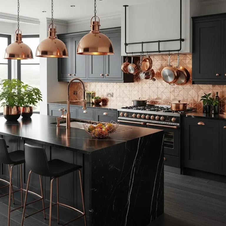
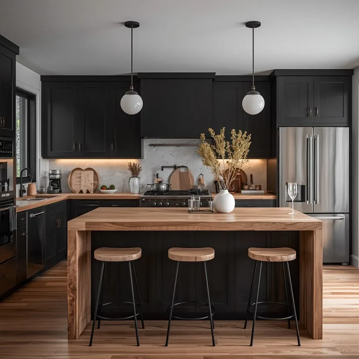
Dark cabinetry gets an unfair reputation for being a passing phase, but charcoal can be genuinely timeless when the room around it has strong natural light, pale countertops, and enough contrast to keep it from feeling heavy.
The important part is choosing a charcoal with some complexity, rather than a flat, absolute black. A slightly warm charcoal pairs well with walnut, oak, cream stone, bronze, and warm white walls. A cooler charcoal suits stainless steel, concrete-look surfaces, and more contemporary kitchens.
If the room is small or doesn’t get much light, save the dark color for the island or the lower cabinets rather than committing the whole kitchen to it the same logic that keeps strong accents controlled in smaller kitchens generally, so the main palette can stay light. A dark island gives you the visual weight of a fully dark kitchen without asking every cabinet to carry that same intensity.
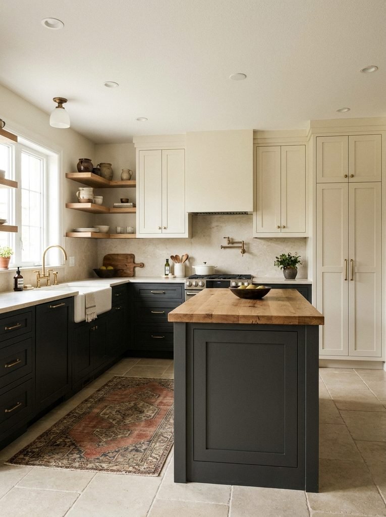
Two-Tone Cabinets Can Outlast a Single Bold Color
Two-tone cabinetry is a smart way to bring in color without letting it take over the whole room.
The most familiar version keeps the perimeter light and saves the deeper shade for the island, but that’s not the only option. Lower cabinets can go taupe while the uppers stay warm white. An island can be natural walnut while the surrounding cabinets are painted. A tall pantry wall can carry the bolder color while the main run of cabinets stays neutral.
The trick is giving each color an actual job the lighter tone usually covers the larger area, and the darker or more distinctive material acts as the anchor.
It also makes future changes far less disruptive. If you eventually get tired of the accent color, swapping out an island is a much smaller project than repainting an entire kitchen. The most durable version of this approach is choosing the contrast based on your room’s architecture, not just pairing whatever two colors happen to be trending together.
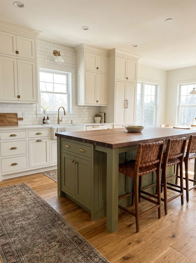
The Finish Changes How the Color Reads
Color gets most of the attention, but finish quietly does a lot of the work.
A high-gloss finish makes a color look more reflective and contemporary. Satin softens the appearance while staying easy to maintain. Matte tends to mute a color and give it a more architectural feel.
Traditional kitchens usually suit painted shaker or framed cabinetry. Contemporary ones often lean toward slab doors with a lower sheen. Natural wood can work across either style, depending on the door profile and hardware.
Don’t choose the color separately from the door style a dusty green on a heavily detailed cabinet reads completely differently than the same green on a flat panel. It’s really the combination of color, profile, sheen, hardware, and surrounding materials that decides whether a kitchen feels current or dated, not any single choice on its own.
Let Hardware Carry the Changes the Cabinets Don’t Have To
One good reason to pick a relatively adaptable cabinet color is that the smaller details hardware especially can then absorb whatever seasonal or personal changes you want to make later.
Brushed brass warms up cream, taupe, green, blue, and walnut alike. Matte black adds contrast against lighter cabinetry. Brushed nickel sits comfortably with cool whites, blue-gray, and most contemporary neutrals.
You don’t have to commit the entire kitchen to one metal finish forever, but repeating a dominant finish across the cabinet hardware, lighting, and faucet usually creates more cohesion than choosing each piece independently. It’s also one of the more effective upgrades available when the cabinetry itself isn’t changing a relatively small investment for how much it shifts the overall feel of the room.
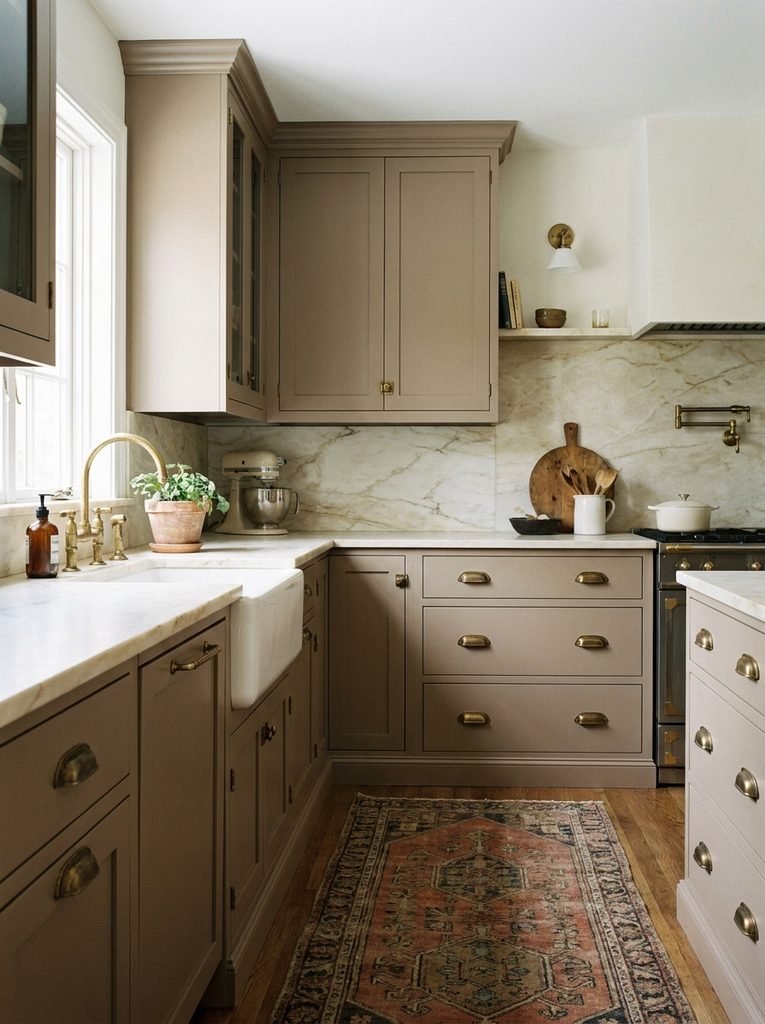
Small Kitchens Need a Slightly Different Strategy
A small kitchen can technically use almost any cabinet color, but visual mass shows up faster when there’s less wall and floor area to absorb it. A very dark color across every surface can make a small, low-ceilinged kitchen feel dense fast, especially without much natural light to offset it.
That doesn’t mean small kitchens are stuck with white. A few combinations that hold up well at a smaller scale:
- Warm white with light oak
- Pale greige with cream stone
- Soft sage with warm white walls
- Dusty blue with light flooring
- Taupe lower cabinets with ivory uppers
- Natural oak with warm off-white walls
Reflective surfaces help too a lighter backsplash, a glass-front cabinet, polished stone, or lighting placed thoughtfully can all break up visual weight without changing the cabinet color itself. If you’re planning a smaller kitchen from the layout up, our guide to small kitchen layouts that make cooking and storage easier pairs well with these color choices.
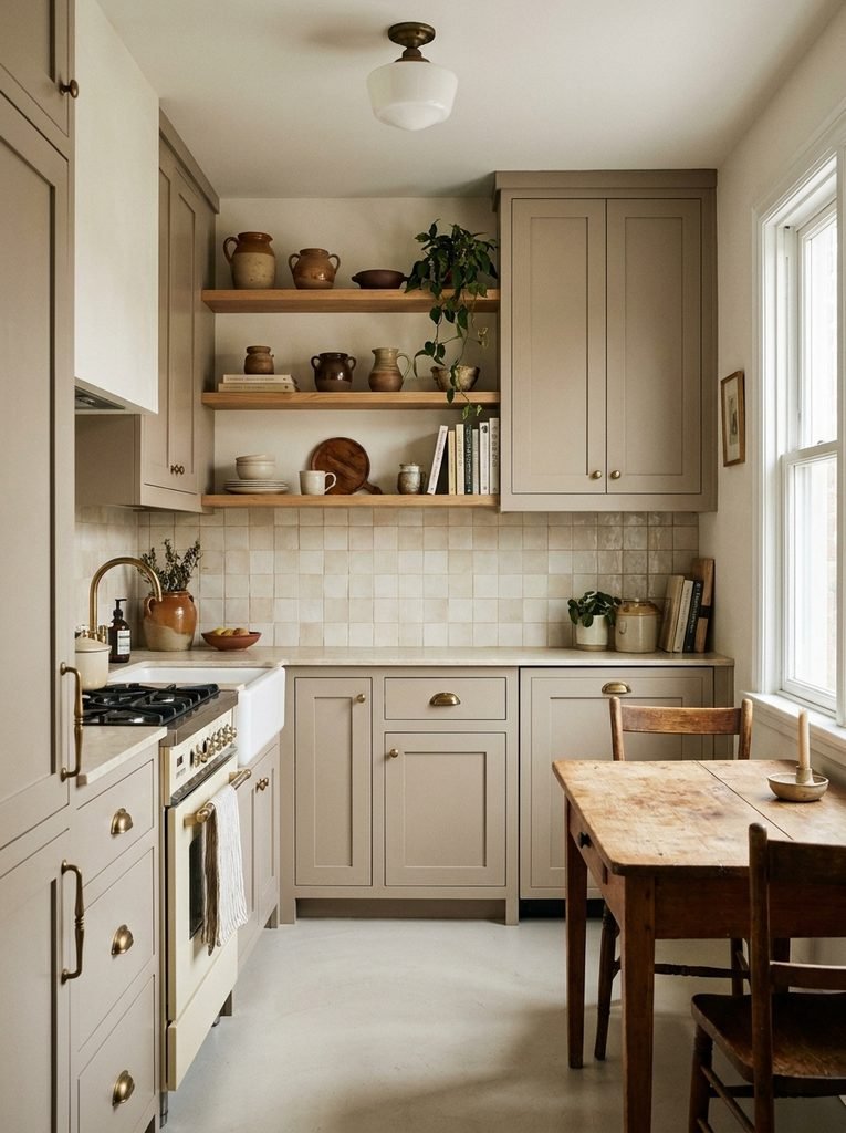
Think About What You Can See From the Kitchen
Open-plan homes complicate cabinet color because the kitchen is rarely viewed in isolation.
If the living room has warm beige upholstery, walnut furniture, and terracotta accents, a stark blue-white kitchen can feel like it belongs to a different house. The same goes in reverse deep green cabinetry may need some visual thread connecting it to the dining or living space next door.
You don’t need to match colors exactly; repeating a material or an undertone is usually enough. Warm oak flooring can connect sage cabinets to a living room full of walnut furniture. A brass light fixture in the kitchen can echo hardware in the dining area. A warm ivory wall color can bridge two different cabinet tones across adjoining rooms.
This matters even more in smaller homes, where several rooms are visible from a single spot keeping a consistent base palette across those sightlines does a lot of the work that color-matching would otherwise have to do.
The Colors That Ask for More Commitment
There’s no universal list of colors guaranteed to look dated eventually context changes everything. But some choices ask more of you simply because they dominate the room.
Very saturated primary colors, colors tied to a specific fashion moment, or unusual combinations can look wonderful when the architecture supports them. They just give you less room to change the surrounding finishes later without a full rethink.
A useful gut check: picture the kitchen without its current accessories. Remove the stools, the artwork, the rugs, the countertop appliances, the bowls, the plants. Look only at the cabinets, counters, backsplash, floor, walls, and lighting.
If the cabinet color still looks considered in that stripped-down version, you’ve probably picked from the right part of the palette. If the room only works because a specific set of accessories is doing all the heavy lifting, the cabinet choice may be asking too much of everything else.
How to Actually Test a Cabinet Color Before You Commit
Don’t rely on a digital rendering alone paint large sample boards, or get real manufacturer samples, and prop or paint them against the actual cabinets for several days rather than a few minutes. Sherwin-Williams’ own sample paint system covers enough wall area to genuinely judge a color in your own lighting, which is a meaningfully different test than a paint chip held under store fluorescents.
Check the sample:
In direct daylight. This shows the color at its strongest and truest.
In indirect daylight. Undertones tend to surface more clearly once the light softens.
Under your kitchen’s actual lighting. Warm LEDs can shift whites, grays, greens, and blues more than people expect.
Beside the countertop. This is where mismatched undertones become impossible to ignore.
Against the backsplash. Look at both materials together, not one at a time.
From the doorway. A color that looks great up close can feel much stronger once you’re viewing the whole room from a distance.
If you’re repainting existing cabinets, test the actual paint system and sheen you’re planning to use a small chip doesn’t always predict how a large, finished cabinet surface will look. This step matters even more if you’re updating the kitchen gradually, since it lets you coordinate each new finish before you buy it.
A Practical Palette Guide
If you want a quick starting point, these combinations work because each one gives the cabinetry a clear supporting cast.
| Cabinet color | Pair with | Overall character |
|---|---|---|
| Warm white | Oak, cream stone, brass | Light and adaptable |
| Soft greige | Oak, black, warm white | Quiet and contemporary |
| Mushroom | Travertine, walnut, brass | Earthy and refined |
| Muted sage | Oak, ivory, aged brass | Natural and relaxed |
| Dusty blue | Cream, oak, nickel | Soft and collected |
| Deep navy | White stone, brass, walnut | Rich and formal |
| Warm charcoal | Cream, oak, bronze | Architectural and dramatic |
| Natural oak | Stone, black, bronze | Organic and versatile |
| Walnut | Ivory, limestone, brass | Deep and traditional |
Treat the table as a starting point, not a formula. Lighting, countertop undertones, room size, and the architecture around it should still make the final call.
The Best Cabinet Color Is the One That Leaves Room to Change
Finding a lasting kitchen cabinet color has less to do with picking something that will never go out of fashion and more to do with picking something that doesn’t lock every future decision into place.
Warm white leaves room for new hardware. Greige can absorb a change in accent color. Mushroom works comfortably with several natural materials at once. Muted sage and dusty blue bring in personality without dictating the whole room. Natural oak and walnut add variation through grain rather than leaning on a painted statement.
The thread running through all of it is flexibility.
Before you commit, look past the cabinet door itself — study the countertop, the flooring, the backsplash, the lighting, the hardware, and whatever rooms sit next to the kitchen. Then ask how the space might look if a few of those elements changed down the line.
A good cabinet color supports that kind of change instead of resisting it. That’s what actually gives a kitchen staying power not an absence of personality, but enough restraint in the permanent finishes that the room can keep evolving around them.
Related HomeDecorio Reading
For more kitchen planning ideas, see kitchen backsplash ideas that give a basic kitchen a custom look, emerald green kitchen ideas, and small kitchen decor ideas for smart remodeling.