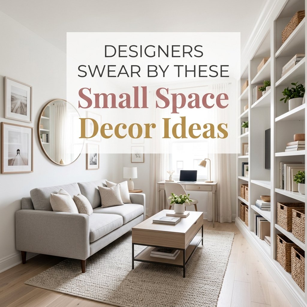
You measure the same 11-by-14 living room three times, moving the painter’s tape a few inches each time, hoping the numbers change. They don’t. What can change is how the room reads. Small space decor isn’t about tricking the eye with a single coat of paint it’s a set of specific, repeatable choices that professional designers reach for in almost every tight room they take on. A small footprint isn’t something to apologize for; it’s a constraint that rewards precision. Below are the moves designers use first when a client’s square footage doesn’t match their wish list, the numbers behind why they work, and the mistakes that quietly undo good design in a room with no inches to spare.

Use High-LRV Paint to Open Up the Room
Paint is the fastest, cheapest way to change how a room reads. Light Reflectance Value (LRV) measures how much light a color bounces back into a room, on a scale of 0 to 100. Benjamin Moore’s Simply White sits around LRV 89 to 91, which is why designers reach for it in rooms with limited natural light. Keep walls, trim, and ceiling within a few points of the same LRV so the eye doesn’t catch a hard line where one surface stops and another starts that continuity is what makes an 8-foot ceiling read taller than it is. An eggshell or satin sheen on trim reflects more light than flat paint without looking glossy. If you’re updating flooring too, a pale white oak or light porcelain tile keeps the sightline moving instead of stopping at a dark rug edge.

Choose Furniture That Pulls Double Duty
In a compact room, every piece should earn its square footage twice over. A storage ottoman that swaps in for a coffee table saves roughly 4 to 6 square feet compared with a coffee table plus a separate bench. A sofa bed with a hidden storage chaise does the work of a guest bed and a linen closet at once. For anyone working from a shared living space, a fold-down wall desk gives back 10 to 12 square feet of floor when it’s closed. These aren’t just space-savers they cut down on how much furniture a room needs in total, which is the real reason a small room starts to feel calmer.

Let Vertical Storage Do the Heavy Lifting
Interior designer Brad Thornton, founder of Thornton Projects, told Apartment Therapy that guiding the eye upward is his go-to rule for making a small home feel bigger — anything that draws attention toward the ceiling adds a sense of height and breathing room. In practice, that means floor-to-ceiling shelving instead of a squat bookcase, and hanging planters or artwork above the 6-foot line rather than clustering everything at eye level. Most small rooms leave the top third of their wall space completely empty, which is exactly the area that reads as “unused” to a visitor’s eye. A single tall bookcase against one wall does more for the sense of scale than three short pieces spread around the room. For a full breakdown of which corners in a small home go to waste most often, this room-by-room breakdown is worth a look.

Place Mirrors Where They Actually Reflect Light
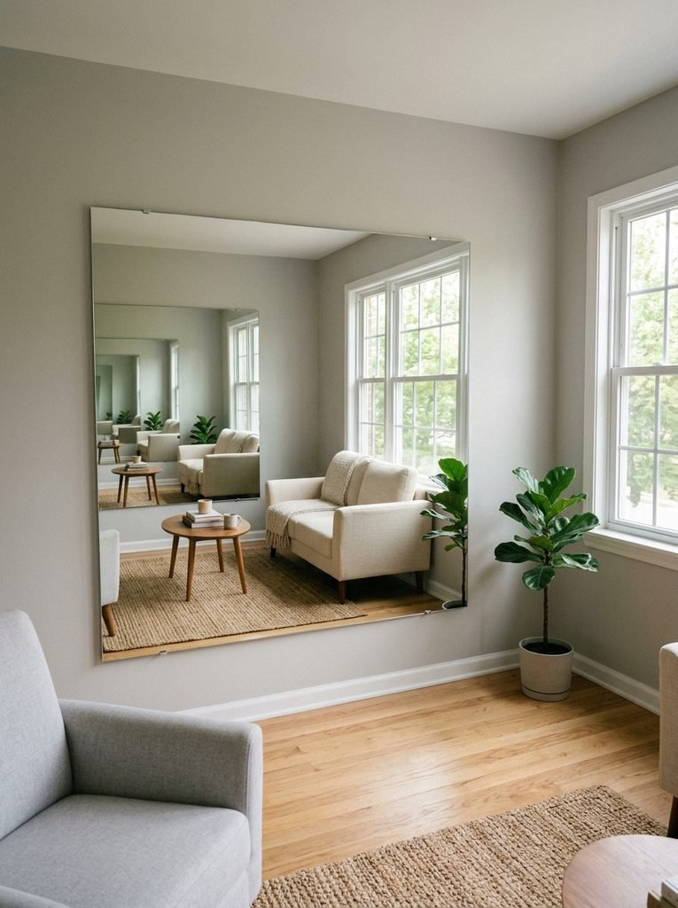
A mirror only helps a small room if it reflects a window or a light source a mirror facing a wall or a cluttered corner just doubles the clutter. The most reliable placement is a large mirror, at least 30 by 40 inches, hung directly across from your main window, which creates a “second window” effect that visually doubles the depth of the room. Frameless or thin blackened-steel frames disappear into the wall better than heavy gilt frames, which can end up reading as another piece of furniture rather than a light source. Hang the mirror so its center sits close to eye level; a mirror placed too high mostly reflects ceiling, not room.
Edit Before You Decorate
Most small-room decorating fails happen before a single new item comes in — the room was never edited down to begin with. Designers use a simple “one in, one out” rule for small spaces: nothing new comes in without something old going out. Closed storage — baskets, cabinets with doors, a bench with a lift-top seat — hides visual noise far better than open shelving, which needs to be styled well or it just reads as clutter. A cord management box or a single cable channel along the baseboard removes one of the most common sources of visual mess in small living rooms and home offices. The goal isn’t an empty room; it’s a room where everything left is something you actually use or love.

Layer Your Lighting Instead of Relying on One Fixture
A single ceiling fixture is one of the most common lighting mistakes in small rooms it flattens the space and casts hard shadows that make a room look smaller, not bigger. Designers layer three types of light instead: ambient (an overall soft glow), task (a reading lamp or under-cabinet strip), and accent (a small spotlight on art or a shelf). Wall sconces and plug-in pendants add light without taking up table or floor space, which matters more in a small room than in a large one. Warm-white LED bulbs, in the 2700K to 3000K range, and a simple dimmer switch let you shift a room from bright and functional during the day to soft and calm at night without buying new fixtures.

Match Furniture Scale to the Room, Not the Showroom
Furniture that looked reasonably sized in a large showroom is often the single biggest reason a small room feels cramped once it’s home. Designers prioritize proportion over price: a slim-profile sofa with visible legs, rather than a deep sectional, keeps sightlines open underneath and around it. Armless chairs and a glass or acrylic side table maintain visual openness because light passes through them instead of being blocked. As a rough guide, leave at least 30 inches of walking clearance around major furniture pieces — narrower than that, and a room starts to feel like an obstacle course no matter how nice the furniture is.
Use Rugs and Lighting to Define Zones Without Walls
When a small home has to serve two functions in one room — living and working, or living and sleeping — designers use rugs and lighting to draw boundaries instead of building them. A rug under the seating area, sized so all the front legs of the furniture sit on it, visually separates that zone from a dining or work corner a few feet away. Pair that with a pendant light over the dining or desk area and a floor lamp by the sofa, so each zone has its own light source and its own mood. This kind of soft zoning keeps a studio or open-plan apartment from feeling like one undifferentiated room, without sacrificing the openness that makes it feel bigger in the first place.
Build Storage Into the Architecture
The most effective small-space storage disappears into the room instead of sitting on top of it. A storage bed with a hydraulic lift, a wall niche painted to match the surrounding wall, or a window seat with a lift-up lid all keep clutter contained without adding visual bulk. In kitchens, toe-kick drawers use the few inches of “dead space” under lower cabinets that almost never gets used otherwise. The common thread is that none of these read as storage at a glance — they read as part of the room’s structure, which is exactly why they keep a small space feeling calm rather than crowded.

Add Texture to Create Depth Without Adding Bulk
Once color and layout are handled, texture is what keeps a small room from feeling flat or sparse. A chunky jute or high-pile wool rug, linen curtains, and a single textured accent wall — grasscloth wallpaper or a limewash finish — add visual richness without taking up floor space. These materials catch light differently throughout the day, which gives a room a sense of depth that flat, single-texture surfaces don’t. The rule of thumb designers use: vary the weight and weave of at least three materials in a room (a smooth sofa, a nubby rug, a woven basket) rather than repeating the same texture everywhere.

Choose Fewer, Bigger Pieces Over Many Small Ones
It sounds counterintuitive, but one large piece of art almost always reads better in a small room than a gallery wall of six small frames the gallery wall introduces more visual stopping points, while the single piece gives the eye one place to land. The same logic applies to rugs, light fixtures, and plants: one substantial area rug beats several small ones, one sculptural pendant beats a cluster of mismatched lamps, and one large Fiddle Leaf Fig in a floor planter does more for a corner than five small potted plants scattered around the room.

Small Living Room Tricks Worth Stealing
In a small living room specifically, wall-mounted TV brackets and floating media shelves remove the footprint of a traditional console entirely. A loveseat or two slim armchairs, upholstered in a light color like ivory bouclé, keep the seating area from visually crowding the room the way a bulky sectional would. Keep at least one clear walkway at least 30 inches wide from the entry to the seating area a living room where you have to turn sideways to get to the couch will always feel smaller than its actual dimensions. For a deeper, room-specific plan covering furniture, lighting, and storage layout together, this small living room design guide walks through the full process.

Small Bedroom Tricks Worth Stealing
Wall-mounted bedside tables free up the floor space that traditional nightstands take up, and a low-profile platform bed with built-in drawers keeps the room’s visual weight closer to the floor, which makes the ceiling feel higher by comparison. Neutral bedding layered in different textures raw silk, waffle-weave cotton, a heavier wool throw adds the sense of depth that color alone can’t in a room that’s mostly one shade. A mirror that reflects the window, not the bed, does the same job here as it does in a living room: it borrows light instead of just reflecting more of the room’s clutter back at you.

Small Kitchen Tricks Worth Stealing
Open shelving in place of upper cabinets removes visual weight from a small kitchen and gives you a place to display glassware or ceramics that would otherwise be hidden. Light cabinetry paired with a reflective backsplash glossy subway tile or a mirrored glass panel bounces light back into the room the way a mirror does in a living space. Vertical pull-out pantry units use narrow gaps between the cabinet and the wall that would otherwise be wasted, often adding several linear feet of storage without expanding the kitchen’s actual footprint.

Small Bathroom Tricks Worth Stealing
A floating vanity is the single highest-impact change in a small bathroom lifting the cabinet off the floor lets light travel underneath it, which makes the whole room read as more open even though the actual floor area hasn’t changed. A mirror that spans the full width of the vanity wall doubles the room’s visual depth the same way a living room mirror does opposite a window. Recessed medicine cabinets and slim floating shelves keep toiletries off the counter without needing extra floor-standing storage, which matters in a room where every square foot counts twice as much.

Budget Moves That Still Look Designer-Level
None of the above requires a full renovation budget to start. Peel-and-stick wallpaper in a textured linen or subtle geometric print creates a feature wall for well under $100 and can be removed without penalty if you’re renting. Painting a set of DIY floating shelves the exact color of the wall behind them creates the same “built-in” look a carpenter would charge hundreds of dollars for. A secondhand wood chair, refinished with matte black paint or reupholstered in a bouclé remnant, does more for a room’s character than a new piece from a big-box store at three times the price. Even a lighting swap a paper globe shade instead of a builder-grade fixture, or plug-in LED strips under a shelf changes the mood of a room for under $50.

Keep One Consistent Palette Room to Room
In a small home, the eye travels from room to room in a way it doesn’t in a larger house you can often see the kitchen from the living room, or the bedroom from the hallway. A consistent base palette (a warm white or soft grey, plus one accent color used sparingly, like deep cobalt or muted terracotta) keeps that sightline from feeling jarring. Sheer or light-filtering window treatments extend this effect by blurring the line between inside and outside, which matters more when there’s no separate room to escape into. This single-palette approach is one of the most repeated pieces of advice from professional stagers, because it makes photos and in-person visits both read as intentional rather than accidental.

Small Space Mistakes That Undo All the Good Work
The most common mistake is simply owning too much furniture for the room three well-scaled pieces almost always look better and function better than six mismatched ones. Dark, heavy curtains are a close second: they block natural light and visually shrink the wall they’re hung on, so swap them for sheer or light-filtering panels. Ignoring vertical space entirely, while also over-filling low surfaces with small trinkets, is the fastest way to lose a room’s sense of scale a coffee table crowded with a dozen small objects reads as cluttered even if the room around it is otherwise well-designed. One large-scale piece, like a floor lamp or an oversized vase, almost always outperforms a handful of small decorative items competing for attention.

Final Thought
None of these ideas depend on square footage you don’t have. They depend on choosing paint by its LRV instead of its name, buying furniture that pulls double duty, hanging a mirror where it actually catches light, and editing what’s already in the room before bringing in anything new. Designers reach for the same handful of moves vertical storage, layered lighting, one consistent palette because they’re the ones that hold up across a studio apartment, a starter home, or a single small bedroom in a bigger house. Start with one room, apply two or three of these changes, and reassess before moving to the next. Small space decor rewards patience and precision far more than it rewards a big budget.