Picture a random Tuesday night in your living room. Laptop open on the coffee table. Tea going cold. The TV throws blue light across a beige sectional that felt exciting three years ago. Now it just feels forgettable. That’s the living room a lot of us built for the last decade. Safe, neutral, and designed to photograph well more than to be lived in. In 2026, that room is starting to feel like a stranger’s.
The shift isn’t about chasing one more trend list. Interior editors and designers keep circling back to the same idea for 2026. Homes are getting more personal, more textured, and less interested in looking “on trend” for its own sake. This guide skips the grab-bag of tips. Instead, it breaks 2026 living room decor into six defined, nameable styles. Each one comes with real materials, colors, and layout details you can actually shop and apply. That’s true whether you’re planning a full renovation or a weekend refresh. Pick one, blend two, or use them as a filter for the ideas you’re already collecting.
Sensory Modernism for a Room That Feels as Good as It Looks
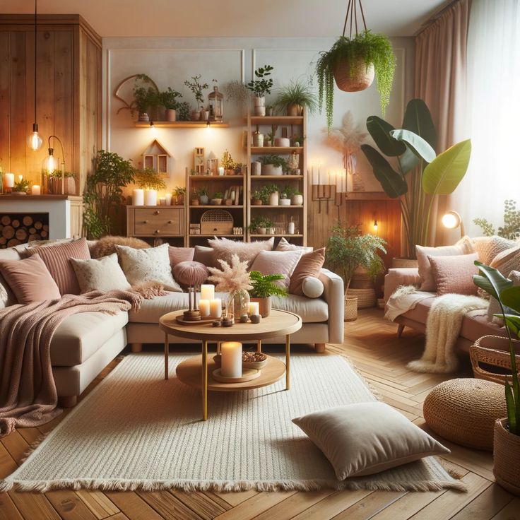
Call it Sensory Modernism. It’s a living room built around how it feels to touch, sit in, and move through, not just how it photographs. The idea borrows from a broader 2026 shift toward interiors that engage more than one sense at once. Form, color, and texture get handled with the same intention, instead of texture being an afterthought to a “clean” palette.
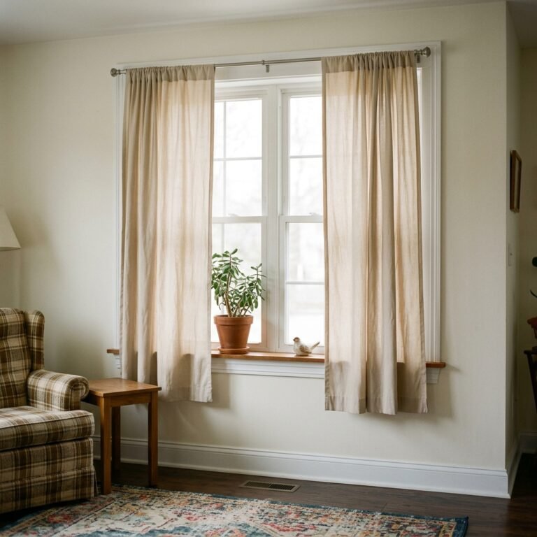
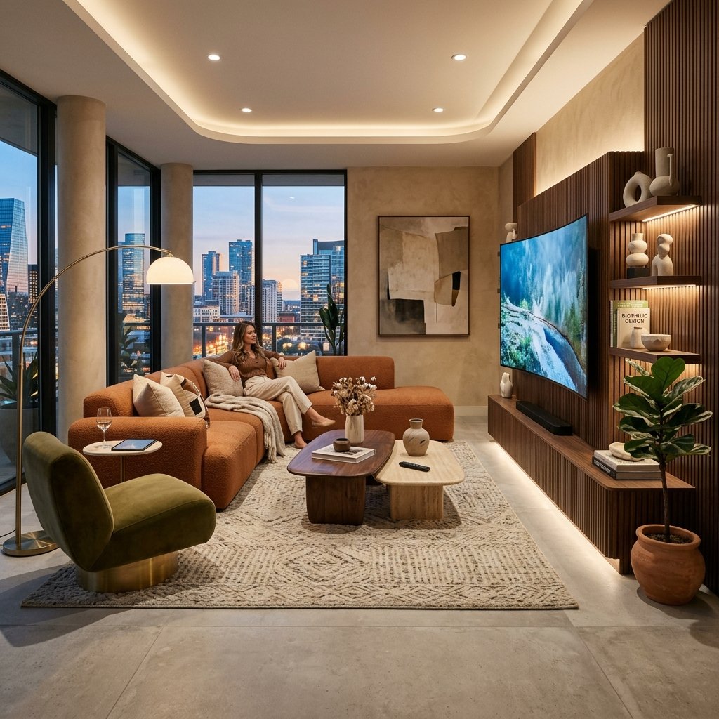
In practice, that means layering at least three distinct textures into every seating group. Start with a bouclé or mohair-upholstered sofa. Add a jute or wool rug underfoot. Frame the window in a linen or raw-silk drapery panel. Keep the palette warm rather than stark: toasted walnut, putty beige, soft clay, brushed brass. Avoid glossy, hard-edged surfaces at eye level, since they read cold under lamplight. Swap one overhead fixture for three layered light sources instead — a floor lamp, a table lamp, and a picture light — and set them all to warm 2700K bulbs. A thick rug pad or heavier drapery also helps soften the echo that open-plan rooms tend to have. If you already lean toward pared-back rooms, our minimalist living room decor ideas roundup goes deeper on keeping that look calm without going cold.
Sound matters as much as material here. Hard floors and bare walls bounce noise around a room. That’s part of why so many “clean” living rooms feel oddly tense to sit in. A rug pad of at least 7/16-inch thickness helps. So does floor-to-ceiling drapery, even on windows you rarely close. One upholstered piece per wall — a bench, a slipper chair, an ottoman — absorbs sound without adding visual clutter. If your living room shares space with a kitchen or entry, this detail is what makes the seating area feel like its own room instead of a hallway extension.

Grounded Organic Modern With Real Wood and Stone
Where Sensory Modernism is about touch, Grounded Organic Modern is about material honesty. Wood grain you can actually see. Stone with visible veining. Plaster with a hand-troweled texture instead of a flat, sprayed finish. This style is having a real moment in 2026, as homeowners move away from stark, overly curated rooms toward ones that feel connected to natural materials and craftsmanship.
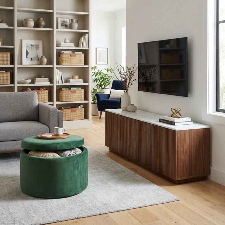
Anchor the room with white oak, walnut, or ash flooring or furniture. Then bring in one architectural wood moment: a fluted panel behind the sofa, a slatted room divider, or a beamed ceiling detail. Vertical fluting works especially well in rooms with ceilings under nine feet, since the lines pull the eye upward. Pair the wood with one honed, not polished, stone surface — a soapstone coffee table top or a marble-topped console both work. Skip small, fussy plants in favor of one or two large-leaf botanicals, like a fiddle-leaf fig or bird of paradise, that read as architecture rather than decoration. Matte, earthy paint colors — terracotta, sage, warm greige — support this look far better than bright whites, which flatten the texture you’re trying to show off.
Furniture silhouettes matter more than the number of pieces in this style. Look for sofas and chairs with visible, sculptural legs, not fully upholstered bases that hide the frame. A wood or cast-metal leg reads as furniture-making. A skirted base just reads as generic. Ceramic and hand-thrown pottery in irregular, slightly imperfect shapes fit better here than symmetrical, mass-produced vases, since the whole point of this style is visible craftsmanship over polish. Renting and can’t touch the walls? A single large mirror with a natural wood or rattan frame can stand in for that architectural wood moment with zero construction involved.

Composed Maximalism for Rooms With a Point of View
2026 is also the year “safe” neutral rooms start losing ground to spaces that actually look like someone lives there. Designers writing for Elle Decor have pointed to this shift directly. They describe living rooms that read as artful and highly intentional rather than simply styled, with pattern-on-pattern layering and personal collections taking center stage over blank, catalog-style rooms.
The trick to pulling this off without looking cluttered is composition, not restraint. Choose one “hero” art piece scaled to at least two-thirds the width of your sofa. Build the gallery wall around it with a consistent two-inch gap between frames, rather than a scattered salon hang. Limit yourself to two patterns in the room at a time — say, a striped rug and a floral throw pillow — and keep them in the same color family so they read as coordinated, not competing. Save bold, saturated colors like deep plum, storm blue, or saffron for one or two statement pieces, such as a lacquered side table or a single accent chair, rather than spreading them across every surface. This is a style built on editing, not accumulation. For every new piece you add, remove one that no longer earns its spot.
Collections are what separate Composed Maximalism from clutter, so group like with like instead of scattering objects around the room. A shelf of ceramics reads as curated. So does a cluster of framed family photos, or a run of hardcover books with their spines turned in for a uniform color. The same objects spread across five different surfaces just reads as mess. Keep one visual “quiet zone” in the room — usually the sofa upholstery or the largest rug — as a solid, neutral color, so the eye has somewhere to rest between the busier moments. That contrast between quiet and loud is what makes a maximalist room feel intentional instead of overwhelming.

Curated Vintage-Modern Mix for Character on a Budget
Rising furniture prices are pushing more homeowners toward vintage sourcing in 2026. Designers report the same pattern with their clients: buying one or two older pieces instead of a full new furniture set. It’s partly about cost, and partly because new furniture rarely has the character an older piece does straight off the showroom floor.
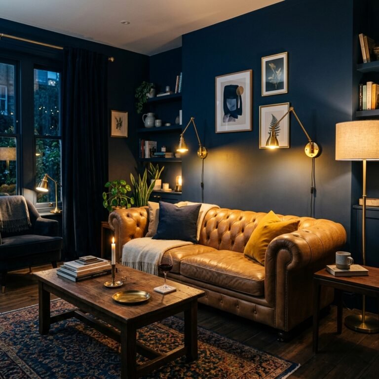
The easiest way to do this well is to pick a single vintage “anchor” piece per room. Think a mid-century credenza, a carved wood coffee table, or a worn leather armchair. Pair it with two or three clearly modern pieces around it, rather than mixing eras evenly throughout. Estate sales, consignment shops, and online marketplaces like Chairish or 1stDibs are reliable places to find a real piece, instead of a mass-produced “vintage-style” replica that tends to look flat next to genuinely aged materials. If the vintage piece has upholstery, budget for reupholstering it in a durable performance fabric. That single move updates the color story instantly while keeping the original frame and proportions that made it worth having in the first place. One true vintage anchor, cleaned up and reupholstered, does more for a room than five new “vintage-inspired” accessories.
When you’re shopping in person, check three things before buying. First, that drawers and doors still open smoothly. Second, that the wood frame isn’t cracked at the joints — cosmetic scuffs are fine and often add character, but structural cracks aren’t. Third, that the piece’s scale actually fits the space you measured, since vintage furniture often runs smaller than modern equivalents. Mixing metal finishes across eras is fine in this style specifically. A brass 1970s lamp next to a matte-black modern shelving unit reads as collected rather than clashing. It’s one of the few places in this guide where the “match your metals” rule can bend.

Salon-Style Social Layout for Rooms That Do More Than Face a TV
Living room layouts are also loosening up in 2026. They’re moving away from a single sofa-facing-TV arrangement toward rooms organized around conversation and activity zones, closer to a small salon than a screening room.
If your living room is 200 square feet or larger, aim for at least two distinct zones. One main seating cluster for conversation, and one secondary spot for something specific — a reading chair with its own lamp, a small game or drinks table, or a window bench. Float furniture at least 18 inches away from the walls to create a walking path around the room. Pushing every piece to the perimeter is what makes rooms feel like a waiting area rather than a place to linger. If the TV has to stay, treat it as one element among several, not the room’s obvious focal point. Mount it at seated eye height. Flank it with shelving so it reads as part of a built-in wall. Or use a sliding art panel to cover it when it’s off. Smaller living rooms can use this same zoning logic on a tighter footprint; our small living room layout ideas post has specific furniture-placement measurements for rooms under 200 square feet.
Rugs help define these zones without adding walls. Anchor the main seating cluster with a rug large enough for at least the front legs of every sofa and chair to sit on. Use a smaller, second rug to mark off the secondary zone — a reading chair or games table — so it reads as its own moment instead of an afterthought pushed into a corner. Lighting should shift with the zones too. Use brighter, more direct light over an activity spot like a desk or game table, and dimmer, warmer light over the conversation area. That contrast lets the room visually “switch modes” depending on which part of it you’re using.

Warm Tech-Minimalism for a Clean Room That Doesn’t Feel Cold
The last style answers a real complaint about the minimalist rooms of the past few years. Clean doesn’t have to mean sterile. Smart-home features don’t have to look like a showroom. Warm Tech-Minimalism keeps an edited, low-clutter footprint, but wraps the technology in the same warm materials as the rest of the room instead of leaving it visible and cold.
Set smart bulbs to a 2700–3000K warm white, rather than the cooler daylight tones many default to. Route lamp and TV cords through a cord channel or behind furniture legs, so nothing crosses open floor. If you keep a TV, look at frame-mode or art-lift mechanisms that hide the screen behind a printed panel when it’s off, so the wall reads as art rather than electronics. Consolidate charging into one multi-outlet smart plug per seating cluster, instead of a visible power strip and a tangle of cables. Choose furniture with soft, rounded edges and warm wood or leather finishes rather than glossy white or chrome, which is what tips this style into feeling cold. The goal is a room that’s easy to keep tidy without looking like a tech showroom.
Storage is what makes this style sustainable day to day. A closed cabinet or credenza for remotes, chargers, and controllers keeps surfaces clear without banning technology from the room outright. A single woven or leather basket by the sofa is enough to catch blankets and stray items before they pile up. Resist the urge to leave surfaces completely bare, though. A stack of two or three books and one textured object — a ceramic bowl, a small plant — on the coffee table is the difference between a room that looks calm and one that looks unfinished.
How to Mix Two of These Styles Without It Looking Chaotic
Few real living rooms commit to exactly one style, and you don’t have to either. Say you want to blend Grounded Organic Modern with a little Composed Maximalism. Pick one style to govern your large, expensive pieces — the sofa, rug, and coffee table. Let the second style live in smaller, swappable layers instead, like pillows, art, and lamps. Stick to one dominant metal finish throughout the room, whether that’s brushed brass or matte black, rather than mixing several. Inconsistent hardware finishes are one of the fastest ways to make a coordinated room look accidental. Finally, repeat at least one material — a specific wood tone, a stone color, or a fabric texture — between the two styles. That gives your eye something consistent to land on as it moves around the room. Once you’ve settled on a direction, our guide to choosing a living room color palette walks through matching paint and fabric colors to whichever style, or combination, you land on.
Final Thoughts: Choosing Your 2026 Living Room Style
If you want calm and tactile, start with Sensory Modernism. If you have good natural light and love visible wood grain, go Grounded Organic Modern. If you’re tired of playing it safe, Composed Maximalism gives you permission to commit to color and art. If budget is the main constraint, one well-chosen vintage anchor piece will do more than a full new furniture set. If your living room has to work as an office, a hangout, and a guest space, plan it in zones rather than around one TV wall. And if you love a clean room but not a cold one, Warm Tech-Minimalism keeps things simple without losing warmth. The best 2026 living rooms aren’t defined by a single trend. They’re defined by choosing a direction on purpose and following it through in the details.