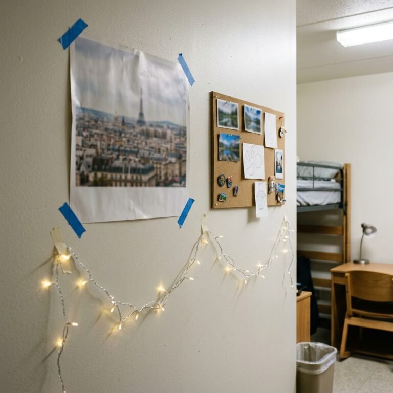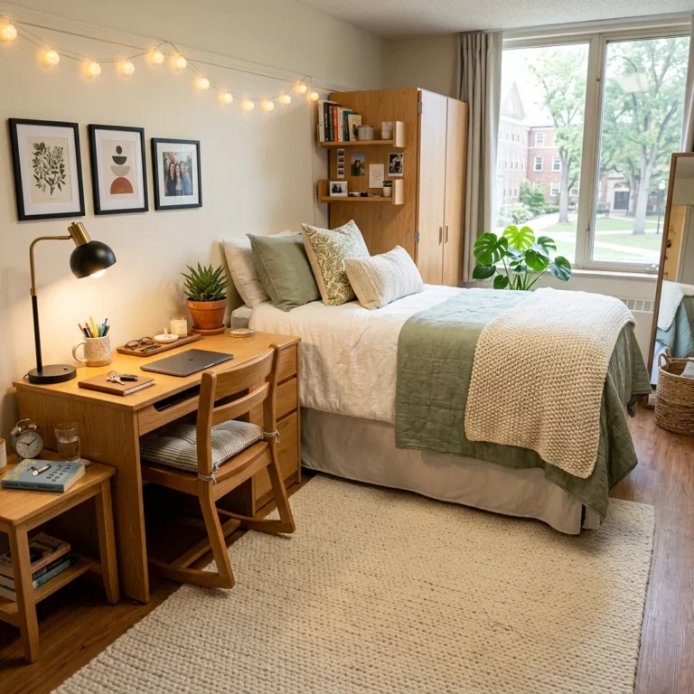
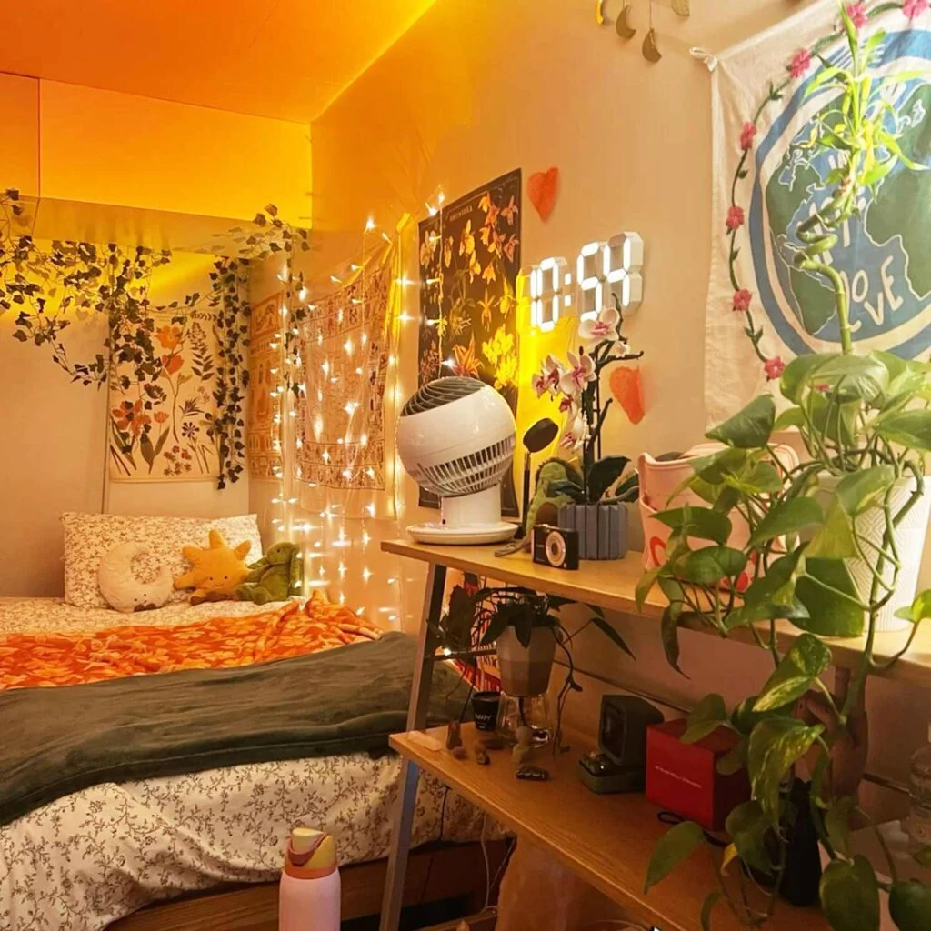
Dorm rooms come with a built-in problem: you can’t paint the walls, you can’t knock anything down, and you’re usually working with under 150 square feet shared with another person. So when Pinterest shows you a gorgeous color palette, the real question isn’t “do I like this?” It’s “can I actually build this with command strips, bedding, and a mini fridge in the way?” That’s the gap this guide is built to close.
Color experts at Benjamin Moore point out that cool, airy tones like soft blues and crisp whites tend to work best in small spaces because they visually recede, making a room feel more open. In a dorm, you can’t repaint to test that theory, but you can borrow the same logic through bedding, curtains, and rugs instead of a paint can. Below are 18 dorm room color schemes, each built around specific, shoppable pieces rather than vague “add some color” advice, so you know exactly what to buy and where to put it.
Soft Beige and Warm White (Minimal Cozy Aesthetic)
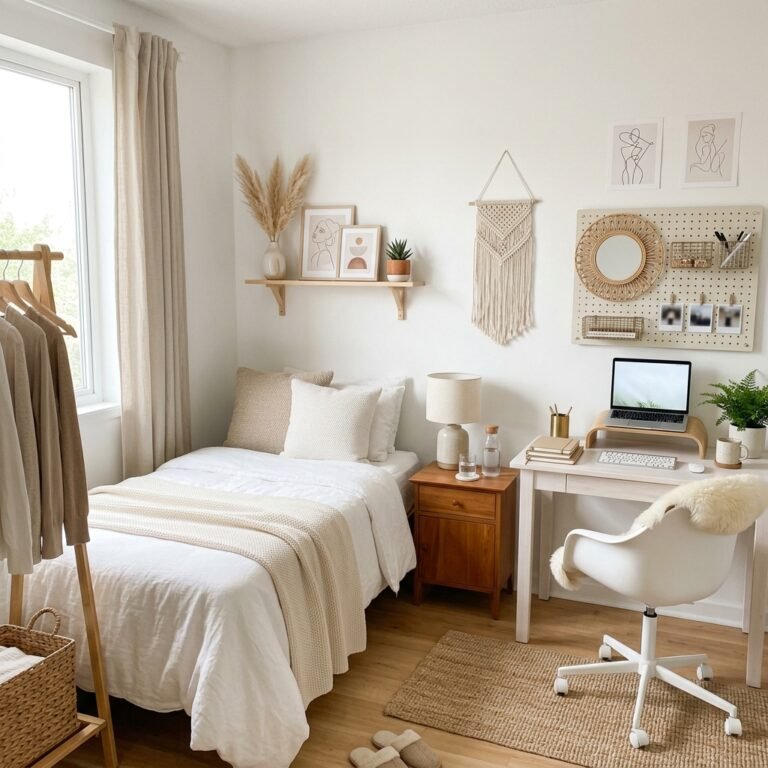
Soft beige and warm white make a small dorm room feel open and calm without looking sterile. Beige adds warmth; white bounces the little natural light most dorms get. Because neither color reads as “dorm carpet beige,” the pairing photographs well and doesn’t fight with the mismatched furniture most dorms come with.
Build it with a white waffle-knit duvet, then layer in a taupe or oatmeal throw and two linen pillow covers. Swap the standard-issue lamp for one with a linen shade to keep the light warm instead of clinical. Command-strip a few abstract line-art prints in a 3-piece cluster above the desk rather than one large canvas, since large frames are harder to level on cinderblock walls. A $12 set of fairy lights along the headboard finishes the look for under $60 total.
Blush Pink and Grey (Soft Feminine Balance)
Blush pink paired with grey keeps a room feeling soft without tipping into “little kid’s room.” Grey does the heavy lifting as the neutral base, while blush shows up only in accents, so the palette reads mature even in a small shared space.
Start with a grey jersey or waffle bedspread, then add two or three blush velvet lumbar pillows and a folded throw at the foot of the bed. A round brass or gold-toned mirror above the desk reflects light and ties in a metallic without adding another full color. Keep wall art to one grey-and-blush abstract print rather than a full gallery wall, since visual clutter reads as messy fast in 120 square feet.

Sage Green and Cream (Nature-Inspired Calm)
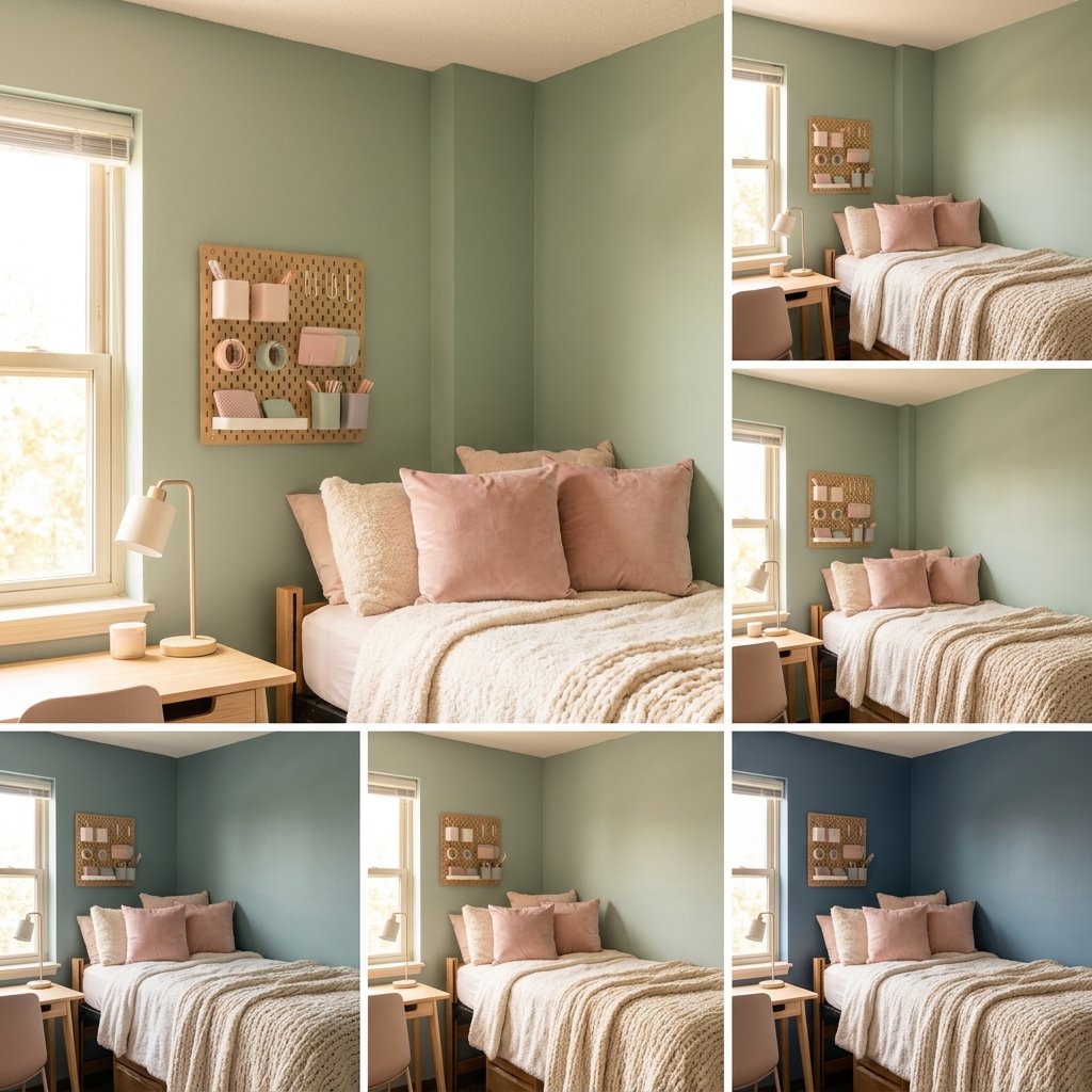
Sage green next to cream gives a dorm room the grounding, outdoorsy feel that’s hard to fake in a windowless building. Sage reads as muted rather than bright, which keeps the room feeling calm even under fluorescent overhead lighting.
Use a cream duvet as your base, then bring in sage through a knit pillow cover and a woven basket for storage. Real or faux plants matter here more than in most schemes — a pothos on a bookshelf or a small snake plant on the windowsill sells the “nature-inspired” part of the palette in a way fabric alone can’t. A rattan mirror or wall basket adds texture without needing wall paint or wallpaper.

Navy Blue and White (Clean and Sophisticated)
Navy and white reads more like a boutique hotel room than a dorm, which is exactly why it’s a popular request from students who share with a roommate and want the space to feel intentional rather than thrown together.
Keep white as roughly 70% of the room — walls, desk, storage bins — and use navy for the duvet cover or a pair of curtains hung on a tension rod. Silver or brushed-nickel desk accessories (a pencil cup, a picture frame) tie the metal tones together. Because navy is a deep, saturated color, one navy accent wall made from peel-and-stick paper does more visual work than scattering navy across five small items.

Lavender and White (Dreamy Study-Friendly Aesthetic)
Lavender and white work well for students who want a room that feels calm during finals week without going full pastel-overload. Lavender has enough grey in it to avoid feeling like a nursery, and white keeps a small room from feeling closed in.
Layer a lavender knit throw over white sheets, then add two pastel-toned photo clips or a string-light photo display above the desk instead of framed art — it’s renter-friendly and easy to update each semester. A soft-white LED bulb (around 2700K, the same warm-white range interior colorists recommend for cozy spaces) keeps the lavender from looking cold at night. For more no-paint wall styling ideas that won’t get flagged at move-out inspection, see our guide to the most common dorm wall decor mistake.

Black, White and Wood (Modern Minimal Dorm)
Black, white, and wood is the closest thing to a “safe bold” scheme on this list — it reads modern and edited without relying on a trend color that might feel dated by graduation. Wood tones keep the black-and-white base from feeling stark under dorm lighting.
Use white for bedding, black for one accent (a desk lamp, a frame, a small trash can), and let a light-wood shelf or crate do the warming work. Two frames maximum per wall keeps the palette from tipping into busy — this scheme fails fast when students add too many small black accessories at once.

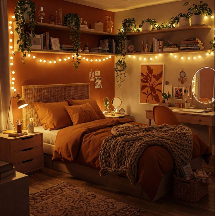
Terracotta and Cream (Warm Earthy Aesthetic)
Terracotta and cream give a dorm room a Mediterranean, sun-warmed feel that stands out from the cooler pastels most students default to. Terracotta reads as mature rather than “college dorm,” which is why it’s become a common request for upperclassmen redecorating a second or third dorm room.
Cream should cover the largest surfaces — sheets, a rug if allowed, curtains — with terracotta layered in through a woven pillow cover and a small ceramic planter or vase. Linen and jute textures (a woven placemat used as a desk mat, for example) do more to sell “earthy” than color alone. Warm-toned bulbs, not daylight-toned ones, keep the terracotta from looking muddy at night.

Dusty Blue and Soft Grey (Calm and Focused Space)
Dusty blue and soft grey is one of the better schemes for students who study in their room, since both colors are muted enough to avoid visual fatigue during long sessions at the desk.
Dusty blue works best on bedding or a single curtain panel, with grey handling smaller items like a desk organizer or rug. Because both colors are low-saturation, add one white accent — a lamp base or picture frame — so the room doesn’t read as flat or dim under overhead fluorescents. A desk lamp with a 3000K bulb keeps the blue from turning cold in the evening.

Olive Green and Beige (Modern Natural Dorm)
Olive green and beige is a deeper, moodier cousin of the sage-and-cream scheme above, better suited to students who want a natural palette without it reading as soft or pastel. Olive holds up visually in rooms with limited natural light in a way pale sage sometimes doesn’t.
Anchor the bed in olive — a duvet or a large throw — and use beige for rugs, curtains, or a desk chair cover. Wood furniture (even a temporary bed riser or nightstand) reinforces the natural feel. Keep wall art neutral-toned so olive and beige stay the visual focus instead of competing with a busy print.

Chocolate Brown and Cream (Cozy Luxury Feel)
Chocolate brown and cream is having a genuine comeback beyond dorm decor — the same warm-neutral trend showing up in interior design coverage this year — and it translates well to small spaces because brown reads as rich rather than dark when it’s balanced against a lighter cream base.
Use cream for the majority of the room and bring in chocolate brown through a boucle or velvet throw pillow and a folded blanket. Avoid brown bedspreads as the dominant piece; a full brown duvet in a small room with limited light can read heavy rather than cozy. Warm-white string lights, not cool-white, keep the palette feeling indulgent instead of dim.

Peach and White (Fresh and Cheerful Aesthetic)
Peach and white gives a dorm room a bright, upbeat feel without the sugary quality that can come with pastel pink. Peach sits warmer on the color wheel, so it holds up better under the yellow-toned overhead lighting common in older dorm buildings.
Keep large surfaces white — bedding, desk, storage bins — and add peach through two or three accent pillows or a single curtain panel. A woven or rattan basket in a warm tone bridges the peach and white without introducing a third competing color. This scheme works especially well in south- or west-facing rooms that already get warm afternoon light.

Grey and Yellow (Modern Energy Boost)
Grey and yellow is one of the higher-energy schemes on this list, best suited to a room that gets decent natural light — in a dim, north-facing dorm, too much grey can flatten the room instead of balancing it.
Use grey for the bedding base and rug, then keep yellow to true accents: a desk lamp shade, one throw pillow, a mug or small storage bin. Because yellow is high-visibility, one or two touches read as “energetic,” while four or five start to feel busy fast. Pair with a cool-white bulb rather than warm-white, since warm bulbs can shift yellow toward a muddier gold.

Mocha Brown and White (Trending Neutral)
Mocha brown and white has become one of the most requested neutral pairings in dorm styling searches this year, likely because it reads as calm and put-together without needing much beyond bedding and one or two accessories to pull off.
White should form the base — sheets, walls, storage — with mocha brought in through a throw pillow, a folded blanket, or a woven rug if your building allows one. Wooden or beige-toned accents (a desk organizer, a picture frame) round out the earthy feel. Because this palette is so neutral, it also transitions well if you want to add a seasonal accent color without a full redecorate.
Black and Beige (Soft Contrast Aesthetic)
Black and beige softens the usual black-and-white contrast into something warmer and less stark, which matters in a small room where high contrast can feel visually loud fast.
Beige should dominate — bedding, rug, curtains — with black kept to small, deliberate accents: a picture frame, a desk lamp, a trash can. Avoid black furniture as a base piece in a small dorm, since large black surfaces can make an already-small room feel smaller. Clean-lined, simple pieces work better here than anything textured or busy.

Teal and Gold (Bold Luxe Dorm Style)
Teal and gold is the most saturated pairing on this list, and it works because gold acts as a neutral metallic rather than a full second color — it reflects light instead of competing with the teal for attention.
Use teal for the duvet or a curtain panel, then add gold through a mirror frame, desk lamp, or small tray for jewelry and keys. Keep everything else — walls, storage, rug — in a plain neutral so the teal and gold have room to stand out. This scheme reads more expensive than it costs, since one teal textile and two gold accessories usually do the whole job.

Pastel Rainbow and White (Creative Student Aesthetic)
Pastel rainbow and white suits students who want to display personality through color rather than posters or prints, and it’s a common choice among art and design majors decorating a shared space.
White walls and bedding keep the base calm, while pastel shows up through a gallery of small prints, a set of colored desk organizers, or a patchwork throw. The key to keeping this scheme from looking chaotic is sticking to one pastel “family” — say, cotton-candy tones — rather than mixing every pastel shade available. Limit pattern to one item (a rug or a throw) so the color does the visual work instead of competing prints.

Charcoal Grey and Soft Pink (Moody Yet Soft)
Charcoal grey and soft pink balances a darker, moodier base with a color known for feeling gentle, which keeps the scheme from reading as cold or unwelcoming in a small room.
Charcoal works well on a duvet or an accent rug, with soft pink layered through pillows or a small wall print. Because charcoal absorbs light, add at least one warm-white lamp so the room doesn’t feel dim after sunset — this is the one scheme on the list where lighting matters as much as the textiles themselves. A pink-toned photo string or fairy lights adds a soft glow without needing an extra lamp.

White, Wood and Green (Timeless Dorm Aesthetic)
White, wood, and green is the most adaptable scheme on this list — it works in nearly any dorm layout, lighting condition, or roommate arrangement, since none of the three elements is a bold or trend-dependent color choice.
White covers bedding and storage, wood shows up through furniture, crates, or a bed tray, and green comes from real or faux plants rather than fabric. A small pothos, snake plant, or trailing ivy on a shelf does more for this scheme than any green textile would. Because the palette leans neutral, it’s also the easiest of the 18 to keep looking put-together for a full school year without a refresh. If you want more low-cost, no-paint styling ideas beyond color palettes, our roundup of minimal and aesthetic dorm room ideas is a good next stop.
Choosing the Right Scheme for Your Dorm
Before you commit to a palette, factor in two things most Pinterest boards skip: your room’s natural light and your building’s decor rules. A north-facing room with one small window will read differently in dusty blue than a south-facing room flooded with afternoon sun — the same color can feel calm in one room and dim in the other. Check your housing handbook, too; some buildings restrict command strips, string lights, or anything resembling paint, which is why every scheme above leans on bedding, textiles, and small accessories rather than wall treatments you can’t take back.
Whichever combination you land on, start with one or two pieces — a duvet cover and a throw pillow — before buying the full set. It’s the fastest way to confirm a color works with your room’s actual light before you’ve spent your whole decorating budget on it.