
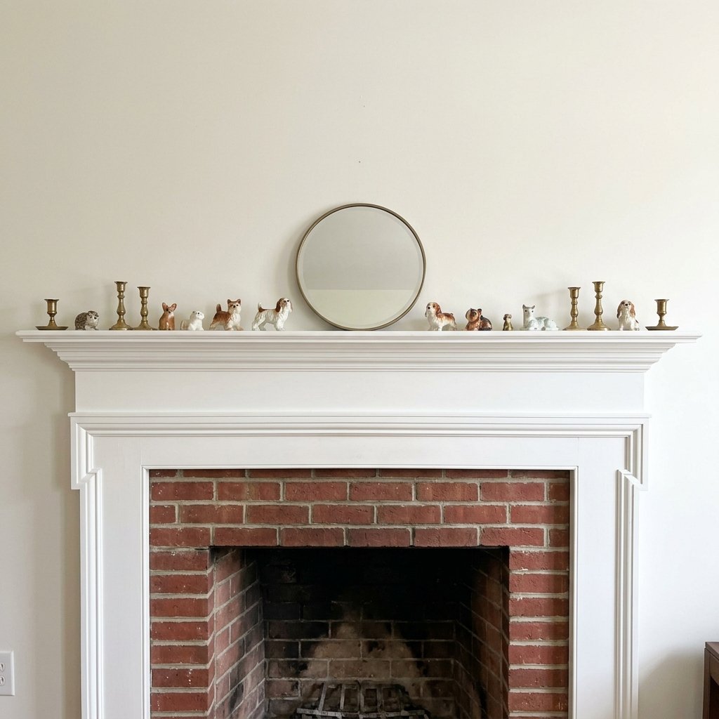
You’ve got candles. You’ve got a vase. Maybe a little greenery, a couple of frames, the works. Everything is clean, everything matches your color scheme, and yet somehow the mantel still looks like it’s missing a step.
If you’ve stood in your living room squinting at your fireplace wondering what’s wrong, you’re definitely not the only one. This is one of the most common styling frustrations out there, and it usually has nothing to do with your taste or your decor pieces. It’s about how those pieces are arranged.
Let’s look at what this actually looks like in real life before getting into why it happens.
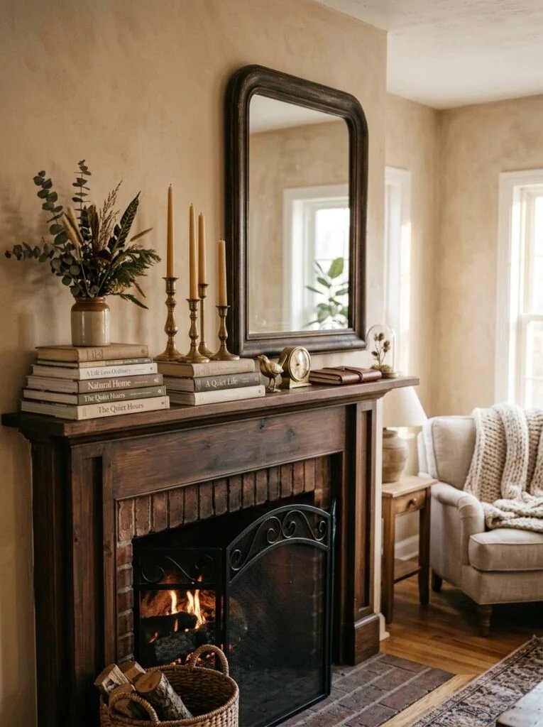
Two Mantels, Same Problem
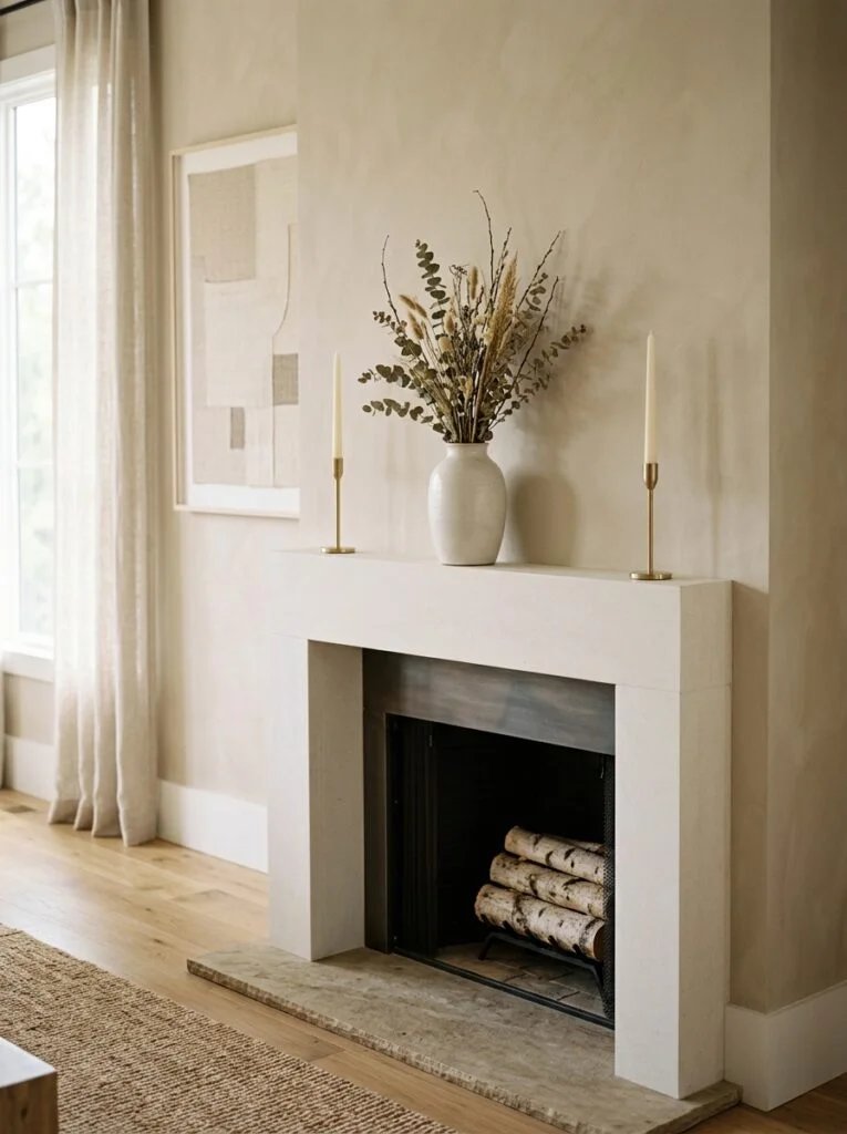
Picture mantel number one. There’s a candle on the left, a candle on the right, and a small vase dead center. Each one sits at roughly the same height, evenly spaced, almost like they were placed with a ruler. It’s tidy. It’s symmetrical. It also looks like a shelf at a home goods store rather than a styled corner of someone’s actual living room.
Now picture mantel number two. This one has a framed print propped in the middle, flanked by two matching lanterns, one on each side, spaced an equal distance from the frame. Neat, balanced, and still somehow flat. Something about it reads as unfinished even though nothing is technically wrong with it.
Different objects, different styles, same underlying issue. Once you see it, it’s hard to unsee.
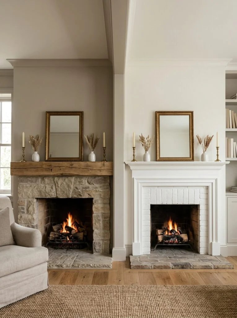
The Common Denominator
In both of those examples, everything sits at almost exactly the same height, and everything is spaced with the kind of perfect evenness you’d expect from a museum display case. There’s no layering, no variation, nothing that draws your eye up and down or forward and back.
That’s the mistake. Styling a mantel like it’s a symmetrical shelf instead of a layered vignette is what makes it look unfinished, even when every individual piece on it is genuinely nice.
Our brains read perfectly even spacing and matching heights as static. Nothing feels alive or intentional about it, because nothing is doing any visual work. It’s just objects, present in a row.
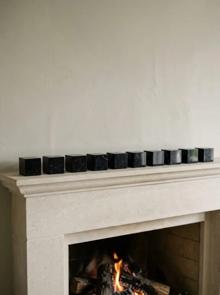
Why We Default to This Anyway
Honestly, it makes sense that people fall into this pattern. Symmetry feels safe. If you put a candle on one side, your instinct says to balance it with something identical on the other side. It feels orderly, and orderly feels correct.
The problem is that a fireplace mantel isn’t meant to function like a matched pair of bookends. It’s meant to be a focal point, and focal points need a little visual tension to actually hold your attention. Perfect symmetry, ironically, tends to make people’s eyes slide right past it.
This doesn’t mean symmetry is always wrong. It just means it needs to be balanced with layering and height variation, or the whole thing reads as flat no matter how nice the individual pieces are.
The Fix, In Simple Terms
Here’s the good news. Fixing this doesn’t require buying new decor. It’s almost entirely about rearranging what you already have.
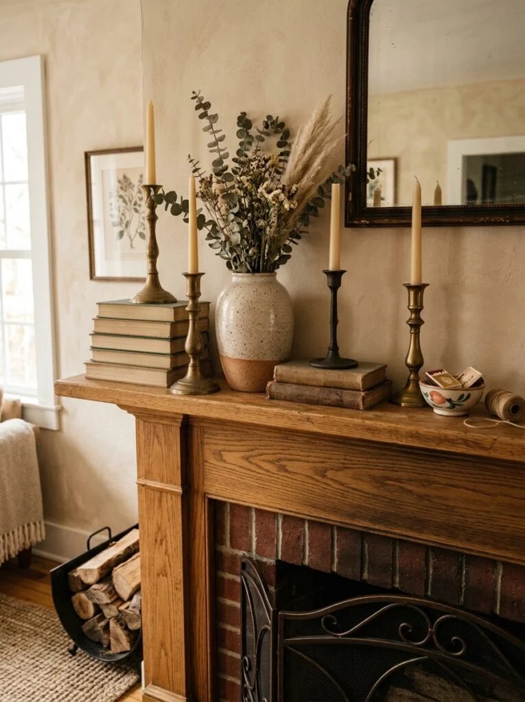
- Vary the heights. Use a mix of tall, medium, and short pieces instead of everything sitting at roughly the same level.
- Layer front to back. Place a taller item slightly behind a shorter one so they overlap a little, rather than lining everything up in a single row.
- Work in odd numbers where you can. Groupings of three tend to feel more natural and less rigid than pairs.
- Break perfect symmetry on purpose. If you have a large piece in the center, let one side be a little busier or taller than the other instead of mirroring it exactly.
- Leave some negative space. Not every inch needs to be filled. A little breathing room actually makes the styled areas look more intentional.
None of this is complicated, but it does take a bit of trial and error to get the balance right for your specific mantel and decor style.
Building the Layers, Step by Step
If you’re staring at your mantel right now trying to figure out where to even begin, here’s a simple order that tends to work well.
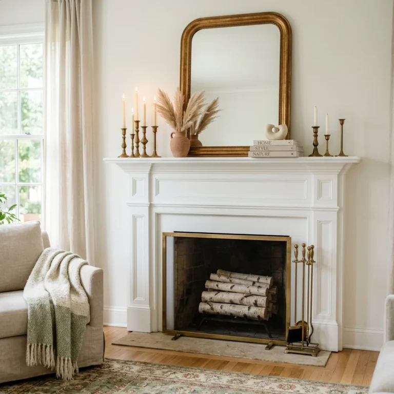
Start with your largest piece first. This is usually a piece of art, a mirror, or a large decorative object, and it typically goes slightly off center rather than dead in the middle. This becomes your anchor, and everything else gets arranged around it.
Next, add your tallest supporting item. This might be a tall vase, a stack of books, or a candlestick. Place it near the anchor piece but not directly beside it in a perfectly even line. A little overlap with the anchor piece actually helps the layering feel more natural.
Then bring in your medium height pieces. This is where a lot of the visual interest happens, since these items bridge the gap between your tall anchor pieces and whatever sits low and small at the very front.
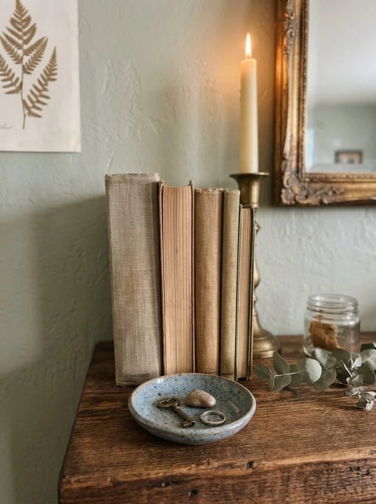
Finally, add small details in front. Little items like a bud vase, a small stack of books, or a candle in a low holder go toward the front of the mantel, partially overlapping the taller pieces behind them. This front layer is what gives a mantel that finished, styled look instead of a lined-up display.
Step back after each addition and actually look at it from across the room, not just up close. A lot of styling issues are only obvious from a normal viewing distance.
Don’t Forget What’s Above the Mantel
A styled mantel top only does half the job. What’s hanging above it matters just as much, and it’s often the piece that ties the whole thing together.
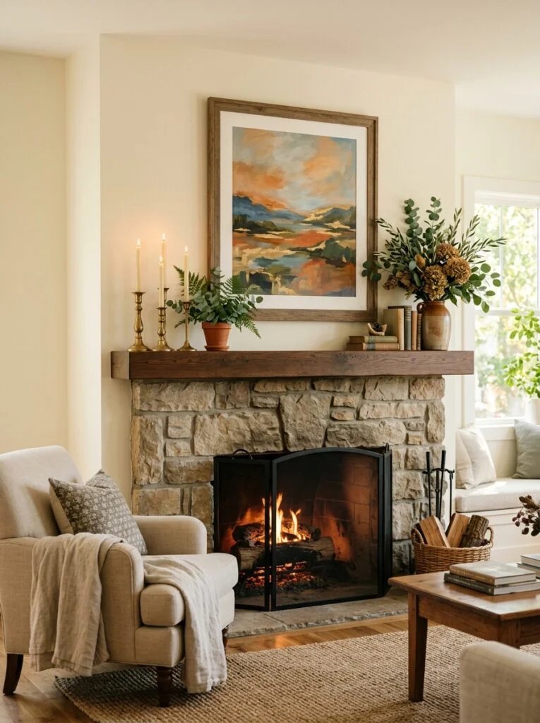
A single large piece of art or a mirror centered slightly above the mantel gives the eye somewhere to land before it moves down into the smaller styled details. Without it, even a beautifully arranged mantel top can feel like it’s floating with nothing to anchor it visually.
If you’re working with an especially wide mantel, a grouping of two or three smaller frames can work in place of one large piece, as long as they’re hung with consistent spacing so they read as a single unit rather than scattered pieces.
This same principle of using one grounding element and building layers around it shows up constantly in interior styling. If you want to see it applied outside of fireplaces, this guide on styling open shelves like a designer covers a lot of the same layering logic, just applied to bookshelves and floating shelves instead.
A Quick Before and After
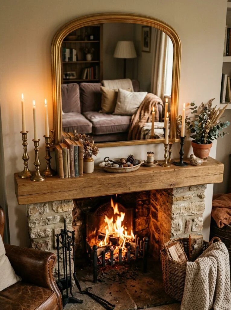
A reader once sent me a photo of her living room, frustrated that her mantel looked plain despite spending real money on decor. She had a large mirror centered above it, two matching brass candlesticks placed evenly on either side, and a small potted plant dead center between them.
The pieces themselves were genuinely nice. The problem was purely arrangement. Everything sat at almost the same height, evenly spaced, mirroring itself perfectly on both sides.
We moved one candlestick slightly behind a small stack of books, let the plant sit slightly off center instead of directly in the middle, and added a low, wide dish in front holding a few small trinkets. Nothing new was purchased. The mantel instantly looked more layered and considerably more finished, just from shifting height and spacing.
Common Mistakes Beyond the Symmetry Trap
The straight line, same height issue is the biggest one, but a few other habits tend to show up alongside it.
Choosing decor that’s too small for the mantel. A tiny vase and a small frame on a long, wide mantel look lost, no matter how well they’re arranged. Scale matters as much as arrangement.
Ignoring the hearth below. An empty hearth area under a beautifully styled mantel can make the whole setup feel top heavy. A stack of firewood, a large basket, or a few oversized candles at the base balances things out visually.
Overcrowding every available inch. More isn’t automatically better. A mantel packed edge to edge with no breathing room can look just as unfinished as one that’s too sparse, just for the opposite reason.
Matching everything too closely. A little variation in texture, material, or finish, like mixing wood with metal or matte with glossy, adds depth. When everything matches too perfectly, it can flatten the whole look the same way even spacing does.
Matching Decor to Your Fireplace’s Style
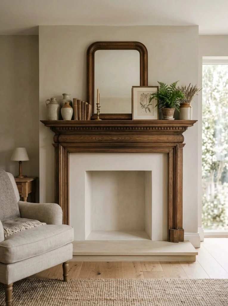
One thing worth mentioning briefly is that the layering principle works regardless of what your fireplace itself looks like, but the decor style you choose to layer with should still feel like it belongs.
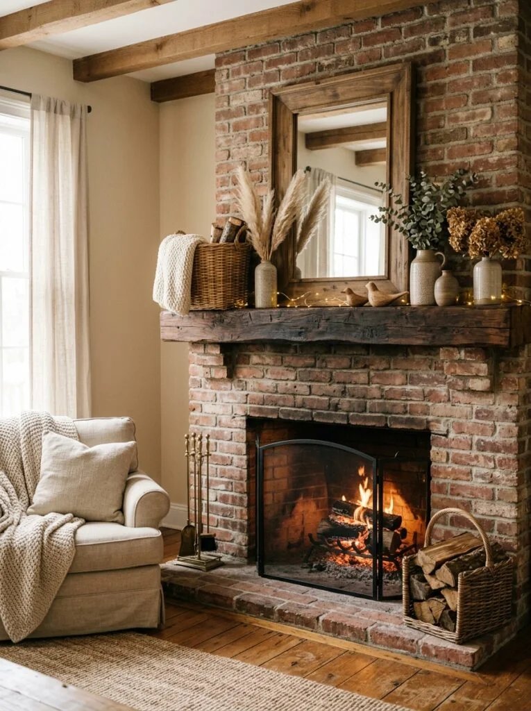
A rustic brick fireplace tends to suit warmer materials like wood, wicker, and aged metal finishes. Sleek glossy decor can look a little out of place against that kind of texture, even if the arrangement itself is technically well layered.
A modern painted or tiled fireplace, on the other hand, usually handles cleaner lines and a mix of matte and glossy finishes well, since the surrounding surface is already fairly simple.
This isn’t a hard rule, and plenty of eclectic spaces mix textures intentionally. But if a mantel still feels slightly off after fixing the height and spacing issues, it’s worth checking whether the materials themselves feel connected to the fireplace surround, not just to each other.
Practical Tips for Getting It Right the First Time
A few small habits make the whole process easier and less frustrating.
- Gather more decor items than you think you’ll need and edit down, rather than starting with too few and trying to stretch them across the space.
- Take a photo of your arrangement on your phone. Photos flatten a space the way a first glance from across the room does, and they make uneven spacing or awkward gaps much easier to spot.
- Rearrange in the daylight if possible. Warm evening lighting can hide styling issues that become obvious the next morning.
- Don’t be afraid to leave one side slightly more open than the other. A mantel doesn’t need to mirror itself to feel balanced.

Adjusting the Arrangement Through the Seasons
One nice thing about this layering approach is that it holds up no matter what you’re swapping in and out throughout the year. The specific pieces change, but the underlying structure stays the same.
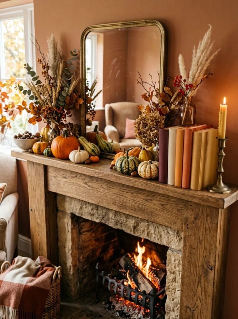
For fall, a lot of people like swapping in a few pumpkins or gourds of varying sizes, mixed with dried florals or a small stack of warm-toned books. The trick is still the same one from earlier: keep the heights varied and let a few pieces overlap instead of lining everything up along the edge.
Around the holidays, garland is the piece that tends to trip people up. Draping it in one perfectly even line across the mantel, with no dips or variation, ends up looking a lot like the same flat row problem discussed earlier, just in greenery form. Letting it swag slightly with a bit of natural dip, then layering ornaments or small lanterns along the top, keeps the same sense of depth going even with a completely different set of decor.
In spring and summer, when a lot of people lean toward lighter, airier styling, the temptation is to declutter the mantel down to almost nothing. A little minimalism is fine, but even a pared back arrangement benefits from one tall piece, like a simple vase of branches or fresh flowers, paired with one or two smaller grounding items so it doesn’t feel like an afterthought.
The point isn’t to remember a different set of rules every season. It’s that the height variation and layering habit, once it clicks, works with whatever decor you happen to be rotating through.
FAQs
Does a mantel need to be symmetrical to look good?
No, and in most cases a little asymmetry actually looks more finished than a perfectly mirrored arrangement. Balance matters more than exact symmetry.
How many items should go on a mantel?
There’s no fixed number, but working in odd groupings, like three or five pieces total including your anchor item, tends to look more natural than an even count.
What’s the easiest way to fix a mantel that already looks flat?
Start by varying the heights of what you already have and adding one layered element toward the front. Often that alone makes a noticeable difference without adding anything new.
Should I hang something above the mantel even if I like the fireplace as is?
It’s not required, but an empty wall above a mantel often makes the styled top feel unanchored. Even a simple piece of art or a mirror helps tie the whole area together.
Does the size of my decor need to match the size of my mantel?
Yes, to an extent. A long, wide mantel needs pieces with enough visual weight to fill the space, while a smaller mantel can feel overwhelmed by oversized decor. Matching scale to your mantel size makes a big difference.
Final Thoughts
If your mantel has always felt slightly off despite having nice pieces on it, there’s a good chance the arrangement, not the decor itself, is the actual issue. Straight lines and matching heights feel safe, but they’re exactly what makes a mantel look more like a display shelf than a styled focal point.
Try varying the heights, layering a few pieces front to back, and letting go of perfect symmetry just slightly. It takes maybe fifteen minutes to rearrange what you already own, and it’s often the difference between a mantel that looks fine and one that actually looks finished.


2 comments