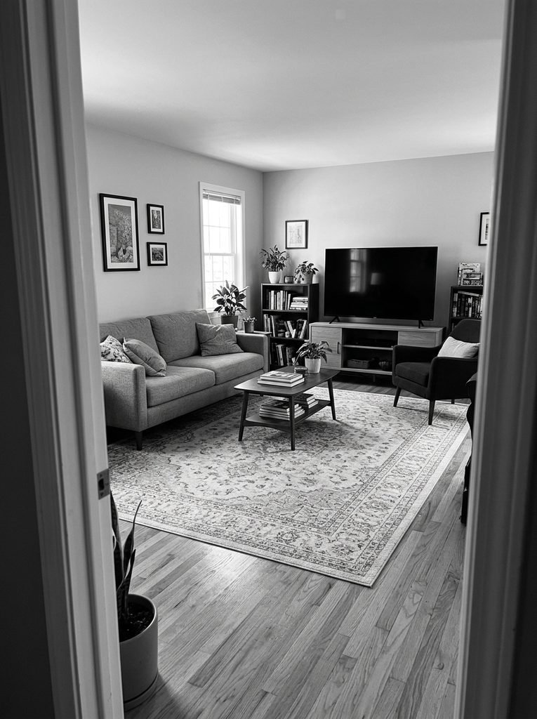
Take a photo of your living room tonight. Stand in the doorway, hold the phone at chest height, and switch the camera to its Mono or Noir filter.
Now look at what came back. The walls, sofa, rug, and curtains have probably melted into one soft gray band. In person, the beige, oatmeal, and cream still look calm and pleasant. In black and white, nothing separates from anything else. The only dark shape in the frame is the TV.
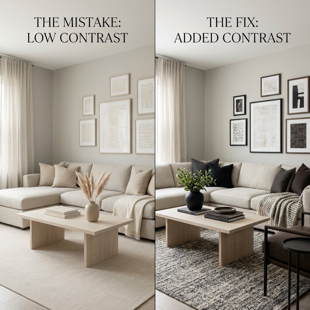
That is the low-contrast mistake. You picked neutral colors, which is a good start. But you also picked neutrals of nearly the same lightness, and lightness is what gives a room its edges, depth, and weight. Without bold color to lean on, it is the only thing left doing that job.
This guide covers why the mistake happens, how to spot it with your phone, and four fixes that range from a quart of paint to a new rug. None of them require adding color.
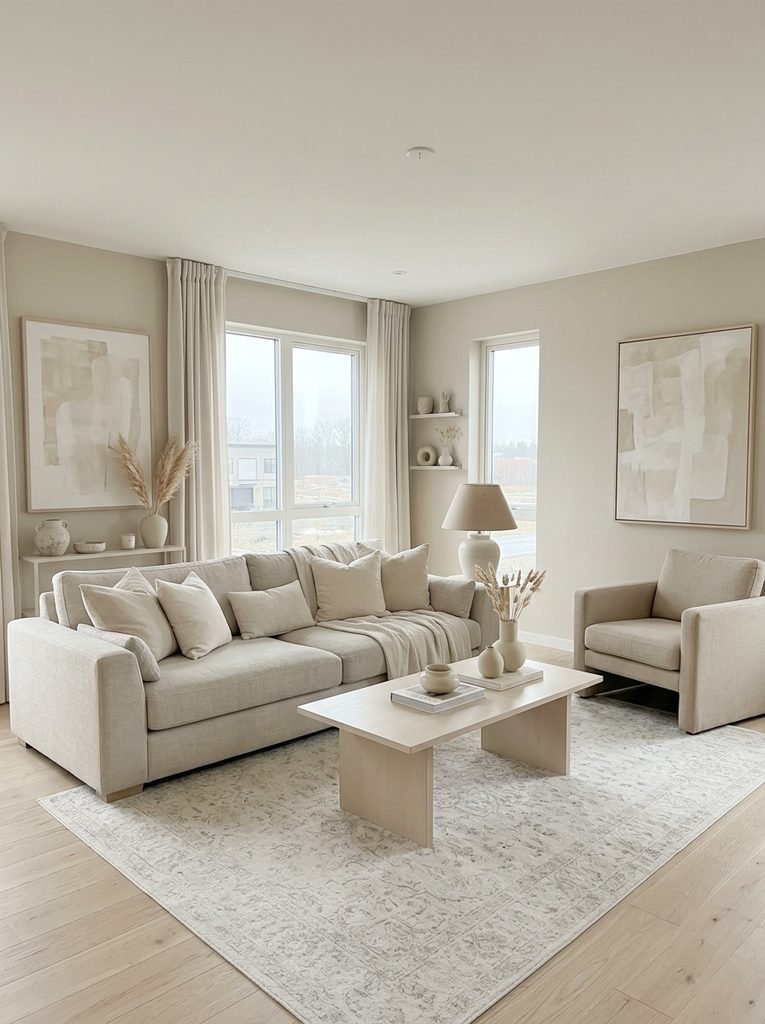
How a Room Ends Up Flat
Nobody sets out to build a flat room. It happens one reasonable purchase at a time.
You choose a greige paint because it feels safe. You buy a cream sofa because it won’t go out of style. The rug arrives in oatmeal because it goes with everything. Each choice makes sense alone, and each one lands in the same pale middle. Together they leave no dark note at all.
Online shopping widens the gap. Retail photos are often shot in bright, even light, which makes mid-tone fabrics look lighter on screen. The real sofa arrives looking deeper than expected, so the next purchase drifts paler to compensate. Meanwhile the TV, which you never chose for its color, quietly becomes the darkest object in the room.
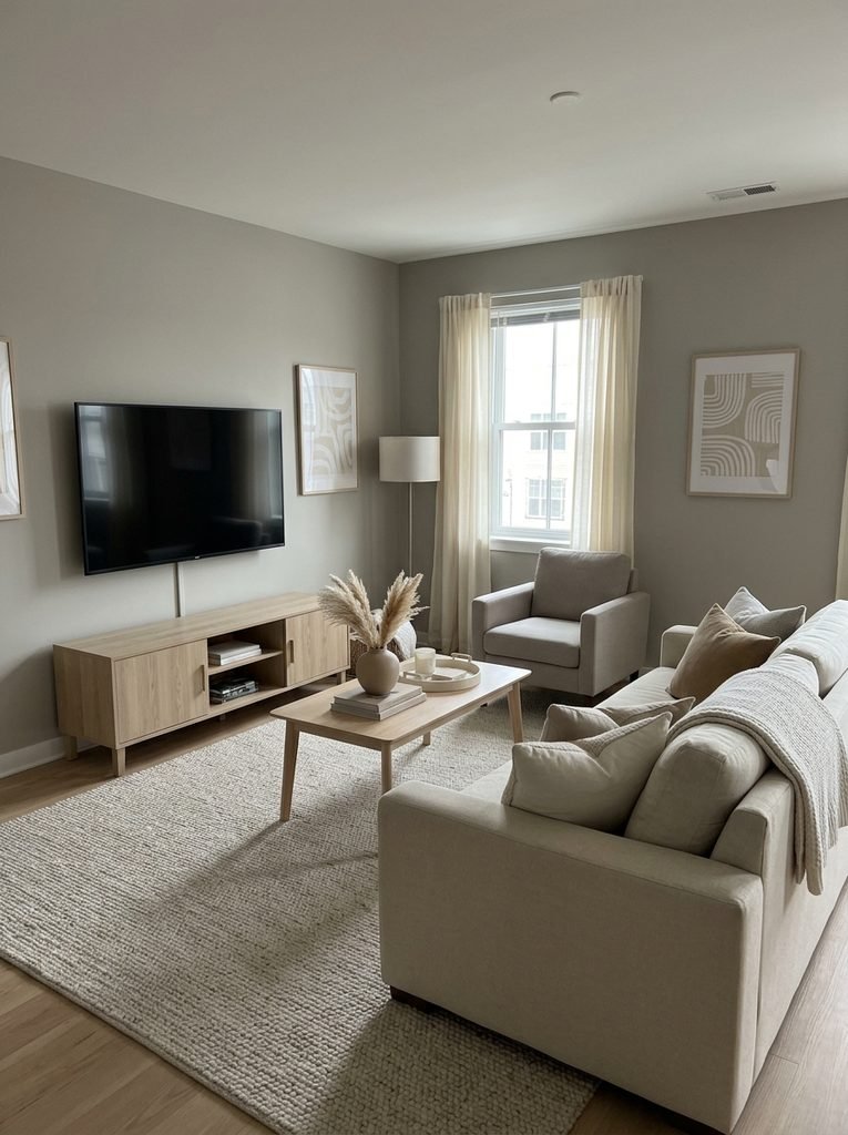
Why Matching Lightness Flattens a Neutral Room
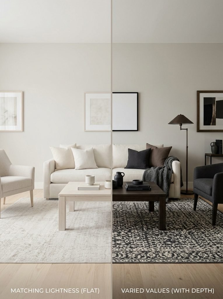
Designers separate two things most of us lump together. Hue is the color family: beige, taupe, gray. Value is how light or dark that color is. A cream sofa and a mocha sofa share a hue family, yet they look nothing alike because their values sit far apart.
In a colorful room, hue contrast moves your eye around. A neutral room can’t count on that, so value has to carry everything. When the walls, sofa, rug, and floor all land in the light-to-middle range, nothing recedes and nothing steps forward. The whole space reads as a single flat plane.
Paint makers give you a number for this. Sherwin-Williams prints a Light Reflectance Value, or LRV, on the back of each color chip. It runs from 0 to 100, and a higher number means a lighter color. The company also reminds shoppers that paint cannot add light to a room. It only reflects what is already there.
Agreeable Gray lists at about 60. Pure White lists at about 84. Urbane Bronze lists at about 8. A flat neutral room usually draws everything from the top of that range and nothing from the bottom.
Fabric and wood don’t come with LRV numbers, so you can’t measure a sofa the way you measure a paint chip. That is where your phone comes in.
The Grayscale Photo Test
You do not need an app. Your camera already does the work.
- Stand in a doorway or far corner so the sofa, the rug, and the main wall all fit in one frame.
- Tap the sofa to lock focus and exposure.
- Apply Mono, Noir, or your phone’s black-and-white filter, then take the shot.
- Ask three questions. Can you trace the sofa’s outline against the wall? Does the rug separate from the floor? Where is the darkest spot in the frame?
In a flat room, the answers run: barely, barely, and the TV. A switched-off screen is usually the darkest object in a neutral living room. That means the one thing you didn’t choose is steering the whole composition.
Aim for the darkest spot to be something you picked on purpose, such as a chair, a console, a plant, or the back of a bookcase. Shopping for new pieces? Photograph the fabric swatch next to your paint chip in Mono before you order.
Give the Room a Deep Anchor
A flat room usually needs one dark mass, not a dozen dark accessories. Here are your options, ordered from cheapest to priciest.
A leafy plant. A four-to-five-foot rubber plant costs roughly $50 to $120, and its dark leaves register close to black in grayscale. It tolerates a spot a few feet back from a window, which a fiddle-leaf fig will not.
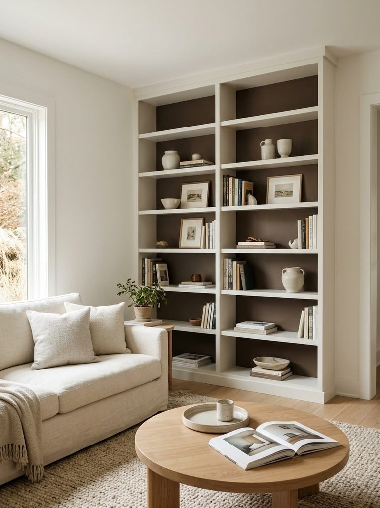
A painted shelf back. Paint only the back panel inside a bookcase or built-in a deep brown-taupe. A quart usually runs $25 to $40 and covers about 100 square feet. A 36-by-72-inch bookcase back is only 18. The books and ceramics in front of it suddenly stand out.
Deep taupe is the friendliest first dark. It keeps the warmth of a neutral room while still reading as a clear step down from the walls.
A fireplace opening. If you have one, the firebox is already a deep value. Keep the mantel to two or three pieces so the opening stays the calmest, darkest thing on that wall.
An accent chair. One chair in mushroom, mocha, or deep olive gives the sofa something to push against. Expect roughly $300 to $900 for a solid frame in a performance fabric.
A walnut or espresso console. Very dark matte finishes show dust and fingerprints within a day. A satin or oiled walnut hides both better. Expect $400 to $1,200 depending on the build.
Start with one. A single deep piece does more than five small ones.
Break Up the Pale Sandwich of Floor, Rug, and Sofa
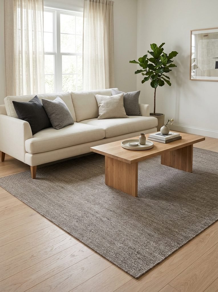
Picture a 12-by-15-foot living room with a pale oak floor, an oatmeal 8-by-10 rug, and a cream 84-inch sofa. Three big shapes, all within a step of each other. The sofa sinks into the rug, and the rug sinks into the floor.
You have two ways out. The first is to darken the middle layer. Swap in a heathered flat-weave rug in mid-taupe or warm gray. A flat weave under half an inch thick also hides the footprints and vacuum tracks that a cream high-pile rug shows. An 8-by-10 in a wool blend runs roughly $250 to $600.
The second is to darken the top layer. Move to a sofa one or two steps deeper, such as mushroom or mocha, and keep the rug pale. The hue family doesn’t change. The sofa simply stops dissolving into its surroundings.
Change one layer, not all three. Two darker layers over a pale floor can make the base of the room feel heavy. Once you pick, lay a swatch on the rug and run the grayscale test again before you commit.
Separate Walls From Trim
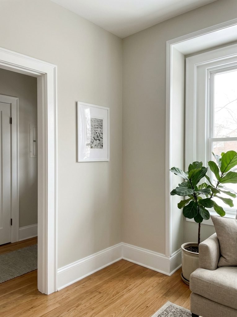
The myth: white trim on white walls looks clean. The reality: baseboards, door casings, and window frames are the outline of your room, and matching them to the wall erases that outline.
Give the trim a few steps of lightness over the walls. Agreeable Gray at 60 beside Pure White at 84 leaves a 24-point gap. That is enough to draw a visible edge without feeling sharp. Use satin or eggshell on the walls and semi-gloss on the trim, since the sheen difference reinforces the line.
The cost is low. A gallon of premium trim paint runs about $50 to $80, and a gallon is more than a typical living room’s baseboards and two window casings need. If the walls are already a pale greige, repainting only the trim can shift the room more than you’d expect.
Let Sheen and Texture Scale Fill the Gaps
Once the big shapes separate, small surfaces can finish the job.
Use Sheen for Highlights
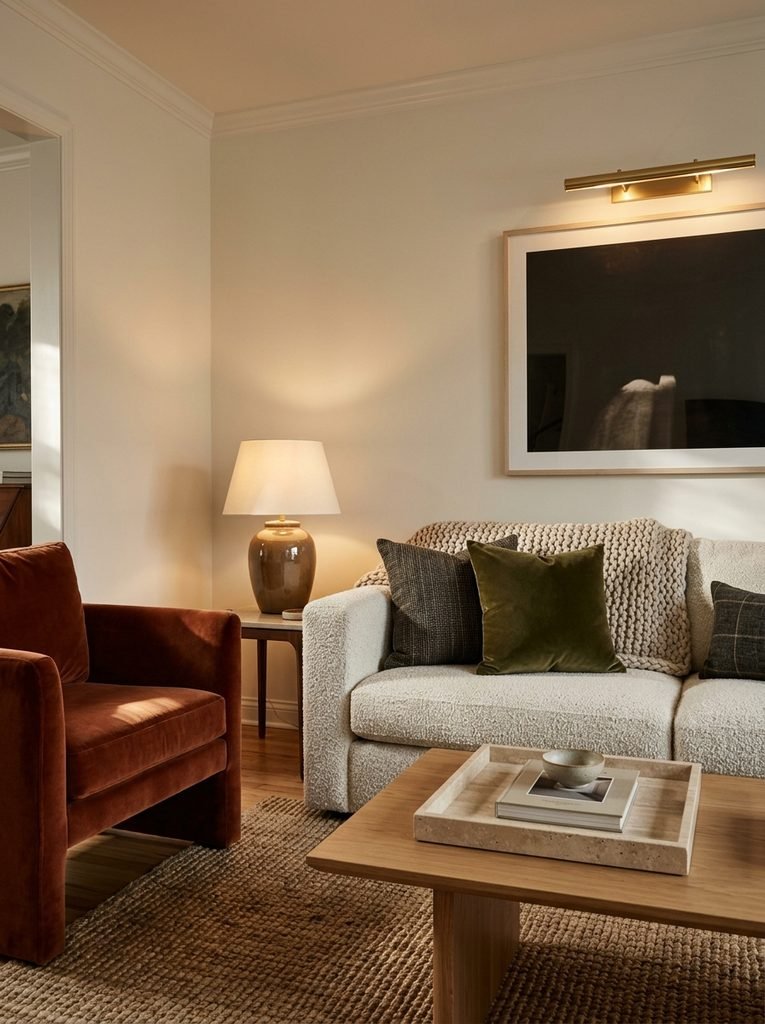
Glossy surfaces throw small bright highlights, and a highlight is the lightest value in a room full of mid-tones. A glazed ceramic lamp base does this. So does a brass picture light.
Stone works too, with one caution. Polished marble etches when lemon juice or wine sits on it, while a honed finish hides those marks. A honed travertine tray is a safer pick for a coffee table.
Lamps add range as well. A pool of lamplight on a wall is lighter than the corner beyond it, and that gradient gives depth that flat overhead light cannot.
Match Texture to Your Seating Distance
Texture only counts if you can see it from where you sit. A fine-weave linen looks smooth from ten feet away. A chunky bouclé, a thick knit, or a jute weave as wide as your thumb still shows. Aim for one coarse, one medium, and one smooth material in the seating area.
Velvet is the easy smooth option, because the nap catches light and reads one step lighter than the same color in linen. Pair it with something coarse and the contrast shows from across the room.
Pillows can carry a medium weave in a deeper tone, which also gives the sofa an edge against the wall.
To go deeper on premium materials such as marble, velvet, and brass, see our guide to luxury living room decor inspiration for elegant homes.
How Much Deep Tone Is Enough
Use this as a starting ratio, not a law.
| Lightness band | Typical items | Share of what you see |
|---|---|---|
| Light | Walls, ceiling, curtains, trim | About 60% |
| Middle | Sofa, rug, floor | About 30% |
| Deep | Console, chair, plant, shelf back | About 10% |
Ten percent sounds small, and it is. In a typical 12-by-15-foot room you need only two or three deep objects. What matters is where they sit. Spread them out: one near the TV wall, one beside the far end of the sofa, one low and one tall. Your eye should hop between them in a loose triangle. Cluster them together and the room tilts toward one side.
When Low Contrast Is the Point
Some rooms want to be quiet. A sunlit room with whitewashed walls, bleached oak, and linen can look calm rather than flat, because strong daylight sculpts the surfaces for you.
Even then, quiet rooms still need an anchor. One black window frame, one dark-stained wood bowl, or one deep ceramic lamp base gives the eye somewhere to land. Without it, a deliberate low-contrast room slides into blank.
Overcorrections That Make It Worse
Most people who fix the flatness trip over one of these.
- A lone dark object. One black chair in a corner reads as a hole in the room. Echo it with a second deep piece on the opposite side.
- Dark only in accessories. Two charcoal pillows and a vase refine contrast. They cannot create it.
- Cold black. Pure black can strip out the warmth you wanted from a neutral room. Reach for brown-blacks, deep taupes, and dark olive first.
- Identical darks. A console, frames, and a lamp all in the same flat black look staged. Mix espresso wood, charcoal fabric, and dark foliage.
Your Weekend Plan
Saturday morning, take the Mono photo and note the darkest spot. Pick one deep piece from the anchor list and one separation from the rug, sofa, or trim fixes. Retake the photo that evening. If the sofa and wall still merge, change the sofa side next.
If your problem is that the room looks different at night rather than flat, a different guide fits better. Our breakdown of living room color combinations that hold up after dark covers undertones and testing paint in lamplight.
Frequently Asked Questions
Why does my beige living room look flatter in photos than in person?
Phone cameras brighten pale rooms and compress the range between light and dark, so small differences vanish. Tap and hold on the sofa to lock exposure, then slide it down slightly before shooting. If the sofa, rug, and wall still merge in the black-and-white version, the flatness is real, not a camera quirk.
What LRV should the darkest paint in a neutral living room have?
Aim below 20 for a clearly deep tone. Colors from 10 to 20 feel deep but soft on a shelf back or one accent wall, while anything under 10 turns dramatic. Urbane Bronze, at about 8, sits in the dramatic zone, so a first-timer may prefer a deep taupe closer to 15.
Can I add contrast to a neutral living room without buying new furniture?
Yes. Paint the back of an existing bookcase, swap one pale rug for a mid-tone flat weave, and add a four-foot plant. Together they cost roughly $325 to $760, and none touch your sofa. Renters can skip the paint and rely on the rug and plant.
Do dark neutrals make a small living room feel smaller?
Not when you limit them to about ten percent of what you see. A deep tone on one shelf back or a low rug adds depth, and deeper colors tend to recede. The risk comes from dark walls plus a dark floor plus dark furniture, which can close in a room under roughly 150 square feet.
Should the ceiling be lighter or darker than the walls in a neutral room?
Keep it lighter in most rooms. A ceiling a few LRV points above the walls keeps the space open, especially at eight feet. With nine-foot ceilings or more, tinting the ceiling paint to half the wall color’s strength adds a soft, cozy lid without darkening the room.