You walk into a friend’s living room and it just feels different nothing in it looks especially expensive, but the whole space reads like it cost twice what yours did. That’s rarely about budget. It’s about a handful of specific, repeatable choices: how light is layered, which materials sit next to each other, and how much restraint went into the styling. Modern decor in 2026 has moved past stark, cold minimalism into something warmer and more tactile, and that shift is actually good news if you’re trying to upgrade a room without a renovation budget.
Below are the specific techniques driving that “expensive” look this year, plus the smaller swaps hardware, molding, lighting that do a disproportionate amount of visual work for very little money.
Warm Minimalism Is Replacing Cold, Stark Modern
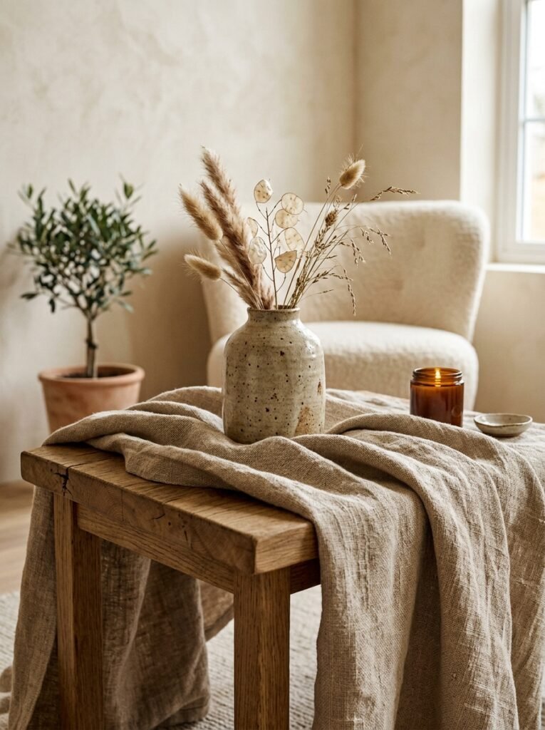
For years, “modern” meant white walls, glass, and hard edges. That look has softened. Warm minimalism keeps the clean lines and clutter-free surfaces of traditional modern design but swaps in materials that actually show texture raw wood, linen, wool, and hand-thrown ceramic. The trick to pulling this off without it looking busy is tonal layering: pick two or three materials in a similar color family (say, oatmeal linen, whitewashed oak, and unglazed stoneware) so the room feels rich instead of stark, but still reads as calm rather than cluttered.
A simple way to test this in your own space: stand in the doorway and count how many different materials are visible. If it’s more than four or five, the room will feel busy no matter how nice each individual piece is. Editing down to fewer, better materials is what separates a “curated” room from one that just has a lot of stuff in it.
Color Drenching for an Architectural, Custom-Built Look
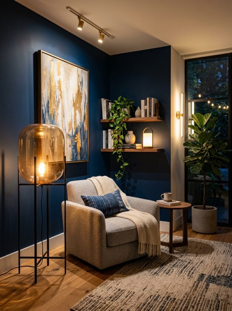
One of the more dramatic shifts in 2026 interiors is color drenching painting the walls, trim, ceiling, and sometimes even the doors of a room in a single unified tone. Because it removes the visual break between wall and trim that a contrasting white ceiling usually creates, the room reads as more architectural and intentional, almost like it was built that way rather than decorated after the fact.
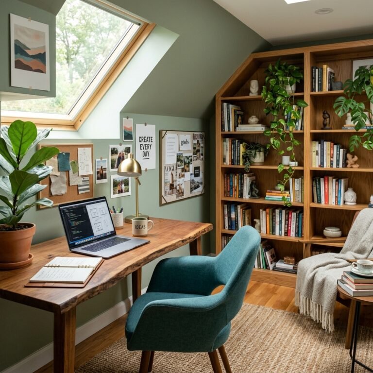
This works especially well in smaller rooms, powder baths, and reading nooks, where the lack of contrast makes the space feel enveloping rather than cramped. Deep, warm tones a muted terracotta, an olive green, a soft charcoal tend to photograph and live better than stark black for this treatment, since they avoid the “unfinished basement” look a flat black ceiling can create in a room with limited natural light. If you’re nervous about committing a whole room, test it in a hallway or a single accent wall-plus-ceiling combination first.
Layered Lighting Does More Work Than Any Single Fixture
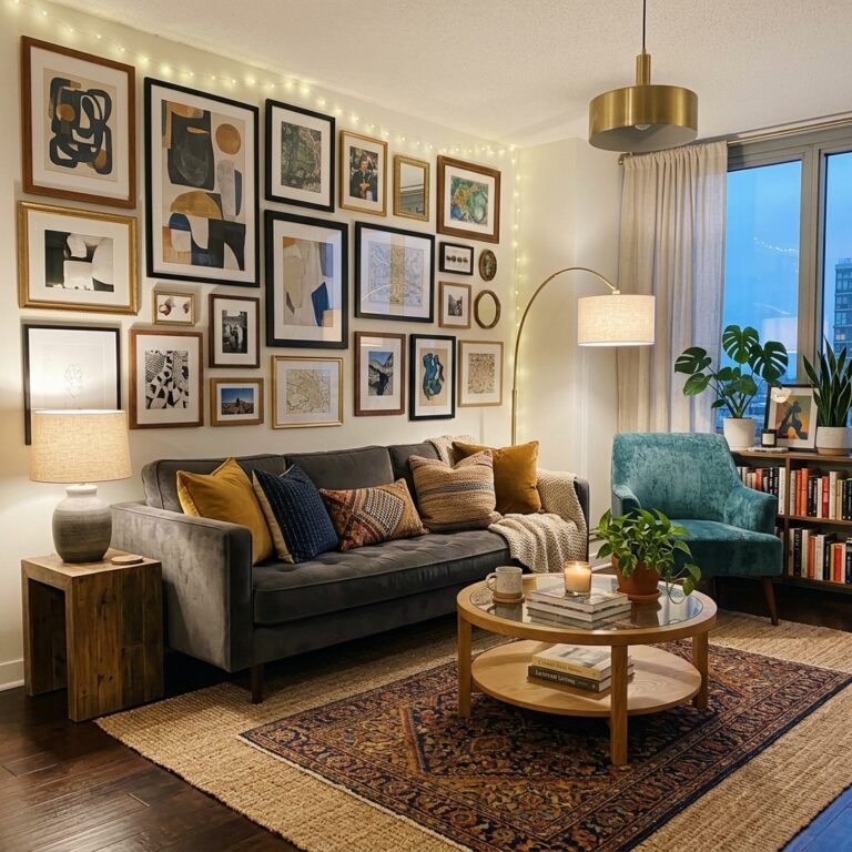
Nothing flattens a room faster than one overhead light doing all the work. Designers reach for at least three light sources per room ambient (overhead or recessed), task (a reading lamp, under-cabinet lighting), and accent (a picture light, a floor lamp aimed at a corner) because each one solves a different problem. Ambient lighting keeps the room usable, task lighting supports whatever you’re actually doing there, and accent lighting is what creates the shadow and depth that makes a space feel dimensional instead of flat.
A sculptural pendant or an oversized floor lamp with a fabric shade can function as both a light source and a statement piece, which is part of why they show up so often in “expensive-looking” rooms they’re doing double duty. If you only make one lighting change this year, add a dimmer to your main overhead fixture; it’s a five-minute swap that changes the mood of a room more than almost anything else on this list.
Curved, Sculptural Furniture Instead of Sharp Edges
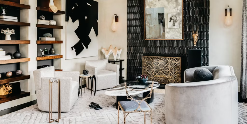
Rounded sofas, curved dining chairs, and arched mirrors have been steadily replacing the boxy, hard-edged furniture that defined the last decade of modern design. Curves photograph softer and tend to make a room feel more welcoming, but there’s a practical reason they also read as more expensive: sculptural, single-form furniture is genuinely harder to manufacture than a rectangular sofa, so it carries an association with custom or high-end pieces even when the actual price point is moderate.
You don’t need to replace your whole furniture set to use this trick. A single curved accent chair, an arched mirror over the console table, or a round coffee table in an otherwise angular room is often enough to soften the whole space without a full furniture overhaul.
Natural and “Noble” Materials Still Anchor the Look
Wood, natural stone, linen, and handmade ceramic remain the backbone of a high-end modern room, and that hasn’t really changed what’s shifted is which specific materials read as current. Deeper, richer wood tones like walnut have been gaining ground over the pale Scandinavian oak that dominated the last several years. Dramatic, heavily veined stone (real or a good composite) shows up on smaller surfaces a side table, a tray, a bathroom vanity top where it reads as a splurge without the cost of a full countertop.
If a full material swap isn’t in the budget, look for the smallest possible surface where a “noble” material can appear: a stone coaster tray, a walnut cutting board displayed on open shelving, a linen table runner. These low-cost touches borrow the same visual language as a full renovation.
Modern Bedroom Decor for a Hotel-Style Look
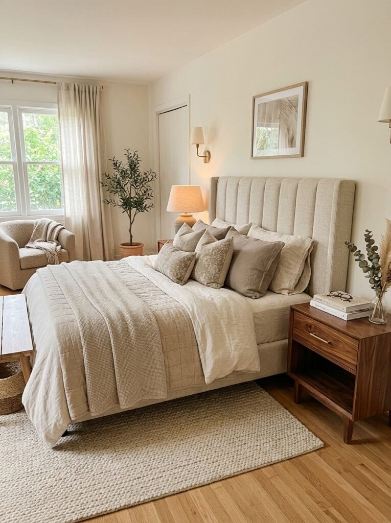
Hotel bedrooms feel calm and expensive for reasons that are easy to copy. Bedding is layered rather than a single flat set a fitted sheet, a lightweight blanket, and a duvet folded at the foot of the bed create the same visual weight a hotel styling team is going for. An upholstered headboard in a soft, tactile fabric (bouclé, linen, or a substantial velvet) does more to elevate a bedroom than almost any other single purchase, since it’s the first thing the eye lands on when you walk in.
Nightstands matter more than most people think. Mismatched styles or anything with visible clutter on top break the calm the rest of the room is working to create a pair of matching lamps, one tray for the essentials, and nothing else on the surface keeps the eye moving smoothly instead of snagging on mess. Soft, warm-toned lighting (skip anything above roughly 2700K) is what keeps a bedroom feeling like a retreat instead of an office with a bed in it.
For more bedroom-specific styling direction, see our guide to modern bedroom decor inspiration for stylish homes.
High-End Living Room Layout and Styling Rules
A living room reads as expensive less because of what’s in it and more because of how it’s arranged. Furniture that’s pulled slightly away from the walls and angled toward a central point a coffee table, a rug, a fireplace creates the kind of intentional layout designers use in show homes, versus the everything-against-the-wall arrangement most of us default to.
A properly sized area rug matters more than people expect. The most common styling mistake is a rug too small for the seating around it, which visually shrinks the whole room; at minimum, the front legs of your sofa and chairs should sit on the rug, not floating just off the edge of it. Beyond that, resist the urge to fill every surface. Three or four well-chosen objects on a shelf a stack of art books, one sculptural object, a single plant read as curated. Ten small objects read as clutter, no matter how nice each one is individually.
If you’re planning a fuller refresh, our roundup of modern living room furniture ideas you can copy at home goes deeper on specific pieces worth the investment.
Small Upgrades That Punch Above Their Cost
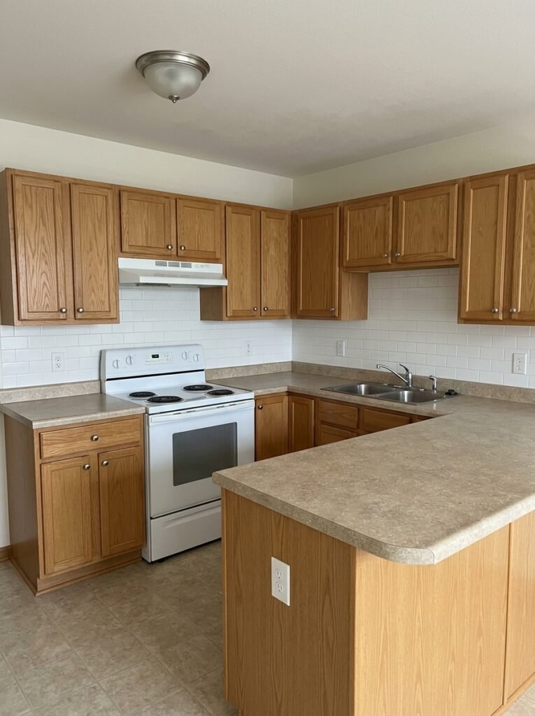
Not every high-impact change requires a renovation. A few swaps consistently deliver more visual value than their price tag suggests:
- Cabinet and drawer hardware. Swapping builder-grade knobs for matte black, brushed brass, or unlacquered brass pulls is one of the fastest ways to make kitchen or bathroom cabinetry look custom rather than stock.
- Wall molding and trim. Simple panel molding, a chair rail, or picture-frame wall trim adds architectural interest to a flat wall for a relatively small material cost, and it’s a project many homeowners can DIY over a weekend.
- Light fixture swaps. Builder-grade flush-mount ceiling fixtures are one of the clearest “cheap” signals in a home. Replacing even one with a sculptural pendant or a fixture with a warm metal finish changes the perceived quality of the whole room.
- Door hardware and switch plates. Small, often-overlooked details but mismatched or worn hardware is exactly the kind of thing that quietly signals an unfinished space.
Modern Home Accessories That Actually Look Expensive
The accessories that read as high-end tend to share three traits: substantial materials, a limited color palette, and restraint in quantity. A ceramic vase with visible hand-thrown texture, a heavy glass or stone tray, and one piece of abstract art in a frame with real presence will do more for a room than a shelf full of smaller trinkets.
If you’re shopping on a budget, prioritize scale and material over quantity one larger, well-made object almost always reads as more expensive than three small ones, even at the same total price.
Glossy and Reflective Finishes as Accent Details
After several years of matte-everything, glossy and lacquered finishes are creeping back into modern interiors but in smaller doses than the high-shine rooms of the early 2000s. A lacquered console table, a glossy ceramic lamp base, or a mirrored tray introduces reflectivity and a bit of drama without tipping the whole room into “showroom” territory. The key is using shine as a single accent rather than a finish applied across every surface; one glossy piece against a room full of matte wood and linen reads as intentional, while an entire room of high-gloss surfaces reads as dated or cold.
Mirrors deserve a specific mention here, since they solve two problems at once. Positioned to reflect a window or a light source, an oversized mirror with a slim metal or unlacquered brass frame makes a room feel measurably brighter and larger, while also functioning as wall art. It’s one of the few upgrades on this list that pays off in both light quality and style at the same time.
Common Mistakes That Undercut an Expensive Look
A few habits quietly work against everything above, even in an otherwise well-decorated room:
- Mismatched metal finishes. Chrome faucets, brass hardware, and matte black light fixtures all in the same room read as unplanned. Pick one or two metal tones per space and stay consistent.
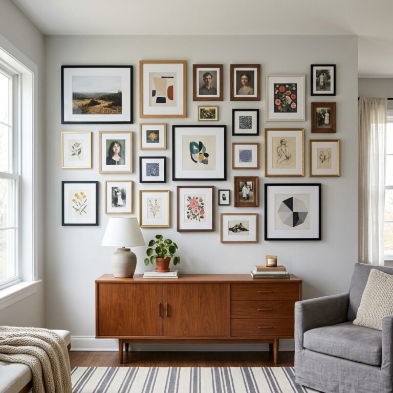
- Undersized art. A single small frame centered on a large wall looks like an afterthought. Art should generally span roughly two-thirds the width of the furniture it hangs above.
- Visible cords and chargers. Cable management is unglamorous, but a lamp cord snaking across the floor undercuts an otherwise curated room instantly.
- Skipping window treatments. Bare windows are one of the fastest ways a room reads as unfinished. Floor-length curtains in a simple, weighty fabric even inexpensive ones add height and softness that bare glass never will.
Fixing even two or three of these is often enough to make a room feel noticeably more finished without buying anything new.
Final Thoughts: The Details That Signal “Expensive” Are Learnable
None of this requires a renovation budget. Warm minimalism, color drenching, layered lighting, curved silhouettes, and a handful of small hardware swaps are all things you can do in a weekend or over a few paychecks. What separates an expensive-looking room from an ordinary one isn’t the price of what’s in it it’s restraint, material choice, and a few specific techniques applied consistently throughout the space.
Start with whichever change feels most doable this month a dimmer switch, new cabinet pulls, a properly sized rug and build from there. Small, well-chosen upgrades compound faster than most people expect.