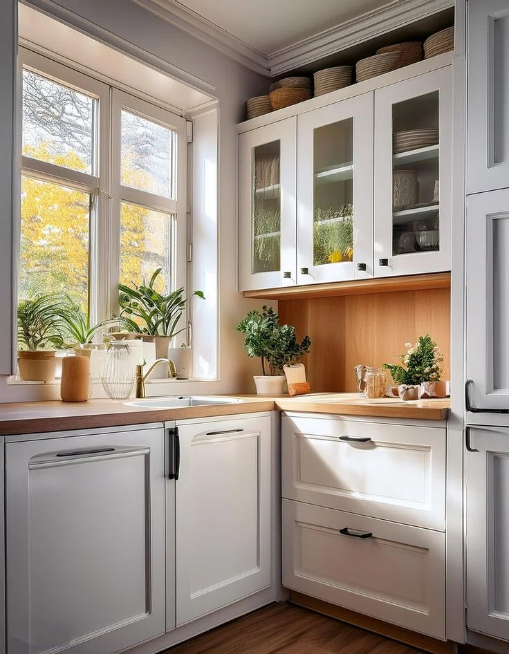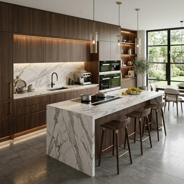
Kitchen Backsplash Ideas That Give a Basic Kitchen a Custom Look
A builder-grade kitchen usually has good bones. The cabinets are fine, the counters do their job, the layout works well enough. What it’s missing is the layer that makes a space feel designed instead of installed, and that layer is almost always the backsplash. Most production kitchens ship with four inches of matching tile or a plain painted strip behind the counter, just enough to meet code and nothing more. Swap that out and the whole room reads differently, even if nothing else changes.
This guide skips the usual approach of listing dozens of tile colors and patterns one after another. Instead, it breaks down the specific decisions that separate a backsplash that looks custom from one that looks like it came from a builder’s standard package: height, layout, framing, material contrast, and the small coordination details most people skip.
What Actually Makes a Backsplash Look Custom
Before picking a tile, it helps to know what a designer’s eye is actually responding to when a kitchen feels expensive. It’s rarely the price of the material. More often it comes down to proportion, where the backsplash starts and stops, and whether the surrounding details support it or fight it.
A four-inch strip of tile above the counter almost always reads as builder-grade, regardless of how nice the tile itself is. A backsplash that runs to the underside of the upper cabinets, or all the way to the ceiling on an open wall, immediately looks more considered. So does a layout with a clean, planned edge instead of a tile trimmed awkwardly around an outlet. These are the details that separate a kitchen that looks finished from one that looks like it stopped halfway through a project.
Take the Tile Past the Standard Counter Line
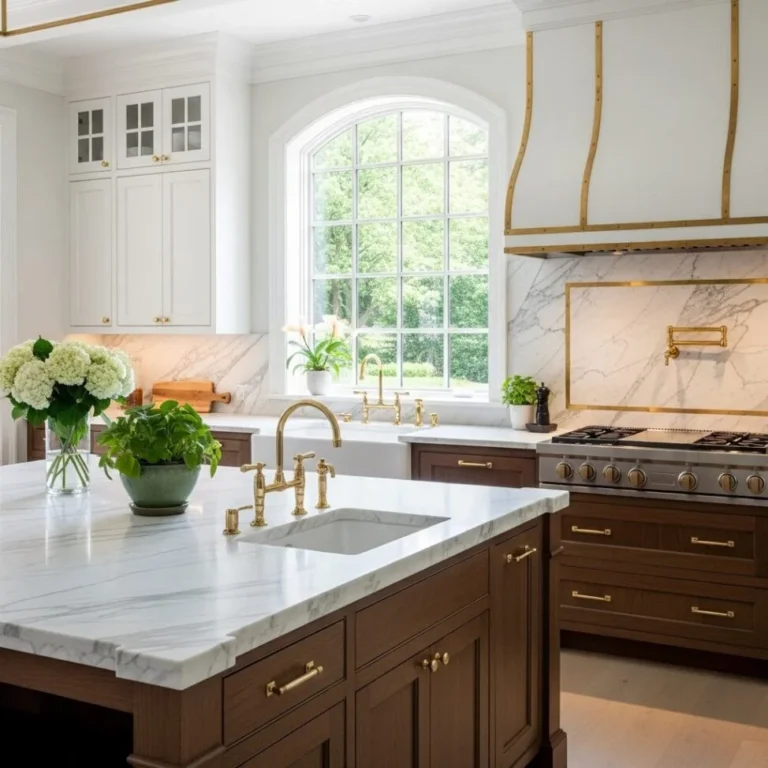
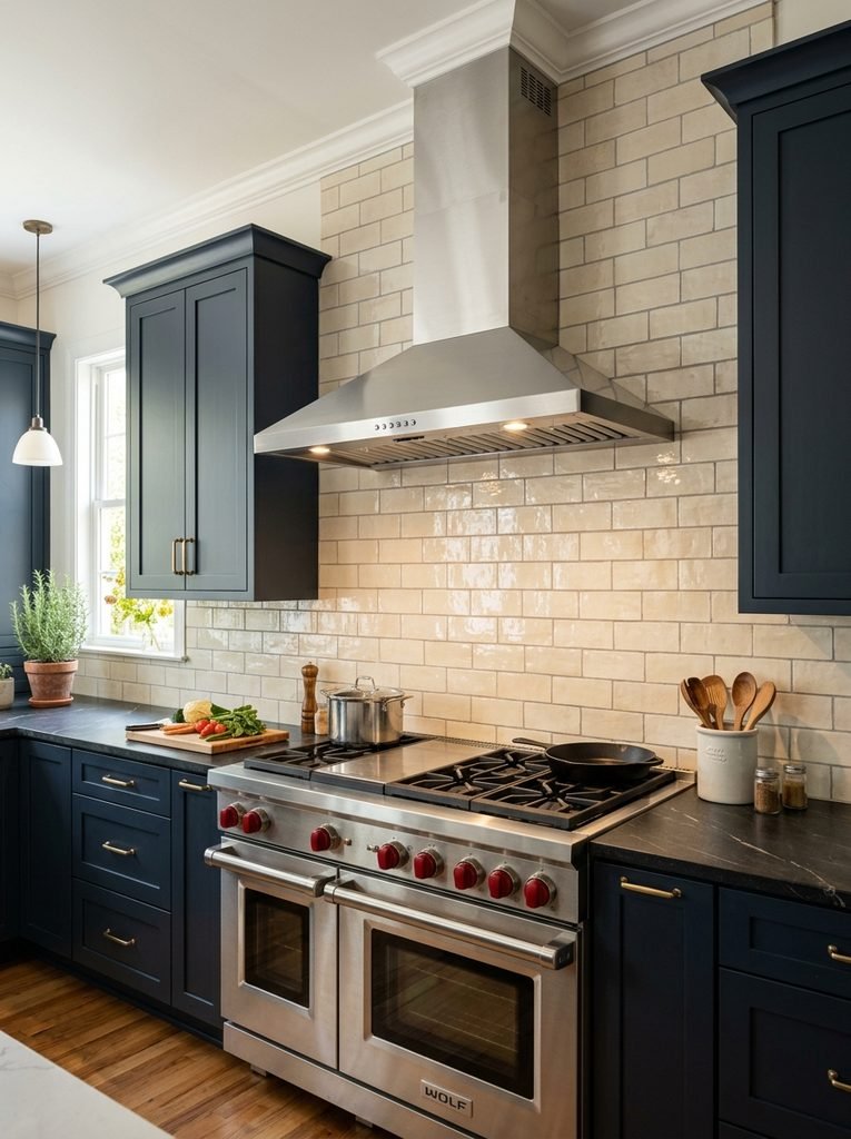
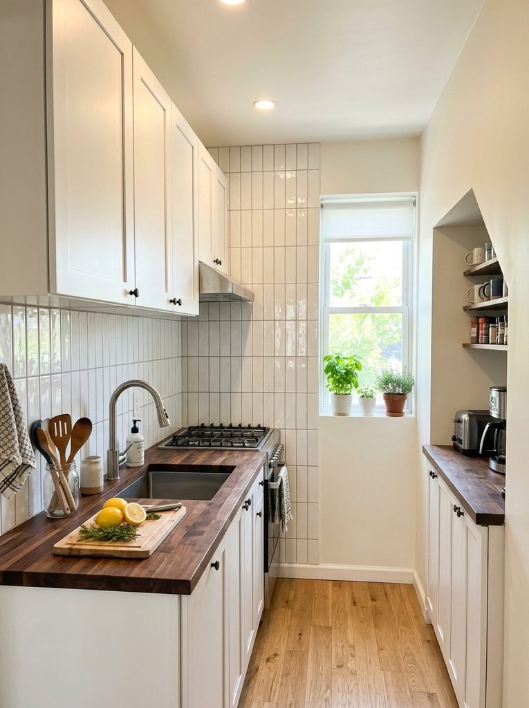
The single biggest visual difference between a production kitchen and a custom one is height. Most spec-built homes use a short backsplash, often just four to six inches, because it’s the cheapest way to satisfy a building requirement. Extending that same tile all the way up to the bottom of the cabinets, or continuing it into the open space above the range where there are no upper cabinets, changes the proportions of the entire wall.
On a range wall without cabinets above it, running the backsplash to the ceiling turns a gap that usually gets filled with paint into a real feature. It also makes the ceiling feel taller, since the eye follows the material upward instead of stopping at counter height. If a full-height installation isn’t in the budget, even adding four extra inches so the tile ends closer to eye level makes a noticeable difference. Professional kitchen planning guidelines also cover recommended clearances behind ranges and cooktops, which is worth checking before extending tile behind a range for both safety and code reasons.
Let the Pattern Carry the Design Instead of the Color
A plain white subway tile set in a standard grid is the most common backsplash in production homes, which is exactly why it reads as basic even when it’s well made. The tile itself doesn’t need to change for the look to change. The layout does.
A vertical stack pattern, where each tile sits directly above the one below it instead of offset in a running bond, creates a cleaner, more architectural line that pulls the eye upward. A herringbone or basket weave layout adds movement without adding a single new color to the room. Even a classic subway tile looks noticeably more intentional set on a 45-degree diagonal behind a range or sink, where the diagonal lines create a focal point without competing with the cabinetry.
The advantage of leaning on pattern rather than an expensive material is cost. Ceramic subway tile is inexpensive per square foot, so a labor-intensive layout like herringbone often costs less overall than a plainer install using a pricier natural stone. Since some layouts require more precise substrate prep and layout planning than a basic grid, it’s worth having an installer reference recognized tile installation standards before committing to a more complex pattern.
Frame the Range Wall Like a Focal Point
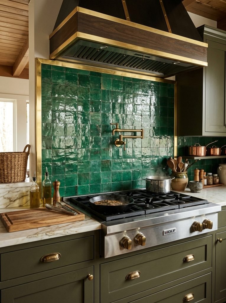
Custom kitchens rarely treat the whole backsplash as one flat, uninterrupted surface. Instead, the wall behind the range often gets its own frame, similar to how a piece of art gets a mat and a border. This can be as simple as running a contrasting tile liner or a thin strip of trim around the edges of the range wall, separating it visually from the rest of the counter run.
Another approach that reads as custom without a full renovation is adding a small open shelf on either side of the hood, sitting directly on the tile. It breaks up a large expanse of material and gives the wall a sense of depth instead of one flat plane. If shelving is part of the plan, it’s worth keeping the styling restrained. A backsplash this considered loses its impact fast if the shelf above it turns into a catch-all, which is one of the more common ways a kitchen upgrade gets undone by everyday clutter.
Choose One Material That Deliberately Doesn’t Match
Basic kitchens tend to match everything a little too closely, with countertop, backsplash, and cabinets all sitting in the same narrow range of tone. Custom kitchens usually break that pattern on purpose, choosing one material for the backsplash that contrasts with everything around it rather than blending in.
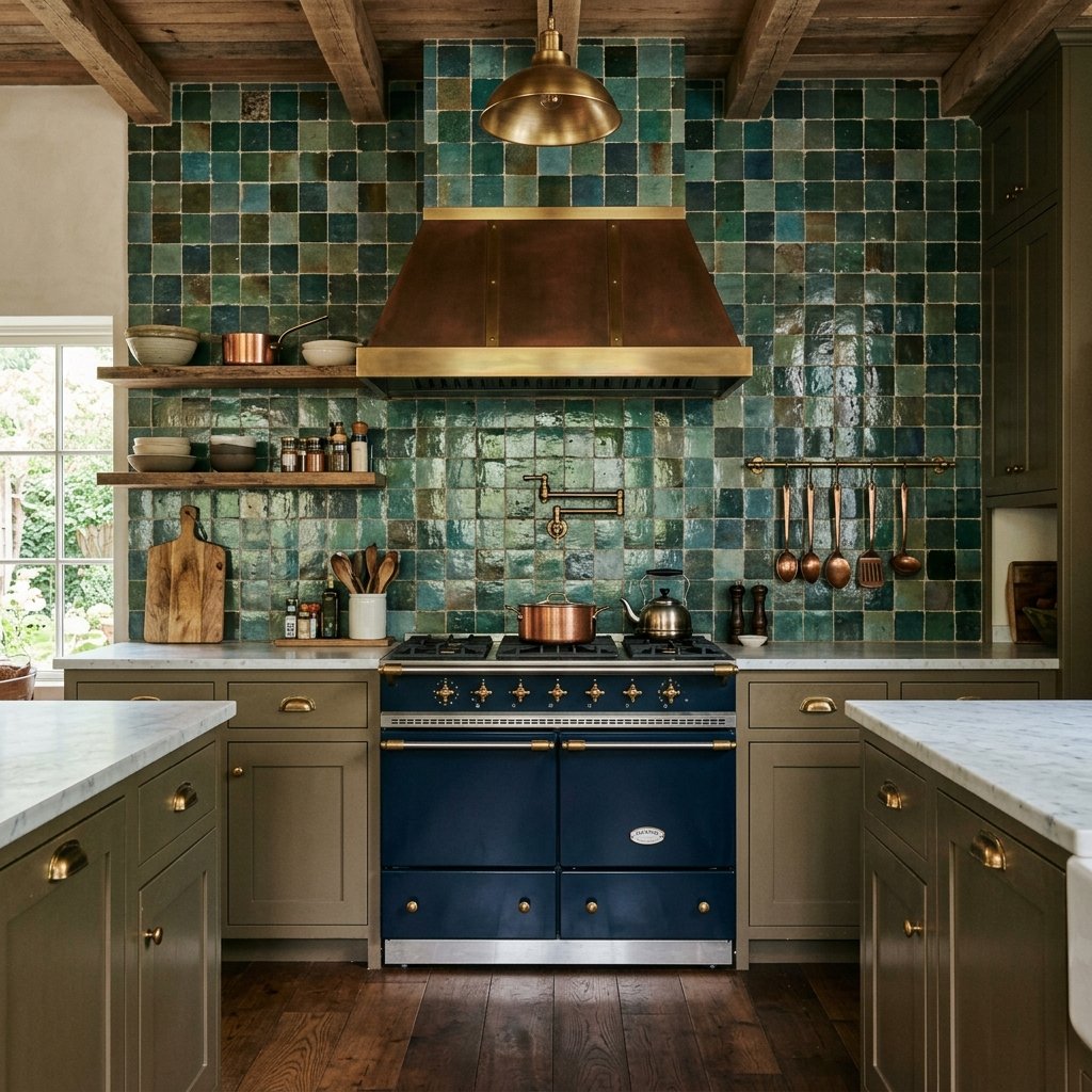
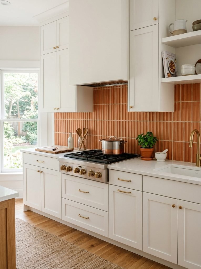
A fluted or ribbed ceramic tile in a warm terracotta against white cabinets does this well, as does a hand-glazed zellige tile with visible color variation against flat matte cabinetry. Even a plaster-look microcement finish, applied in a single unbroken sweep with no grout lines at all, creates contrast simply through texture rather than color. The goal isn’t to introduce a clashing element. It’s to make sure the backsplash reads as its own considered choice instead of an extension of the countertop.
This is also where a slightly imperfect, handmade-looking tile tends to outperform a perfectly uniform one. Small variations in glaze and shape catch light differently across the surface, which is part of what makes artisan tile look more expensive even when the price per tile isn’t dramatically higher than a machine-made alternative. If white cabinetry is the starting point, this collection of white cabinet backsplash pairings is a good next stop for material-specific ideas.
Carry the Backsplash Beyond the Range Wall
One habit that keeps a kitchen looking like a builder’s package is stopping the backsplash the moment the counter ends, leaving the sink wall, the island, or the space behind open shelving untouched. Continuing the same material, or a coordinating one, into these areas ties the whole kitchen together instead of leaving one wall looking upgraded and the rest looking untouched.
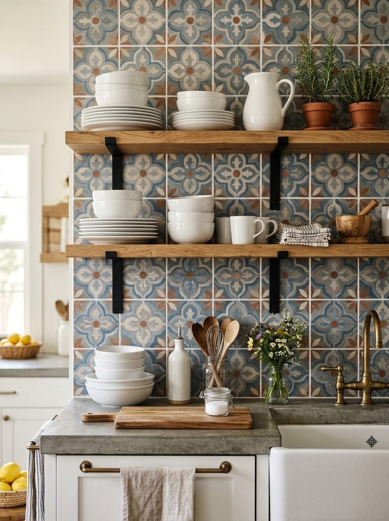
Behind open shelving in particular, a patterned or textured backsplash gives the display something to sit against. A row of white dishes on open shelves in front of a plain painted wall can look sparse, while the same shelf in front of a patterned tile or a warm plaster finish looks intentional. This is one of the details that tends to separate a kitchen that was renovated all at once from one where the backsplash was clearly an afterthought.
Coordinate Grout and Hardware, Not Just Tile
A detail that gets overlooked constantly is grout color. Bright white grout against a bright white tile disappears, which is fine for a quiet, seamless look, but a slightly deeper or warmer grout, even just one or two shades off from the tile itself, adds definition without changing the material at all. On darker or textured tile, matching the grout closely to the tile color keeps the surface reading as one continuous material rather than a grid of individual pieces.
Hardware finish matters just as much. A backsplash chosen with real care can still look disconnected if the cabinet pulls, faucet, and light fixtures are all in different metals with no relationship to each other. Picking one dominant metal finish, whether that’s brass, matte black, or brushed nickel, and repeating it across hardware, faucet, and any exposed hood or shelf brackets creates the kind of cohesion that reads as planned rather than assembled piece by piece. Keeping the counters themselves clear of clutter also matters here, since even a well-chosen backsplash loses its impact behind a wall of small appliances and mismatched containers.
Budget-Friendly Ways to Get the Same Effect
A full tile renovation isn’t realistic for every household, and it doesn’t need to be. Several lower-cost approaches can deliver a similar visual result.
- Large-format tile reduces the number of grout lines dramatically, which on its own makes a backsplash look calmer and more expensive, even in an affordable ceramic.
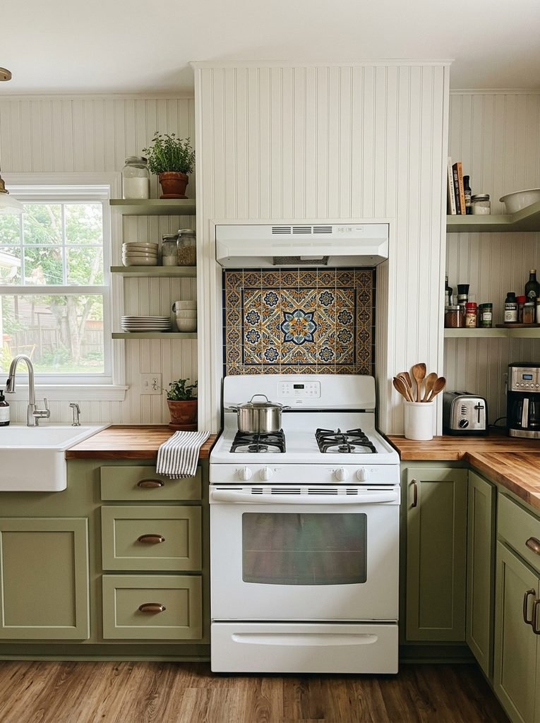
- An accent panel behind the range only, rather than tiling the full perimeter, lets a higher-end material go into a small, high-impact area without the cost of covering every wall.
- Quality peel-and-stick tile has improved enough in recent years to work well as a rental-friendly or temporary option, particularly in a vertical stack or herringbone layout where the pattern does most of the visual work.
- Painted brick-look or beadboard panels behind open shelving or a sink wall add texture for very little cost, especially in a farmhouse or cottage-style kitchen.
Approaches like these pair well with other low-cost updates, such as swapping cabinet hardware or adding a runner and better lighting, the kind of small, high-impact changes covered in this guide to budget-friendly kitchen upgrades.
Small Kitchen Considerations
In a compact kitchen, a backsplash carries even more visual weight simply because there’s less wall space competing for attention. A busy, high-contrast pattern can overwhelm a small galley kitchen quickly, so it’s often better to choose one strong material and let the height and framing details do the work of making the space feel custom, rather than layering in multiple patterns.
Light, reflective materials such as glossy ceramic or pale zellige also help a small kitchen feel brighter, since they bounce available light rather than absorbing it the way a matte, dark material would. Running the backsplash to the ceiling is particularly effective in small kitchens with low natural light, since it removes the visual break where tile meets paint and lets the wall read as one taller surface. For more layout-specific strategies, this small kitchen decor guide is worth a look alongside this one.
Mistakes That Keep a Backsplash Looking Builder-Grade
A few habits tend to undo an otherwise good backsplash choice, even when the tile itself is nice.
- Stopping the tile at the exact edge of the counter with no consideration for where it visually ends.
- Choosing a busy pattern and a busy countertop at the same time, so neither one gets to be the focal point.
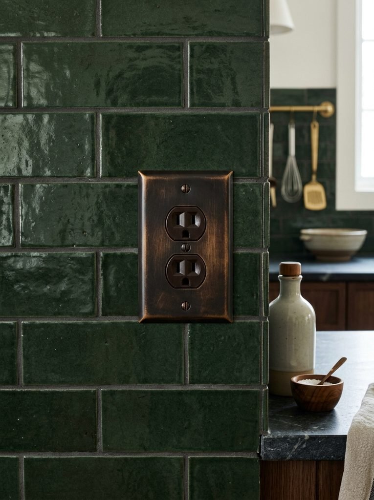
- Leaving outlets and switch plates in a mismatched white or ivory against a colored or dark tile, which draws the eye straight to the flaw.
- Skipping the grout color decision entirely and defaulting to whatever the installer has on hand.
- Treating the backsplash as separate from hardware and lighting choices instead of part of the same overall finish palette.
Most of these are inexpensive to fix. Swapping switch plates to match the wall color or the metal finish in the room, for instance, costs very little and removes one of the most common giveaways of an unfinished-feeling kitchen.
Bringing It All Together
None of these changes require a full gut renovation. A basic kitchen becomes a custom-looking one through a series of smaller, deliberate decisions: how high the tile runs, how the pattern is laid, whether the range wall gets its own frame, and whether the small hardware details are considered as part of the whole. Choose two or three of these strategies rather than trying to apply all of them at once, and the kitchen will start to look like it was designed on purpose rather than filled in with whatever came standard. For a broader look at how these smaller upgrades add up across an entire kitchen, this modern kitchen remodel guide can help map out what to tackle next.