
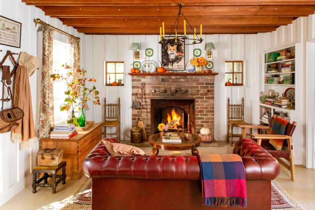
Modern farmhouse living rooms strike a balance between rustic warmth and clean modern lines, but that balance can tip either direction. This guide leans toward the clean-lined, restrained end of the style — fewer distressed finishes, more negative space, and a lot more restraint than the classic collected-over-time farmhouse look. If you love the cozier, more rustic version with layered vintage accessories and a heavily styled mantel, our guide to beautiful farmhouse living room decor ideas covers that side of the style in detail. The Spruce has described this cleaner take as a less rustic, more streamlined update of classic farmhouse — restraint is the whole point, not an afterthought. These 21 ideas will help you build a living room that feels intentional, cozy, and quietly modern.

Why This Version of Farmhouse Holds Up
The clean-lined take on farmhouse works because it doesn’t chase a fixed checklist of barn doors and signage — it borrows the warmth of farmhouse style and edits out the clutter. That makes it easier to live with long-term, since a room built on restraint doesn’t date the way a heavily themed room does. It also adapts well to smaller spaces, since fewer objects and more negative space make any room feel less crowded. The trade-off is discipline: every purchase has to earn its spot, since there’s no busy backdrop for a mismatched piece to disappear into.
Neutral Palette Kept Deliberately Simple
Stick to two or three tones total — a warm white, a mid-tone wood, and one deeper accent color — rather than layering five or six different neutrals the way a more collected farmhouse room might. This restraint is what keeps the room feeling calm rather than busy, even before you’ve added a single piece of furniture. Warm white walls paired with one wood tone throughout the room, instead of mixing several different wood finishes, does more for cohesion than any single decor purchase. Sherwin-Williams Alabaster or Benjamin Moore Classic Gray both work well as a warm-white base coat, since they read as soft rather than stark under most lighting.

Clean-Lined, Structured Sofa Silhouettes
Where a classic farmhouse room often reaches for a slipcovered sofa, this version favors a structured silhouette in a performance fabric — track arms or slim rolled arms, rather than the loose, casual shape a slipcover creates. Neutral upholstery still does the heavy lifting here, but the shape stays tailored rather than relaxed. This isn’t an anti-cozy choice — a structured sofa layered with the right textiles still reads as warm, just less overtly rustic. Look for a performance fabric rated for at least 30,000 double rubs if you have kids or pets, since a tailored silhouette only holds up if the fabric underneath does too.

A Single Sculptural Wood Coffee Table
Instead of an oversized, heavily distressed table, look for one with a cleaner silhouette — a solid slab top, simple tapered or turned legs — so the wood grain does the talking rather than the finish. One well-proportioned table does more for the room than a chunky, deliberately weathered piece competing with everything around it. Reclaimed wood still works here, as long as the shape stays simple. A table roughly two-thirds the length of your sofa, sitting 16–18 inches off the floor, tends to hit the right proportion for most seating arrangements without needing to be oversized to feel substantial.

One Modern Shiplap Wall, Painted a Single Tone
Shiplap still has a place in this version of the style, but the execution matters: a thinner reveal, painted the exact same tone as the surrounding trim, on one wall only, with nothing decorative layered on top. That’s a different effect than a full shiplap wall styled with framed art and shelving — it reads as architecture rather than a themed backdrop. If your walls are already plain drywall, board-and-batten trim in the lower third of one wall achieves a similar effect with even less visual noise. Painting the battens the same color as the wall above, rather than a contrasting white, keeps the detail feeling architectural instead of like an applied accent.

A Simple Material Story Across Textiles
Rather than layering many different textures — velvet, wool, linen, leather, jute — pick two and repeat them throughout the room. A linen sofa with wool throws, for instance, is enough contrast on its own; adding a third or fourth material tends to push the room toward “collected” rather than “edited.” Repetition, not variety, is what makes a restrained room feel intentional. If you’re shopping for both at once, buy the wool piece first and let its color guide the linen choice — wool takes dye less predictably, so it’s easier to match a linen tone to it than the other way around.

Matte Black Sculptural Lighting
A single geometric matte black fixture — a simple linear chandelier or a sculptural floor lamp — does more for this look than a vintage-style lantern or an ornate chandelier. The goal is a fixture that reads as a modern object first and a farmhouse detail second. Black finishes still provide the contrast farmhouse rooms rely on, just through a cleaner shape. Better Homes & Gardens has described this cleaner farmhouse update as leaning on black accents and clean lines rather than rustic signage or heavy ornamentation — the lighting is often where that contrast shows up first.

A Quiet Mantel, Not a Heavily Styled One
One large mirror or a single piece of neutral art above the fireplace, with maybe one ceramic vase to the side, is the full styling budget here — no layered frames, no collected greenery, no candle clusters. The mantel becomes a quiet visual pause in the room instead of its own dense focal point. This is the single easiest way to tell a restrained farmhouse room from a heavily collected one at a glance. If the mantel feels bare once you’ve added your one piece, resist the urge to add more — a little visual quiet above the fireplace is doing its job even when it doesn’t look “finished” in the traditional sense.

Streamlined Open Shelving With Negative Space
Limit each shelf to two or three objects, with visible empty space around each one — a stack of books, one ceramic piece, one small plant, and nothing more per shelf. That’s a deliberate departure from a fuller, more collected shelf display with baskets, frames, and layered greenery all in one spot. Negative space here isn’t emptiness for its own sake; it’s what keeps a handful of objects from turning into visual noise. As a rule of thumb, aim to leave at least a third of each shelf’s surface visibly empty — if you have to squint to find the gaps, the shelf has too much on it.

Structural Black, Not Decorative Black
Instead of scattering black accents across accessories — frames, curtain rods, small hardware — concentrate black on structural elements: window frames, a stair rail, door hardware throughout the room. This reads as an architectural choice rather than a decorating trend, and it tends to age better because it’s tied to the bones of the room rather than a styling moment. Matte black window frames in particular have become a signature of this cleaner farmhouse look, since they read as a building material rather than a decorative accent.

One Statement Rug Instead of Layered Rugs
A single large rug — wool or a low-pile natural fiber blend, in a solid or subtly textured weave — grounds the seating area without the visual complexity a layered jute-plus-patterned-rug combination creates. Choose a rug large enough that at least the front legs of every seating piece sit on it; that alone does more for a room’s proportions than the rug’s pattern does. As a general sizing guide, an 8×10 rug is the minimum for most standard living rooms — anything smaller tends to float in the middle of the seating area rather than anchoring it.

Throw Pillows Kept to a Strict Palette
Two pillows in solid, textural fabrics — bouclé, a nubby weave, a heavier linen — read as more finished than four or five in mixed patterns and colors. If you want pattern, choose one subtle stripe or check and repeat it, rather than mixing several different prints across the same sofa. Restraint here is what keeps a cozy detail from tipping into clutter. Sizing matters too — 22×22-inch inserts in 20-inch covers give pillows a fuller, less deflated look than the smaller inserts that often ship with budget pillow covers.

One Vintage Piece, Used as a Focal Point
Rather than collecting several antique or vintage-inspired accessories throughout the room, choose one — a single weathered mirror, an old trunk used as a side table, one aged ceramic piece — and let it stand alone as a point of contrast against everything clean-lined around it. One vintage object reads as intentional; five or six start to read as a theme. Estate sales and local auction houses tend to have better prices on genuinely aged pieces than antique malls, which mark up for the browsing experience as much as the item itself.

Built-In Cabinets With Modern Appeal
Built-ins painted in a warm neutral like mushroom, sand, or soft greige feel more current than stark white, and slim pulls or knurled knobs in matte black or brass finish the look without adding visual clutter. Keeping the shelves inside mostly empty, rather than densely styled, lets the millwork itself read as the design feature. Knurled knobs in particular have become a common detail in this style, since the texture reads as a quiet upgrade from plain pulls without adding visual weight.

Muted Greenery in Architectural Planters
One or two larger plants — an olive tree or a fiddle leaf fig — in a single matte ceramic or concrete planter do more for the room than several small plants in mismatched pots. The planter itself should read as a design object, not just a container, since it’s doing double duty as both function and decor in a room with few other accessories. Rotate the plant a quarter turn every couple of weeks so it grows evenly toward the light instead of leaning noticeably to one side.

One Slipcovered Accent Chair, Not a Slipcovered Sofa
If you want the softness a slipcover brings, save it for a single accent chair rather than the main sofa. That keeps the primary seating structured while still giving the room one relaxed, touchable piece — a small concession to comfort that doesn’t undo the room’s clean lines everywhere else. Position it at an angle to the sofa rather than directly facing it, which reads as more casual and conversational than a perfectly symmetrical furniture arrangement.

Warm Wood Ceiling Beams
Whether original or faux, ceiling beams in a warm wood tone add architectural interest without needing more furniture or accessories to do the work. They draw the eye upward, which makes a room feel taller, and they introduce wood grain and warmth at a scale that doesn’t compete with a restrained furniture layout below. Spacing beams 24 to 36 inches apart, rather than crowding them closer together, keeps the ceiling feeling architectural instead of busy.

Large-Format Minimal Art
One oversized abstract or landscape piece does more for a wall than a gallery arrangement of several smaller framed photos and prints. For more direction on filling a bare wall without over-cluttering it, our living room wall decor ideas guide covers additional options for scaling art to a room. A single large piece also simplifies framing decisions — you’re choosing once instead of coordinating five or six frames. As a sizing guide, art hung over a sofa should span roughly two-thirds of the sofa’s width, which usually lands somewhere between 48 and 60 inches for a standard-size sofa.

Functional Multi-Purpose Furniture
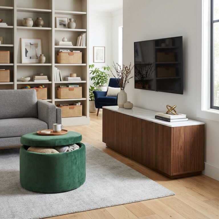
A storage ottoman or a console table with drawers does the same tidying job as a collection of woven baskets, but it reads as furniture rather than an accessory layer. That’s a meaningful difference in a room built on restraint, since fewer visible objects — even functional ones — keeps the space feeling calm. A console with two or three drawers is usually enough for remote controls, coasters, and other small living-room clutter without needing a dedicated catch-all basket nearby.

Simple Linen Curtains Without the Frills
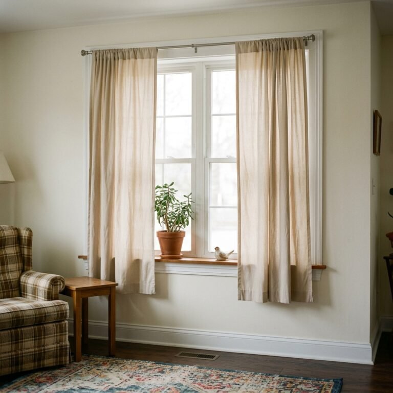
Plain linen or cotton panels in a warm neutral, hung close to the ceiling on a simple black rod, do the job without needing tiebacks, valances, or patterned trim. Letting the fabric hang straight rather than styling it into folds keeps the window treatment feeling architectural rather than decorative. Hang the rod 4 to 6 inches above the window frame and let panels break just at the floor, which reads as more current than curtains that pool or stop short.

Thoughtful, Open Furniture Layouts
Float furniture away from the walls to create a centered seating area, and keep walkways clear rather than pushing every piece to the perimeter. This matters more in a restrained room than a densely decorated one, since open floor space is one of the few remaining ways to add visual breathing room once the decor itself has been pared back. Leave at least 30 inches of walking clearance between major pieces, which is enough for comfortable passage without pieces feeling crammed together.
Personal Touches That Still Feel Curated
Choose a few larger, more meaningful objects — one great travel find, one family photo in a simple frame — rather than a dense cluster of smaller mementos. The goal is personality without density: a room can feel like a genuine reflection of the people who live there without every surface carrying a story.
1 comment