Cherry tones are having a real moment in bedroom design right now, and it’s not just a Pinterest trend. HGTV’s 2026 color coverage points to dark cherry red as one of the standout shades of the year, with Graham & Brown stylist Paula Taylor noting that, unlike softer earthy reds, cherry “feels bold and polished, making a strong visual statement.” That richness is exactly why the color works so well in a bedroom: it reads as warm and enveloping in low light, rather than harsh or overly bright. Below are 12 ways to bring cherry tones into your bedroom, ranging from a single throw pillow to a full accent wall, so you can pick the level of commitment that fits your space and your lease.
Cherry Wood Furniture for a Warm Foundation
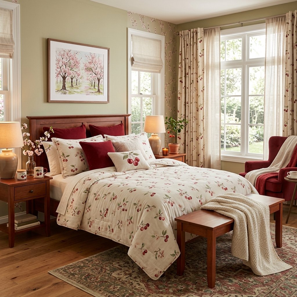
Cherry wood furniture is the lowest-risk way to introduce this trend, because it reads as a finish rather than a bold color statement. A cherry wood bed frame, nightstand, or dresser has reddish-brown undertones that deepen with age and sunlight exposure, which is part of why the wood has stayed popular in traditional furniture for decades. Pair it with lighter walls in the 3–4 LRV range (light reflectance value) — think warm white or soft oatmeal — so the furniture reads as a focal point instead of making the room feel closed in. One or two cherry wood pieces is usually enough; if every surface in the room is cherry-toned wood, the room can start to feel more like a furniture showroom than a bedroom.
If you’re starting from an existing piece rather than shopping new, a light coat of tung oil or furniture wax every year or two keeps cherry wood from drying out and dulling, since the wood tends to darken naturally over time even without staining. Secondhand cherry furniture — a dresser from an estate sale or a hand-me-down nightstand — is often a better value than new pieces, since solid cherry has become harder to find at mass-market price points and older furniture is usually built from thicker stock.

Soft Cherry Textile Accents for Subtle Elegance
If you’re not ready to commit to furniture or paint, textiles are the easiest entry point. Two 18×18-inch cherry-toned cushions on a neutral duvet, a wool throw folded at the foot of the bed, or a cherry-hued area rug are all reversible changes that still make an impact. Velvet holds cherry tones especially well because the pile catches light differently depending on the angle, giving a single cushion more visual depth than a flat cotton print in the same color. This is also the best option for renters: nothing here touches the walls or the furniture, so a full deposit-safe refresh can happen in an afternoon.
Rotate cherry textiles seasonally rather than leaving them out year-round, and the color stays feeling intentional instead of becoming background noise. A cherry-toned wool throw and matching cushions in the cooler months, swapped for a lighter linen palette in summer, is an easy way to keep the room feeling current without buying new pieces twice a year — just store the off-season textiles in a breathable cotton bag rather than plastic, since wool and velvet need airflow to avoid mildew.

Cherry-Toned Bedding and Layered Textiles
Moving one step further than accent cushions, a cherry-colored duvet cover, quilted coverlet, or set of pillow shams puts the color in direct contact with the bed itself, which is the largest surface in most bedrooms. Layering matters here: a cherry coverlet under white linen sheets, topped with a knit throw in a lighter tone, keeps the look soft instead of flat. Because bedding is one of the more affordable ways to test a bold color — a full set typically runs $60–$150 depending on the fabric — this is a practical way to live with cherry tones before deciding whether to extend them to furniture or walls.
Stick to natural fibers where you can. Cotton sateen and linen both take saturated dye well and tend to hold their color through repeated washing better than cheaper polyester blends, which can look chalky or faded within a few months. A 300–400 thread count cotton sateen sheet set is usually the sweet spot for a cherry duvet cover: high enough to feel substantial against the skin, without the slipperiness that higher thread counts sometimes bring.

A Cherry Accent Wall for Visual Impact
A cherry-colored accent wall, typically the wall directly behind the headboard, delivers the biggest visual change for the smallest square footage. Because cherry tones sit on the darker end of the red family, one wall is usually enough — painting all four can make a room feel noticeably smaller and darker at night. Satin or eggshell finishes work better than flat paint in a bedroom accent wall, since they reflect a bit more of your lamp or sconce light back into the room. If you’re testing the color before committing, painting a 2×2-foot sample board and moving it around the room across a full day will show you how the shade shifts between morning and evening light.
A north-facing bedroom will read cherry tones cooler and slightly more muted, while a south- or west-facing room with more direct sun will pull out the color’s warmer, more orange-red undertones by late afternoon. If your bedroom gets limited natural light, look for a cherry shade with a bit more brown mixed in — Benjamin Moore’s Cherry Burst and similar paint-brand reds skew warmer and tend to hold up better in dimmer rooms than a true, cooler-toned cherry.

Cherry Wallpaper for a Bold Statement Nook
For bedrooms with an alcove, reading nook, or sloped ceiling detail, cherry-toned wallpaper is a way to get the drama of a full accent wall without repainting later if your taste changes — wallpaper is generally easier to remove than repainting over a saturated color. Botanical prints, thin stripe patterns, and grasscloth textures all take cherry tones well, since the pattern breaks up the color enough to keep it from feeling heavy. This works particularly well in a small bedroom, where a single papered nook can become the room’s focal point instead of trying to make the whole room do the work.
Peel-and-stick wallpaper has come a long way for exactly this kind of low-commitment project — most brands now hold up for two to three years without curling at the seams, which is long enough to live with a bold pattern through a full design cycle. If you’re papering a sloped ceiling or dormer nook, measure and cut a paper template first, since angled surfaces are far less forgiving of a crooked first strip than a flat wall.
Modern Cherry Bedroom Decor for Contemporary Homes
In a modern bedroom, cherry works best used sparingly and paired with clean-lined furniture rather than ornate pieces. Think a low platform bed, a single cherry-toned lounge chair in the corner, and matte black or brushed brass hardware to keep the palette from feeling busy. Limiting cherry to roughly 10–15% of the room’s visible surface area — one chair, one rug, one piece of art — keeps the space feeling curated instead of themed. Neutral shades like warm gray, beige, or true white do most of the work in a modern cherry bedroom, with the color appearing only where it earns its place.
Repetition helps a restrained palette feel designed rather than accidental. If your lounge chair is cherry, echo that same tone in a smaller way elsewhere in the room — a book spine on the nightstand, the piping on a throw pillow, or a single framed print — so the eye reads it as a deliberate color story instead of one orphaned object. Avoid mixing more than one additional bold accent color alongside cherry in a modern room; a second saturated hue tends to compete rather than complement.

Cherry Decor Ideas for Small Bedrooms
In a small bedroom, cherry tones need a lighter hand than in a larger room, since dark colors can visually shrink a space that’s already tight on square footage. The safest approach is to keep walls light and confine cherry to one or two objects — a headboard, a slim accent chair, or curtain panels — so the color adds depth without closing the room in. Mirrors placed opposite a cherry accent help bounce light back across the space and soften the effect. For more space-specific strategies like this, our guide to small bedroom decor ideas that maximize space covers additional layout and storage tricks that pair well with a bold accent color.
Vertical elements do a lot of work in a small room, so consider putting cherry on floor-to-ceiling curtain panels rather than a low piece of furniture — the eye travels upward, which makes the ceiling feel higher and the room feel larger than it is. If floor space is especially tight, skip the accent chair altogether and let a cherry-toned reading lamp or a small gallery of framed art carry the color instead.

Luxury Cherry Bedroom Styling with Velvet and Brass
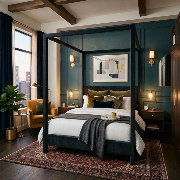
For a hotel-suite feel, pair cherry tones with tactile, higher-end materials: a velvet cherry headboard, brass or warm gold hardware, and a mix of table and floor lamps rather than a single overhead fixture. Layering two or three lighting sources at different heights is a trick professional stagers use to make a room feel finished rather than flat, and it works especially well with a color as rich as cherry, since warm bulb light (around 2700K) brings out the wood or velvet’s undertones. If you want more direction on pulling together a high-end bedroom look, our luxury bedroom decor ideas guide breaks down the layering and lighting choices that make a room feel expensive without a full furniture overhaul.
Fabric weight matters more than most people expect when styling a luxury cherry bedroom. A heavier velvet, in the 300–400 gram-per-square-meter range, drapes with more structure and photographs richer than a lightweight velvet blend, which can look thin and slightly cheap by comparison even in the same color. If you’re upholstering a headboard, ask for a fabric sample under both daytime and lamp light before committing, since velvet’s pile can shift a cherry tone noticeably darker under warm bulbs.

Cherry Tones Paired with Natural Materials
Cherry tones soften considerably when set against raw or matte natural materials — think unfinished linen curtains, a jute or sisal rug, and one or two houseplants. Where cherry alongside glossy or metallic surfaces reads as formal, cherry against linen and wood reads as lived-in and calm. A cherry-toned throw on a linen-upholstered bench, or a single terracotta planter near a cherry accent chair, keeps the palette grounded rather than showroom-polished. This combination also tends to age well, since natural materials patina rather than look dated the way a trend-driven accessory can.
Texture contrast is what keeps this pairing from feeling flat. Set a smooth cherry-glazed ceramic vase against a rough jute rug, or a woven rattan headboard against a cherry velvet cushion, so the eye has more than color to register. Unbleached and undyed natural materials also tend to yellow or gray slightly with age rather than fade the way dyed cherry textiles can, so mixing the two gives the room a built-in sense of depth as it wears in over time.

Warm Lighting That Complements Cherry Decor
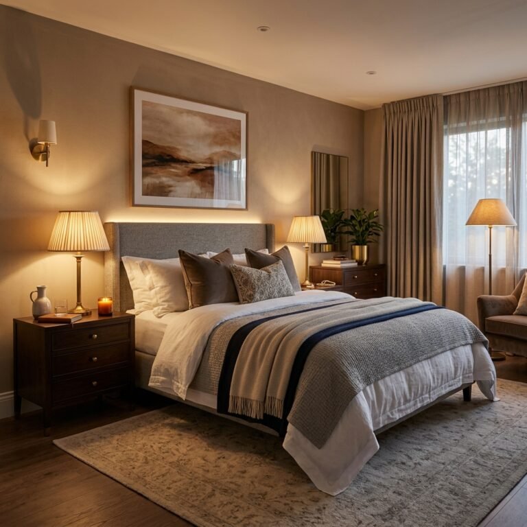
Lighting temperature changes how cherry tones read more than almost any other variable in the room. Warm white bulbs (2700K–3000K) bring out the color’s brown undertones and make it feel cozy, while cool white or daylight bulbs (5000K+) can push cherry toward a harsher, more purple-leaning red. A dimmer switch is worth the small investment here, since it lets you shift the room from bright and functional during the day to warm and moody at night without changing a single piece of decor. Wall sconces flanking a headboard, rather than a single ceiling fixture, also help distribute warm light evenly across a cherry accent wall instead of leaving it in shadow.
Aim for at least two separate light sources at different heights in a cherry bedroom — for example, a floor lamp near a reading chair and a pair of sconces at headboard height — rather than relying on one overhead fixture to do everything. A single ceiling light tends to flatten a saturated color and cast hard shadows, while layered lighting lets you dim different zones independently depending on whether you’re getting ready for the day or winding down at night.

Cherry Accents in Vintage and Traditional Bedrooms
Cherry has deep roots in traditional and vintage-inspired furniture, which makes it a natural fit for a bedroom built around antique or reproduction pieces. A cherry wood dresser with brass pulls, a cane-backed headboard, or a vintage quilt in cherry and cream tones all lean into the color’s classic associations rather than fighting them. This is a good option if you already own inherited or secondhand furniture in cherry-toned wood and want to build the rest of the room around it instead of replacing it. Ticking-stripe curtains and a floral or paisley accent chair round out the look without pushing it into costume territory.
If you’re mixing inherited cherry pieces of different ages, don’t worry about matching the wood tone exactly — furniture built decades apart will have picked up different amounts of sun exposure and polish, and a slight variation between pieces actually reads as more authentic than furniture bought as a matched set. A light dusting with a beeswax-based polish, rather than a silicone spray polish, keeps older cherry pieces from developing the slightly plastic sheen that spray products can leave behind over repeated use.
Cherry Bedroom Decor for a Calming, Relaxing Retreat
Despite being a bold color, cherry can support a genuinely restful bedroom when it’s balanced with soft textures and restraint elsewhere in the room. The color’s brown undertone keeps it from feeling as stimulating as a true bright red, which is part of why it works in a space meant for sleep rather than entertaining. Keeping surfaces clutter-free, choosing one or two cherry-toned pieces rather than five, and sticking to warm, dimmable lighting are the three habits that keep a cherry bedroom feeling like a retreat instead of a statement piece that’s hard to relax in.

Final Thoughts on Cherry Bedroom Decor Ideas
Cherry bedroom decor works at almost any level of commitment, from a pair of throw pillows to a full accent wall or wallpapered nook. The color’s warmth and brown undertone make it easier to live with than a true bright red, and pairing it with natural materials, warm lighting, and a light hand elsewhere in the room keeps it feeling elegant rather than overwhelming. Whichever entry point you choose, the goal is the same: let cherry do one clear job in the room, and build everything else around it.