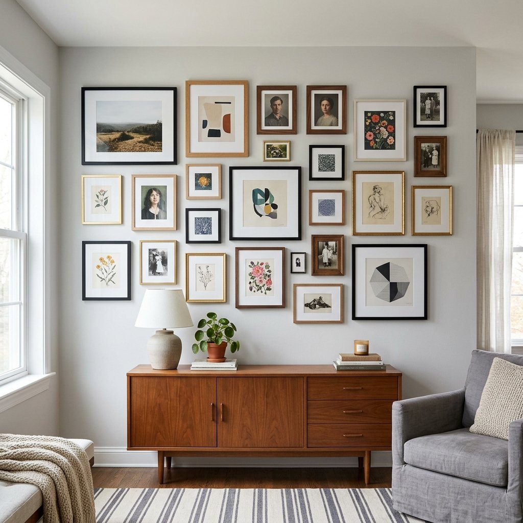
The Gallery Wall Mistake That Makes It Look Cluttered Instead of Curated
Most people troubleshoot a messy gallery wall by taking frames down. Too many pieces, they assume, so a couple come off the wall and the room gets patched holes for nothing, because the frame count was never the actual problem.
The real issue is almost always inconsistent spacing. When the gap between frames shifts from two inches in one spot to seven in another, the eye can’t settle into a rhythm, and the whole arrangement reads as chaotic no matter how good the individual pieces are. Galleries and museums have understood this for decades. Professionally hung collections keep a gap of roughly three to six inches between every piece, regardless of how many pieces are involved. That consistency, not the number of frames, is what separates curated from cluttered.
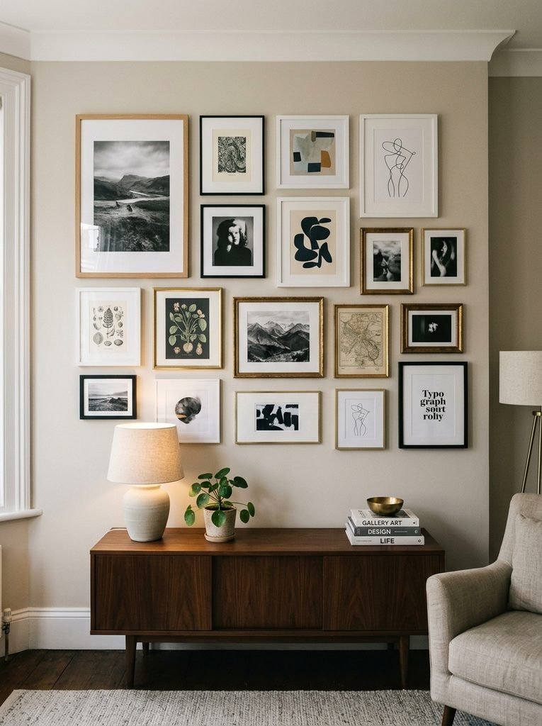
Why Uneven Spacing Reads as Clutter
The brain processes a group of objects by hunting for a pattern. When frames sit at even intervals, it registers the whole thing as one composition almost instantly and stops working to interpret it. When spacing varies, the brain keeps searching for a pattern it can’t quite find, and that unresolved search is what produces the low-level unease people describe as a wall looking “off” without being able to say why.
This is why two gallery walls with identical frames and an identical piece count can look completely different depending on execution. One feels considered. The other feels accumulated, even when both were planned with equal care.
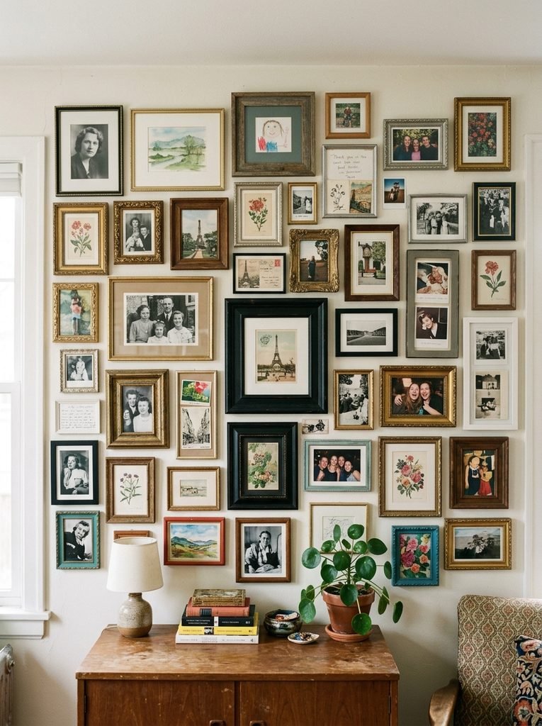
Pick One Gap Distance and Use It Everywhere
Before a single frame goes up, decide on a gap distance and hold to it across the whole wall. Two to three inches suits smaller, tightly grouped arrangements. Three to four inches gives more breathing room and works better for larger walls or bigger frames. Whatever number you land on, it needs to repeat between every pair of frames, including the ones near the edges that are easy to eyeball instead of measure.
Cut a simple cardboard spacer at your chosen width and use it as a physical guide throughout, rather than trusting your eye as you go. This one habit has more influence on whether a finished wall looks calm or chaotic than almost any other decision in the process.

Use a Paper Template Before Any Nail Goes In
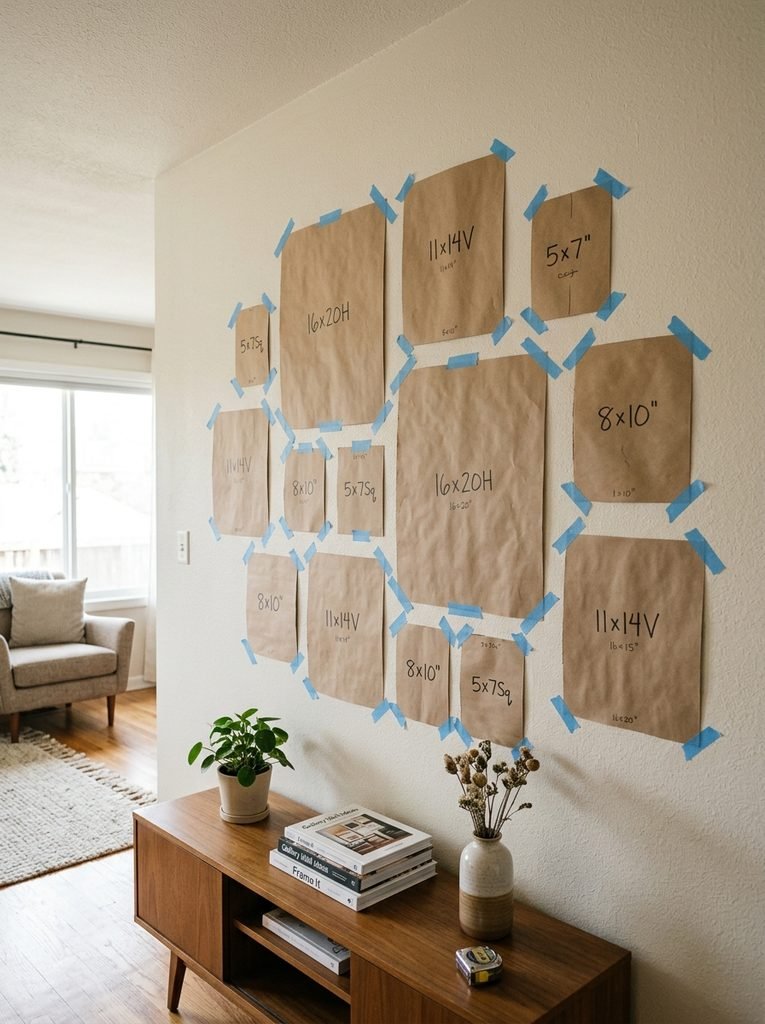
Cutting paper templates to the exact size of each frame and taping them to the wall in your planned layout lets you check spacing, alignment, and overall balance before committing to a single hole. Move templates around, step back across the room, and look again. What reads as fine up close often looks uneven from where people actually stand and view the wall.
This step also catches problems that are hard to see with frames stacked on the floor, like two similarly proportioned pieces that end up visually merging when they’re close enough together, or a small frame that gets swallowed by a gap that looks generous next to the rest of the arrangement. Mark the nail position on each template, hammer through the paper directly into the wall, then peel it away. It sounds tedious, but it turns a guessing process into a precise one.
If your gallery wall is competing with other visual elements in the same room, it’s worth reviewing The Coffee Table Styling Mistake That Makes Living Rooms Look Cluttered, since both problems trace back to too many focal points without a consistent thread connecting them.
Anchor the Whole Arrangement at Eye Level
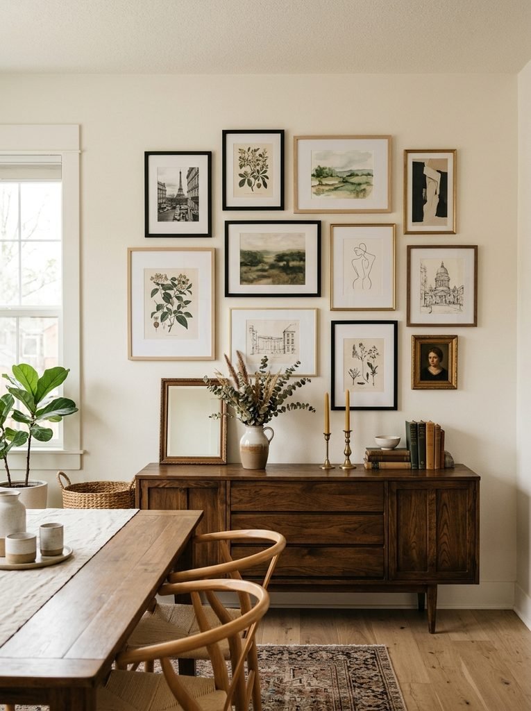
Spacing between frames matters, but so does where the entire grouping sits on the wall. Galleries anchor the center of a piece, or the center of an entire arrangement, at roughly fifty seven inches from the floor, which lines up with average adult eye level. Treating a multi-frame gallery wall as one large shape and centering that shape at this height, rather than centering just the biggest individual frame, keeps the composition grounded instead of floating too high or sitting too low.
Rooms where people are mostly seated, like a dining room or a reading nook, can drop that center a few inches to meet a seated sightline instead. Above furniture, the rule changes again: the bottom of the arrangement should sit roughly six to eight inches above the piece it’s paired with, so the whole thing reads as one connected vignette rather than two unrelated elements stacked on top of each other.
One Consistent Element Should Tie Everything Together
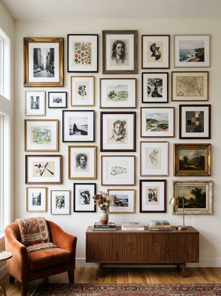
Even spacing handles the rhythm, but a gallery wall also needs one unifying thread running through the pieces themselves, whether that’s frame finish, mat board color, or a shared subject like black and white photography. Without it, perfectly spaced frames can still feel like an assortment rather than a collection.
This doesn’t mean every frame needs to match. Mixing styles and sizes is part of what makes a gallery wall feel personal instead of prepackaged. The discipline is in picking one variable to hold constant and letting everything else move freely around it, rather than varying frame color, mat color, and style all at once.
If you’re still settling on a palette or style direction for the room, Luxury Living Room Decor Trends Taking Over Pinterest is worth a look before you commit to that unifying element.
Start With Your Largest Piece as the Anchor
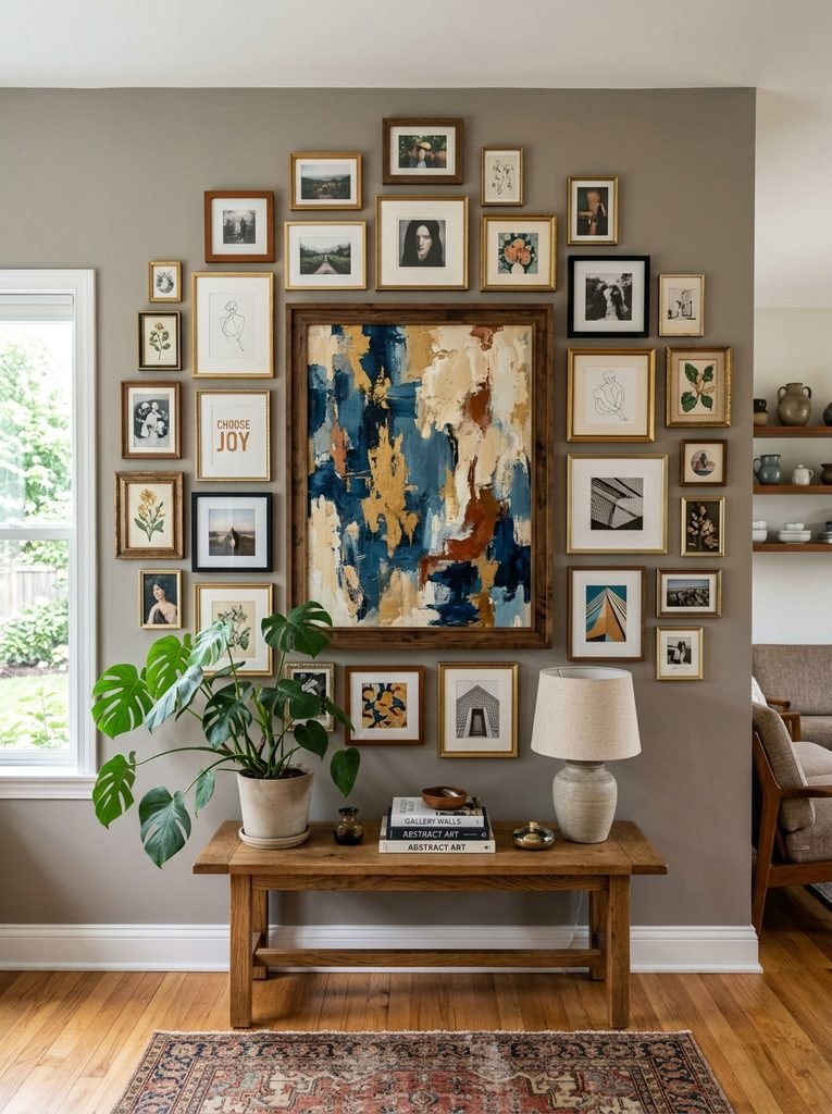
Every well-composed gallery wall has one piece functioning as a visual anchor, usually the largest frame or the one with the most visual weight. Place that piece first, slightly off-center or wherever feels like a natural starting point, and let smaller frames radiate outward from it. Trying to balance a dozen similarly sized pieces against each other with no clear hierarchy is what tends to produce a flat, grid-like result that reads as sterile rather than curated.
The same logic shows up in The Mantel Styling Mistake That Makes Fireplaces Look Unfinished, where the absence of a clear focal point is often what leaves an otherwise decent collection of objects feeling unresolved.
No-Nail Options for Renters
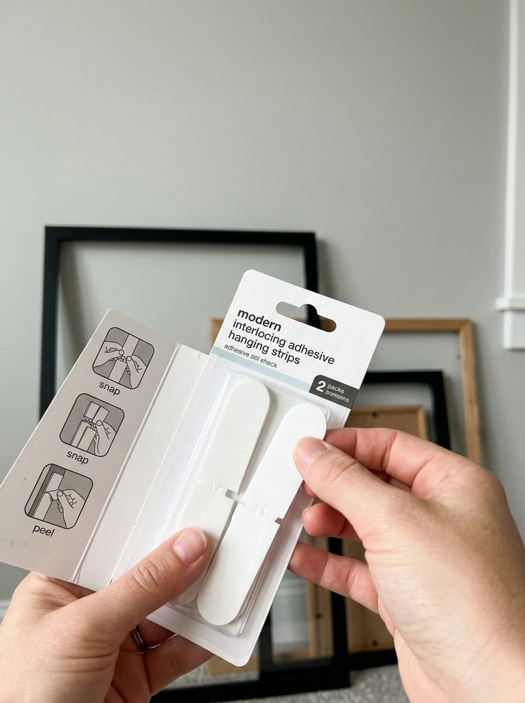
None of this requires drilling into a wall you don’t own. Adhesive picture hanging strips rated for the weight of your frame hold securely without leaving holes, and most come in a range of sizes matched to different frame weights. The same paper template method still applies, since the spacing problem exists whether frames are nailed or stuck.
The one adjustment for renter-friendly hardware is checking the weight rating printed on the strip packaging against your actual frame weight, glass included, since underestimating this is the most common reason adhesive strips fail. Heavier frames, especially anything with glass, may need two strips instead of one for a secure hold.
A Quick Real Life Example
A friend spent an entire Saturday hanging nine frames on her stairwell wall, following what she thought were all the right rules. Mixed sizes, mixed frame colors, a decent mix of photos and prints. Stepping back, it still looked messy, and she couldn’t identify why, since every individual choice felt reasonable on its own.
The issue was spacing. Some frames sat two inches apart, others closer to seven, purely from eyeballing placement as she went. She took everything down, cut a three inch cardboard spacer, and rehung the same nine frames using that spacer for every gap. Nothing else changed. The wall read as intentional instead of thrown together.
Common Mistakes That Undo an Otherwise Good Layout
Even with the right frames chosen, a few habits tend to creep back in during the actual hanging process.
Eyeballing spacing instead of measuring it. This is the single most common reason a gallery wall looks uneven, and it happens even to people who plan everything else carefully.
Skipping the paper template step. Committing to nail holes before confirming the layout on paper first almost always leads to at least one frame needing to be repositioned, which leaves visible patch marks behind.
Ignoring the overall center point. A beautifully spaced arrangement can still look off if the entire grouping sits too high or too low relative to eye level or the furniture beneath it.
Mixing too many variables at once. Varying frame color, mat color, and frame style all within the same wall usually reads as disorganized rather than eclectic. Pick one element to hold constant.
FAQs
How much space should I leave between gallery wall frames?
Two to three inches works well for smaller frames or tighter arrangements, while three to four inches suits larger frames or bigger walls. The exact number matters less than keeping it identical between every pair of frames.
Do all the frames need to match for a gallery wall to look put together?
No. Mixing frame styles and sizes is common and often looks better than a fully matched set, as long as one consistent element, like color family or matting, ties the mix together.
What’s the best way to plan a gallery wall layout without damaging the wall?
Cutting paper templates to the size of each frame and taping them up in your planned arrangement lets you finalize spacing and alignment before a single nail goes in.
Where should the center of a gallery wall sit?
Treat the entire arrangement as one large piece and center that shape at roughly fifty seven inches from the floor for a standing eye level, or a few inches lower in rooms where people are usually seated.
Can a gallery wall work with an odd number of frames?
Yes. Odd numbers often create more dynamic, less rigid compositions than even numbers, especially when one larger anchor piece anchors the arrangement.
Wrapping This Up
A gallery wall doesn’t become cluttered because it has too many frames. It becomes cluttered when the spacing between those frames has no consistent logic for the eye to follow. Measuring one gap distance and repeating it across the entire arrangement does more for the finished look than any amount of careful frame selection on its own.
Template the layout on paper first, pick one unifying element to hold constant, and let a simple spacer guide every gap. The frames you already own are very likely enough. What usually needs adjusting is the plan behind how they’re placed.
For more detail on the spacing and eye level standards professional galleries follow, Fine Art Shippers’ guide to museum hanging practices breaks down the gap ranges and placement logic used in professional installations.