
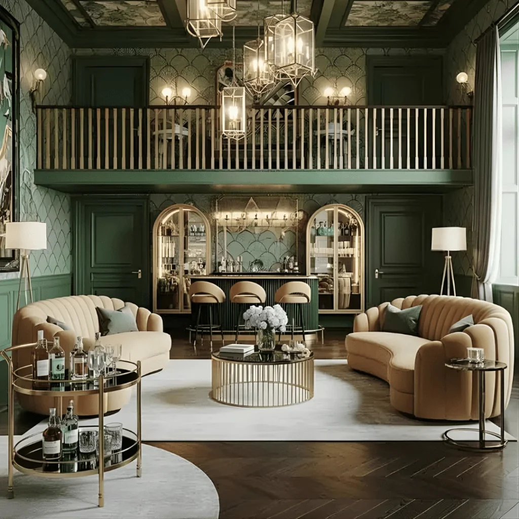
You walk in after work and the living room is fine. The sofa is beige, the walls are white, and the lamp came in a two-pack. Nothing is wrong, yet nothing makes you stop and look. That’s what a “basic” home feels like: tidy, comfortable, and a little forgettable.
Neo-Deco is a smart fix because it adds structure to a quiet room instead of replacing it. It borrows 1920s glamour, such as geometry, brass, lacquer, and velvet, and edits it for modern spaces. Each upgrade below names the problem it solves, a measurement to follow, and a cheaper or renter-friendly version where one exists.
Why Basic Homes Respond So Well to Neo-Deco
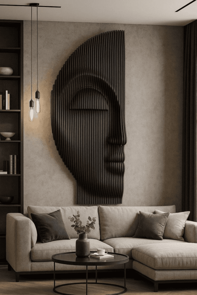
Builder-grade rooms share the same weak spots: flat walls, one overhead light, rectangles everywhere, and a palette with no dark note. Neo-Deco answers each one directly. It adds depth to walls, curves to hard lines, and contrast to flat color.
You don’t need all twenty upgrades. Pick the three that fix your biggest weakness, then add one statement piece at a time. A single dramatic item, like a sunburst mirror or an arched headboard, sets the tone, and everything else can stay quiet. For the bigger picture, see how Neo-Deco differs from minimalism.
How Much Time and Money Each Upgrade Takes
Not every upgrade needs a contractor. Sort them by effort before you shop, and you’ll avoid starting a project that stalls halfway.
Under an afternoon: swapping cabinet hardware, adding a statement mirror, trading lamp shades, editing your shelves, and clearing negative space. Most cost little and are fully reversible. One weekend: painting an accent wall or a faux arch, laying a new rug, adding fluted panels to a dresser, and hanging drapes higher. Bigger commitments: a statement headboard, a new chandelier that needs wiring, curved seating, and real wall paneling. Do the first group first, live with it for a week, and let the room tell you what it still needs.
Sculptural Lighting That Commands Attention
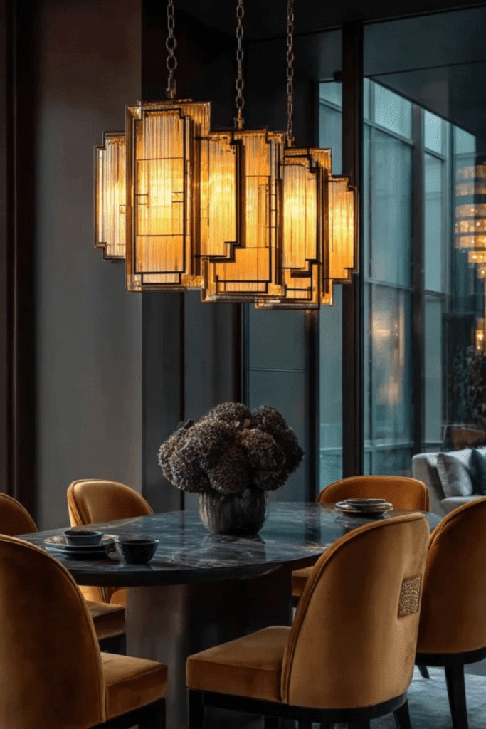
A single ceiling fixture is the quickest giveaway of a basic room. Swap it for something with presence: a tiered glass chandelier, a geometric pendant, or a sculptural flush mount. Size it with a simple rule. Add the room’s length and width in feet, and that number in inches is a good diameter, so a 12-by-14 room suits a fixture about 26 inches across. Over a dining table, hang it 30 to 34 inches above the surface. Brass or frosted glass gives a warmer glow than chrome. If the fixture needs wiring and you rent, a plug-in pendant with a ceiling hook gets you most of the look without an electrician.
Bold Geometric Wall Panels
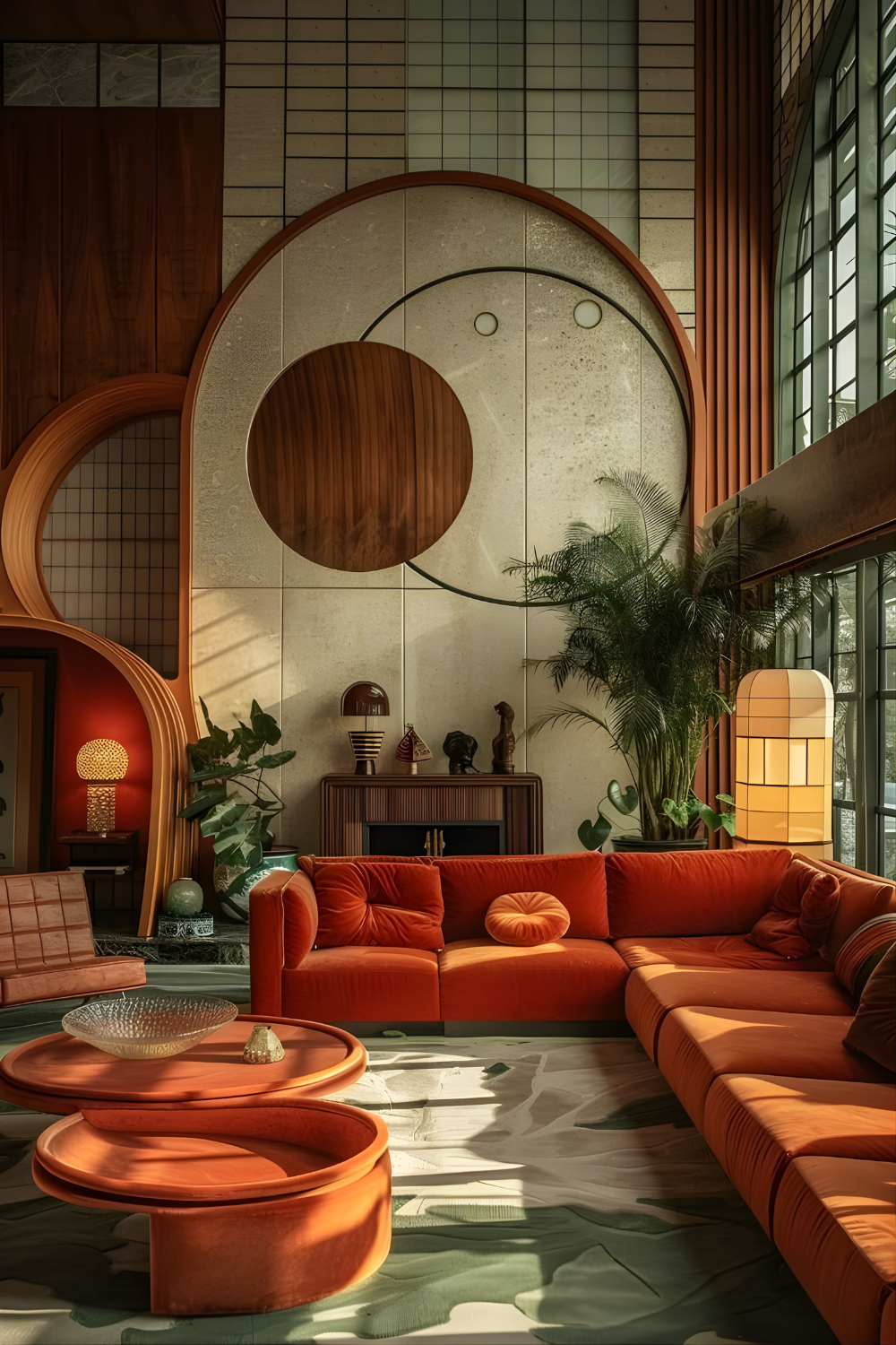
Flat walls are a big reason rooms look unfinished. Panels with fluting, arches, or stepped lines add shadow and depth, and the result looks built in. Run them floor to ceiling on one wall, or stop at about a third of the wall height, roughly 32 to 36 inches on an eight-foot wall. Paint panels and wall the same color for a tonal, high-end finish. Use a satin or eggshell sheen so the shadows between grooves stay soft instead of glossy. Renters can use peel-and-stick molding, a trick we cover in our guide to rental decor that looks custom designed.
Curved Furniture with Strong Silhouettes
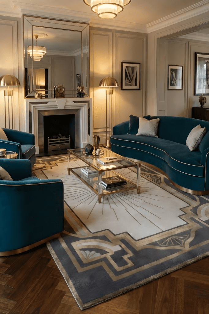
If every piece in your room has a right angle, the room reads as stiff. Add one curve per seating area: a round coffee table, a rounded accent chair, or an arched headboard. A round table 36 to 42 inches wide suits most sofas between 80 and 90 inches long. Keep 14 to 18 inches between table and sofa so knees clear. Curves also help in tight rooms, because there are no corners to catch your hip as you walk past. If you can only afford one curved piece, make it the one nearest the door, since it’s the first thing anyone sees.
High-Contrast Color Pairings
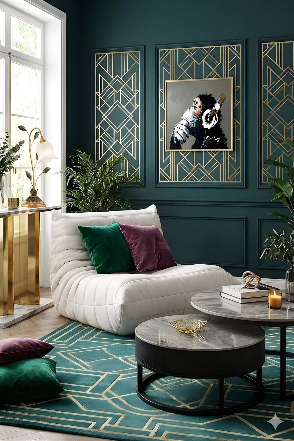
Basic rooms usually lack a dark note, so everything floats at the same light value. Add one deep anchor, such as emerald, navy, or charcoal, and pair it with one warm metal. Keep everything else light. Test before you commit by painting a two-foot sample square and checking it at 8 a.m. and 8 p.m. Deep colors shift a lot between daylight and lamplight. Reliable pairings include green with brass, black with ivory, and navy with gold.
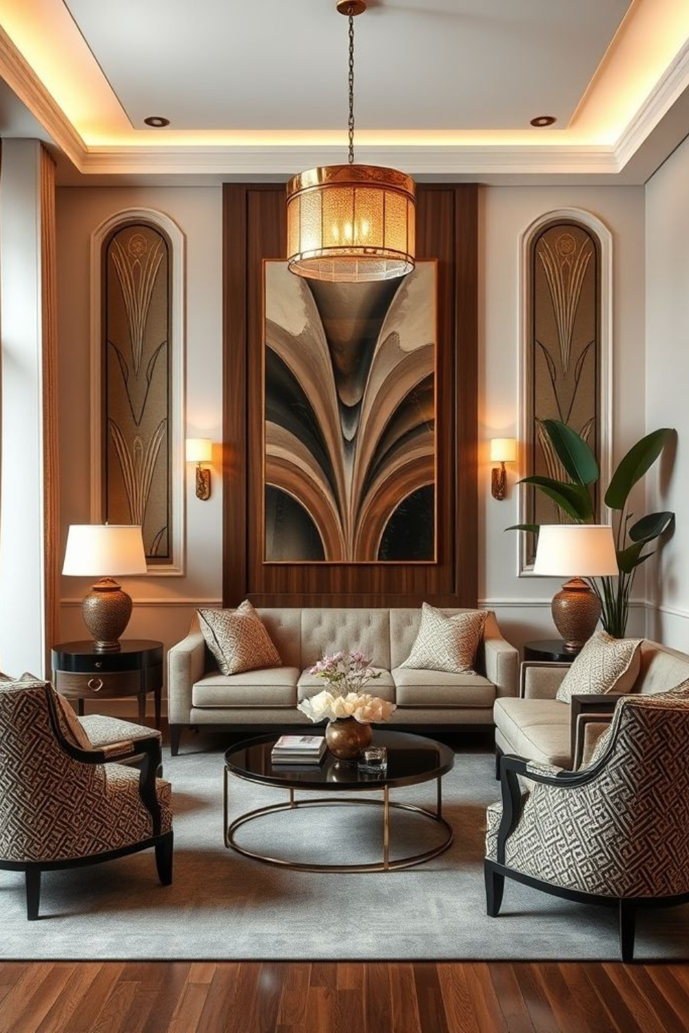
Statement Mirrors with Artful Frames
A mirror should be about two-thirds the width of the piece beneath it, so a 60-inch console wants a mirror near 40 inches wide. Hang it with the center about 57 to 60 inches from the floor. Sunburst, arched, and stepped frames all read as Neo-Deco. Place the mirror where it catches a window or a lamp, not a pile of mail. Check the reflection from your sofa and your doorway before you drill, since the best spot is often a few inches off where you’d guess. A large mirror is one of the cheapest ways to make a room feel brighter.
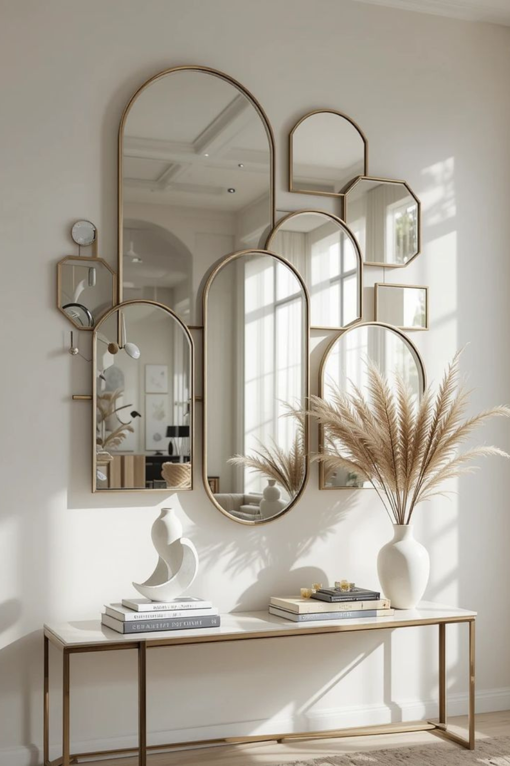
Luxe Materials That Feel Rich
Luxe doesn’t have to mean expensive. Start with surfaces your hands touch daily: a marble lamp base, brass drawer pulls, a velvet pillow. Pair opposites, such as cool stone with soft velvet, or matte paint with a glossy lacquer tray. Marble stains and etches, so seal it and use coasters. On a tight budget, buy small pieces in real materials rather than a large piece in a convincing fake.
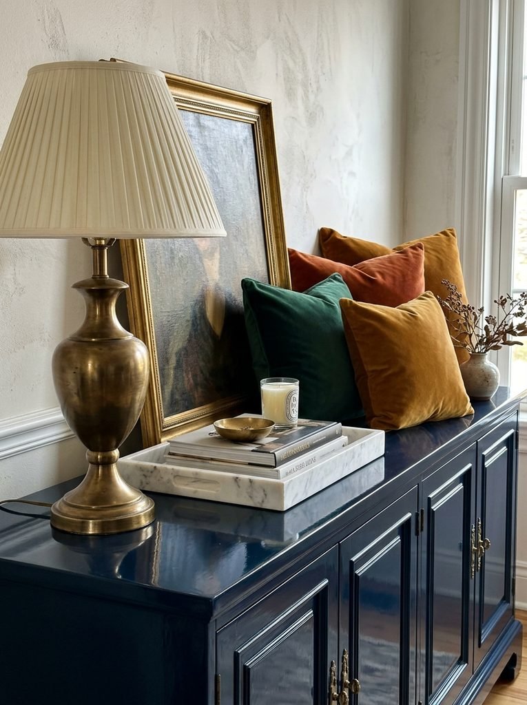
Symmetrical Furniture Layouts
Basic rooms tend to scatter furniture wherever it fits. Symmetry gives a room a spine. Pick a center line, such as the fireplace, bed, or sofa, and mirror outward with a tape measure. Paired armchairs, twin lamps, or matching nightstands should be within an inch or two of each other in height. Use symmetry in the main zone and let the edges relax, so the room feels designed rather than like a hotel lobby.
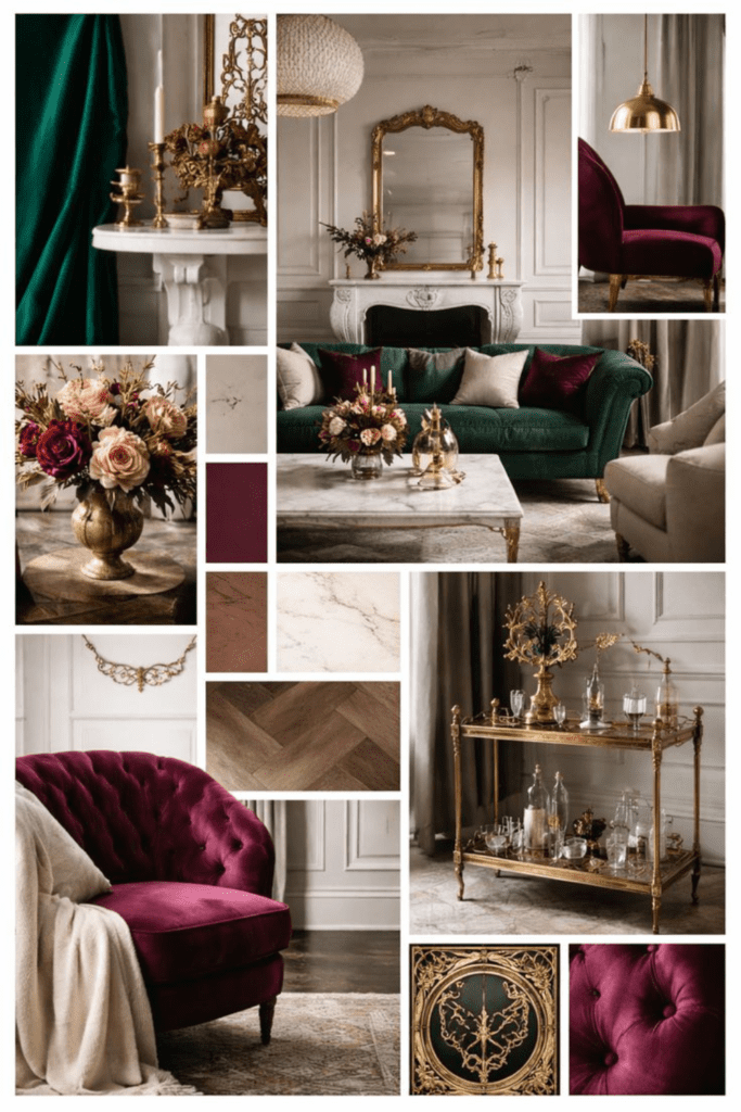
Art with Graphic Impact
Small prints scattered across a big wall look timid. Choose one large piece instead, about two-thirds to three-quarters the width of the furniture below it, and hang it with the center near 57 inches. Look for sunburst motifs, stepped silhouettes, or bold black-and-gold abstracts. A thin metal frame with a wide white mat keeps the look modern. Large-format prints from independent artists often cost far less than originals.
Metallic Accents with Restraint
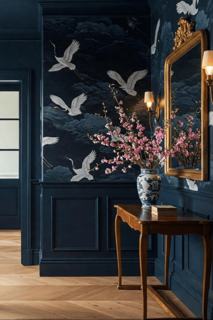
Think of metal as punctuation, not the whole sentence. Pick one dominant finish, such as brass, for about 80 percent of your metal, then add a second finish like black or chrome for the rest. The fastest swap is hardware. Measure the center-to-center distance of the existing holes, usually 3 or 3¾ inches, and buy pulls to match so you never drill new ones. Ten new pulls can transform a basic cabinet in an afternoon. Buy one first and hold it against the door before ordering the rest, because scale looks different on screen.
Layered Lighting for Mood
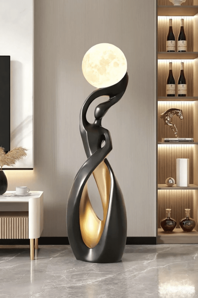
The best Neo-Deco rooms are lit at three heights: ambient light overhead, task light from lamps, and accent light from sconces or picture lights. Put each layer on its own switch or smart plug so you can dim them separately. Energy.gov treats 2,700 to 3,000K as warm light and says color rendering, scored on a 1 to 100 CRI scale, matters even more than color temperature. In practice, high-CRI bulbs make velvet and brass look richer. About 800 lumens matches an old 60-watt bulb, and dimming needs bulbs labeled dimmable.
Bold Area Rugs with Geometry
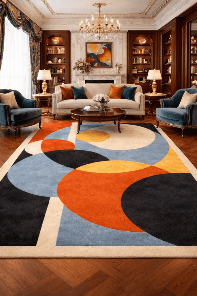
A rug that’s too small is a classic mistake in basic rooms. In a living room, at least the front legs of every seat should sit on the rug, and an 8-by-10 works for most layouts. Leave 12 to 24 inches of bare floor around the edge. Choose a large-scale geometric pattern, such as chevrons or stepped fans, in two or three colors already in the room. Add a rug pad to stop slipping and keep the edges flat. In a dining room, size up so chairs stay on the rug even when pulled out, which usually means the rug extends 24 inches past the table on every side.
Decorative Panels on Furniture
A plain dresser or sideboard can look custom with one change to its front. Flexible fluted or reeded panels, cut to fit the doors and glued on with construction adhesive, give a built-in look. Sand, prime, and paint everything one color, such as black lacquer or deep green, then add brass pulls. Measure each door twice and cut panels a hair under size. It’s a weekend project and costs a fraction of a new piece.
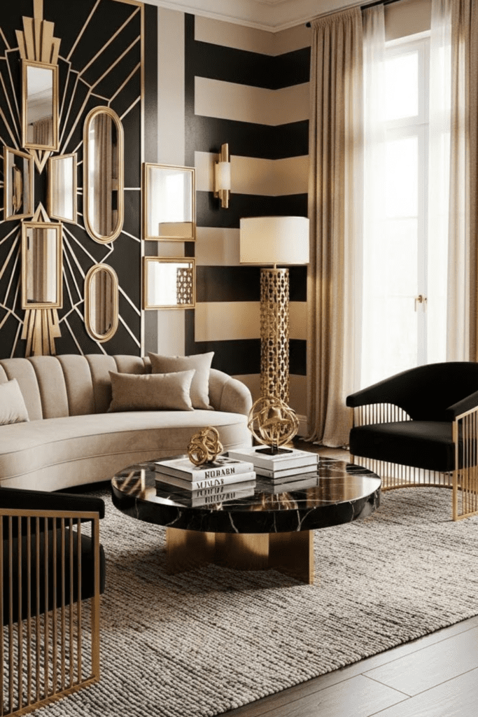
Rich, Moody Accent Walls
Choose the wall with the fewest windows, usually behind the bed or sofa. Deep colors absorb light, so use a matte or eggshell finish that hides flaws. One gallon covers about 350 to 400 square feet, so a single 8-by-12-foot wall needs just one gallon for two coats, plus primer. For extra drama, carry the color onto the trim. Pair it with brass sconces or a marble console so the wall looks planned, not patched.
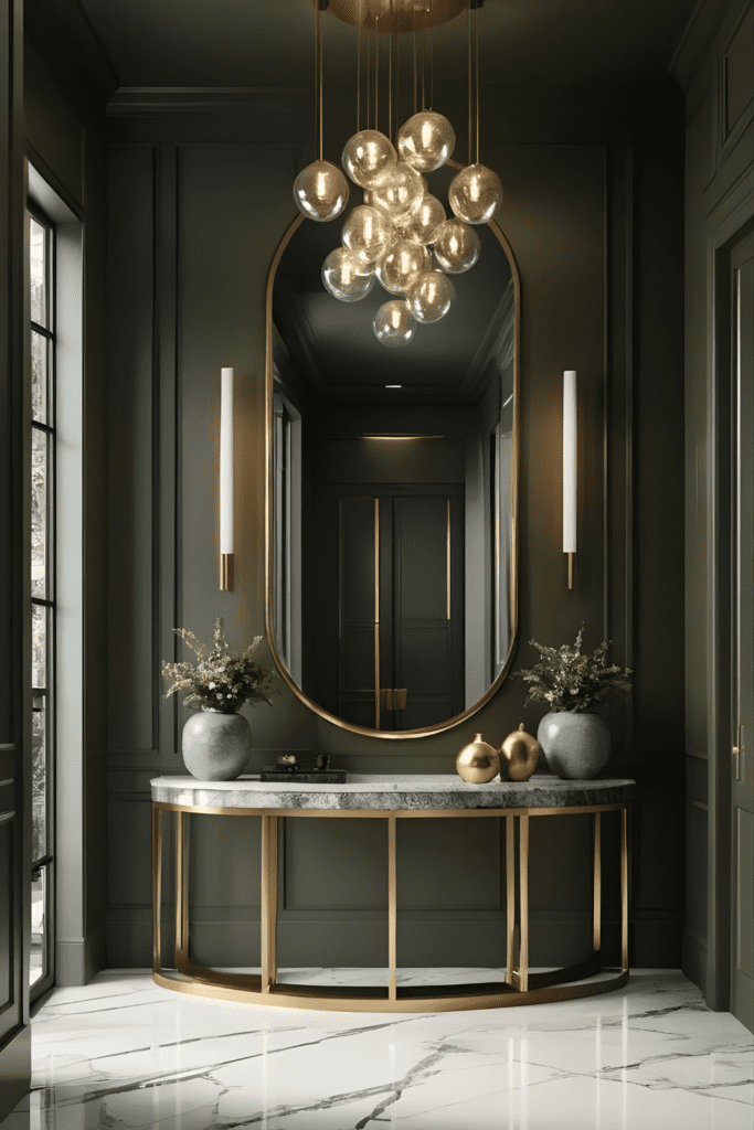
Curated Decorative Objects
A basic shelf holds many small things and none of them matter. Edit to three objects per surface in different heights: something tall like a vase, something mid-size like a sculpture, and something low like a tray. Leave about a third of the surface empty. Choose materials that catch light, such as smoked glass, marble, or brass, so each piece reads as a deliberate choice. Edited surfaces always look more expensive. Rotate the objects you remove into a drawer, then swap one in each month to keep the shelf fresh.
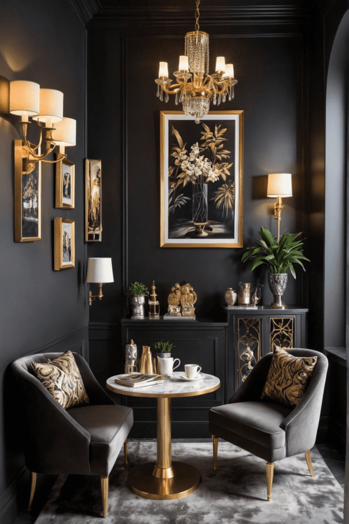
Architectural Arches
You don’t need to rebuild a doorway to get an arch. Paint one. Tie a string to a pencil, pin the other end at the arch’s center point, and sweep a half circle. The string length is the radius, which is half the arch’s width. A painted arch about 6 inches wider than your headboard looks striking behind a bed. Arched mirrors, cabinet doors, and shelves deliver the same softening effect in smaller doses.
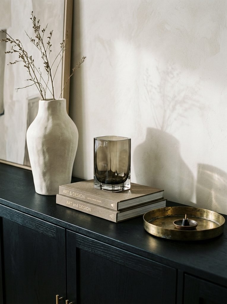
Statement Headboards
A bed with no headboard looks unfinished. A tall one, about 54 to 60 inches from the floor, changes the whole wall. Look for channel tufting, a scalloped arch, or fluting, in velvet or leather. The headboard should extend a few inches past each side of the mattress. If you can’t mount anything, a freestanding upholstered headboard that attaches to the bed frame solves the problem without touching the wall.
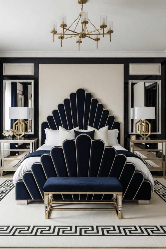
Elegant Console Tables
An entry with only hooks and shoes tells guests nothing. A slim console, 10 to 14 inches deep and 30 to 34 inches tall, gives the space a focal point. Keep at least 36 inches clear in front of it for walking. Style it in three parts: a lamp or pair of lamps, a tray for keys, and one sculptural object. Hang a mirror 4 to 8 inches above the top so the two read as one unit.
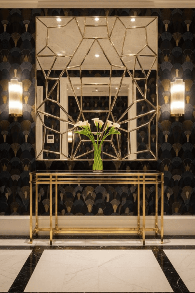
Refined Window Treatments
Hang the rod 6 to 12 inches above the window frame, or near the ceiling, so the drapes stretch the wall. Extend it 8 to 12 inches past each side, which makes the window look larger and lets in more light. Panels should total about two times the window width for full folds, and they should just skim the floor. Velvet or heavy linen on a brass rod with geometric finials delivers the look.
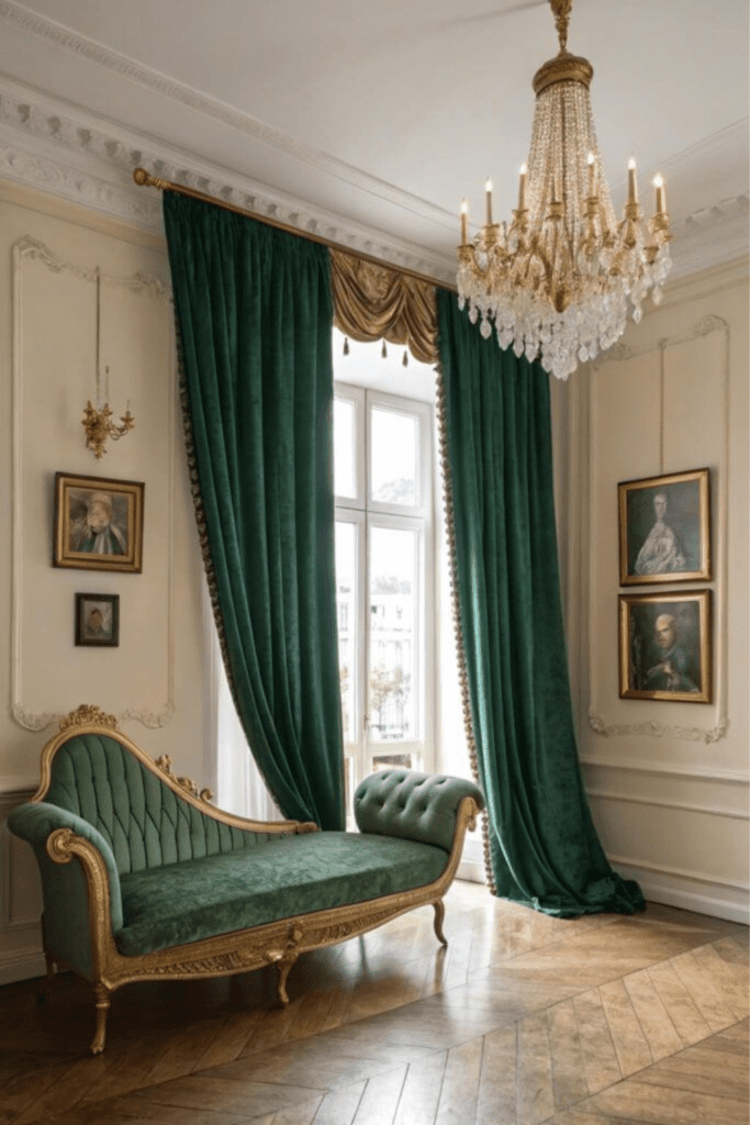
Statement Seating Pieces
One bold chair can wake up a corner. Look for a visible silhouette: open arms, exposed legs, a curved back, or fluting. Keep the scale sensible, about 28 to 32 inches wide for a chair that won’t overwhelm a living room, and angle it about 45 degrees toward the sofa. Secondhand chairs with good bones are worth reupholstering in velvet or bouclé. You get a one-of-a-kind piece for far less than a new designer chair. Sit in it first, since a gorgeous silhouette you can’t stand for ten minutes will end up as decoration.
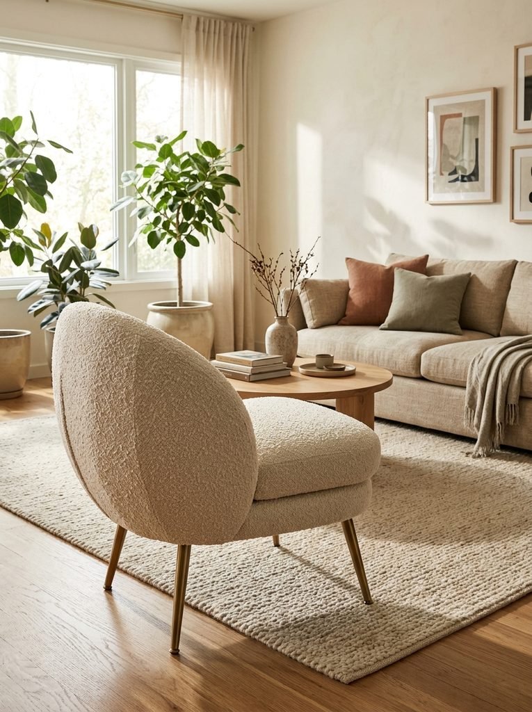
Intentional Negative Space
The last upgrade is removal. Every statement piece needs room to be seen. Edit until each wall has one focal piece, each surface holds no more than three items, and your statement chair or console has at least 24 inches of clear space around it. Empty areas aren’t unfinished. They let the details read as luxury. If you try only one upgrade this month, clear a surface and see what happens.
Where to Start First
If twenty upgrades sounds like a lot, start with three: lighting, a mirror, and hardware. They cost the least, take an afternoon each, and change how the whole room reads. Then add one bigger move, such as a moody wall or a statement headboard. Neo-Deco works because it’s edited, not crowded. Add pieces slowly, step back after each one, and stop when the room feels finished.
1 comment