How to Choose the Perfect Living Room Color Palette
Master the art of atmosphere by curating a strategic living room color palette, a foundational interior design move that dictates the mood, perceived scale, and visual flow of your home. A professional-grade palette does more than just “look good”; it creates a harmonious dialogue between your walls, large-scale furniture, and accent pieces like rugs and art. By understanding the 60-30-10 rule—where 60% is your dominant neutral, 30% is a secondary color, and 10% is a bold accent—you can achieve a balanced, designer-level look that prevents your space from feeling either too sterile or too chaotic. This color styling approach is the most cost-effective way to transform a room’s architectural feel. For instance, cool tones like soft blues or crisp whites can make a small living room feel expansive and airy, while warm terra-cotta’s or deep olives can turn a large, drafty room into a cozy, intimate sanctuary. To ensure success, always test your chosen hues against both natural daylight and warm evening bulbs, as lighting drastically shifts how a pigment sits on a surface. Whether you are aiming for a moody “dark academia” vibe or a bright “organic modern” aesthetic, a well-defined color story acts as the invisible thread that pulls disparate decor elements into a singular, visually cohesive narrative that reflects your unique personality.
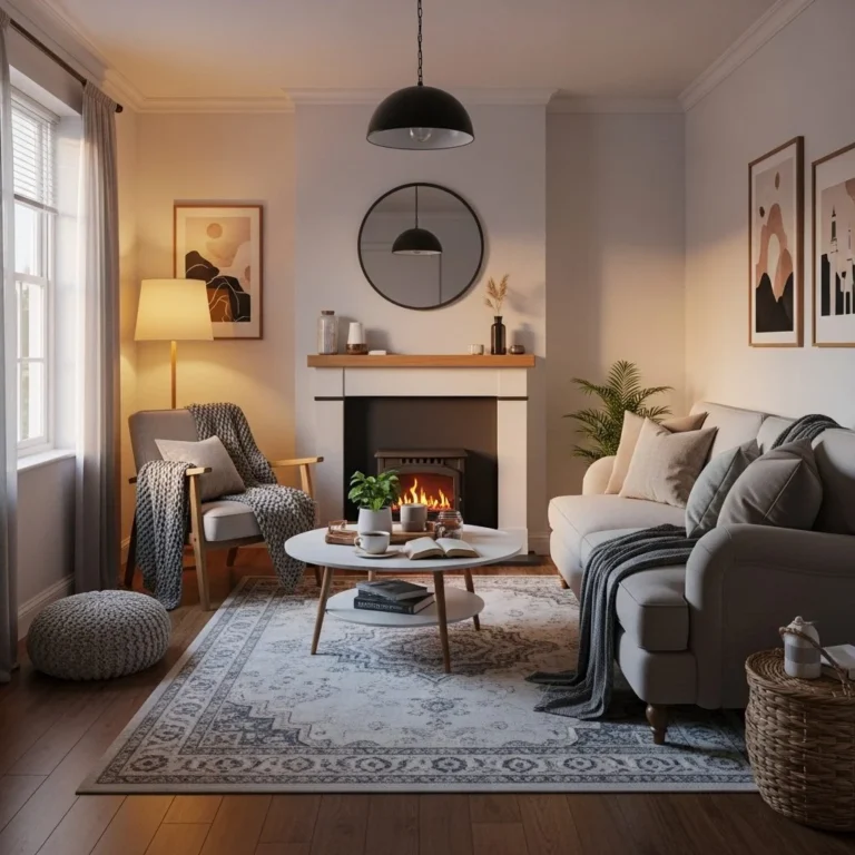
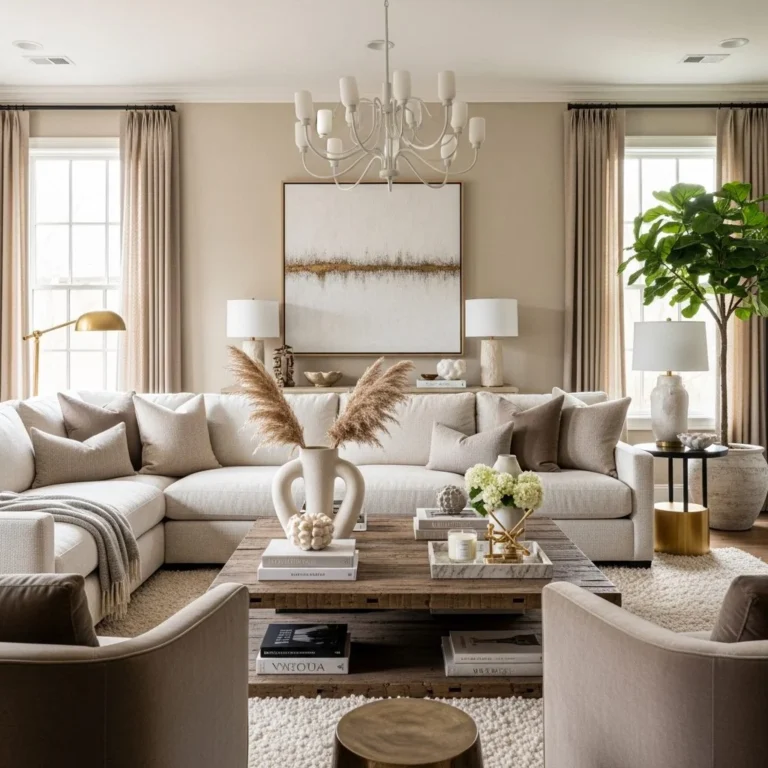
1. Start with a Neutral Base Color
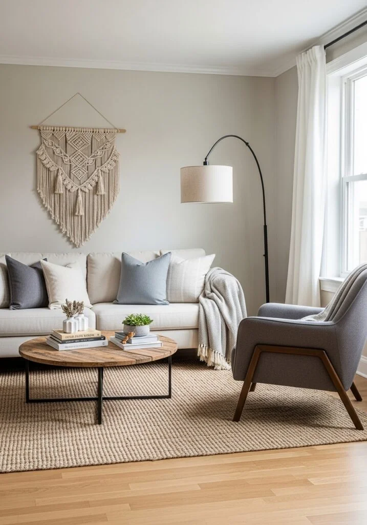
Establish a timeless foundation by starting with a neutral base color, a core interior design strategy that provides maximum flexibility and longevity for your living room palette. Professional designers frequently utilize “anchor neutrals” like warm white, soft beige, greige, or cream to create a serene, open atmosphere that serves as a sophisticated canvas for more daring decor elements. By applying these muted tones to high-impact surfaces—such as your walls, primary sofa, or large-scale cabinetry—you ensure that the room feels architecturally balanced and visually uncluttered. This color layering approach allows you to evolve your style over time without the need for a full renovation. Once your neutral “60%” is established, you can effortlessly introduce seasonal trends or personal pops of color through lower-commitment items like velvet cushions, abstract artwork, or textured throws. This method is particularly effective for modern and minimalist interiors, as it highlights the silhouette of your furniture and the quality of your natural light. By prioritizing a calm, cohesive base, you transform a potentially overwhelming space into a polished sanctuary that feels both curated and expansive, providing the perfect “quiet” backdrop for a life well-lived.
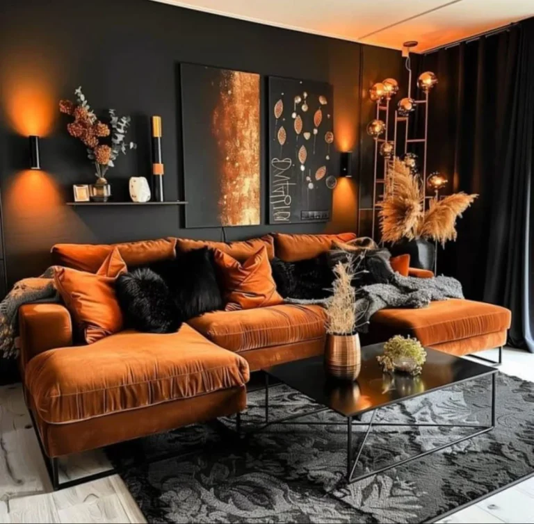
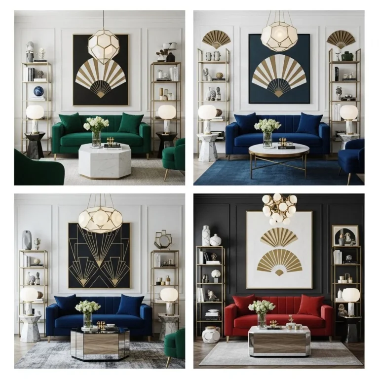
2. Use the 60-30-10 Color Rule
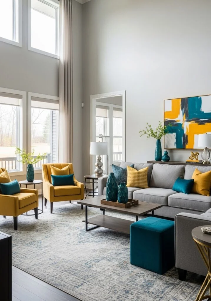
Achieve a professionally balanced interior by mastering the 60-30-10 color rule, a classic design principle that ensures a harmonious and visually interesting living room layout. This strategic approach divides your palette into three distinct layers: sixty percent serves as the dominant foundation, typically applied to large-scale surfaces like wall paint or a primary sectional to anchor the space; thirty percent introduces a secondary hue through elements such as area rugs, curtains, or accent seating to add depth; and the final ten percent is reserved for bold accent colors found in decorative accessories like throw pillows, artwork, or vases. By adhering to this proportion, you prevent a room from feeling chaotic while allowing for enough color variation to create a sophisticated, home styling narrative. This simple yet effective guideline makes it effortless to choose complementary tones that organize your furniture and decor into a cohesive, designer-grade sanctuary that feels both curated and comfortable.
3. Consider Natural Lighting in the Room
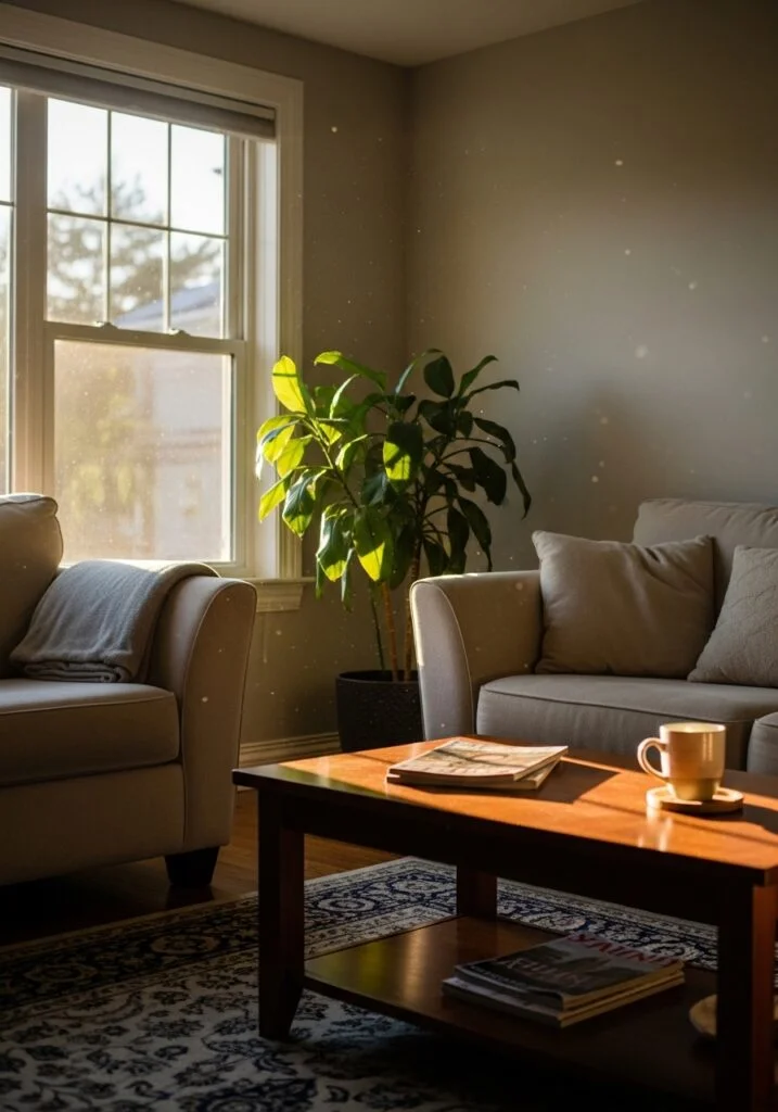
Maximize the architectural potential of your home by optimizing your living room color palette for natural lighting, a critical interior design strategy for creating a balanced and welcoming atmosphere. Lighting serves as the ultimate “chameleon” in home styling; while sun-drenched, south-facing rooms with expansive windows beautifully amplify cool tones and soft neutrals like crisp whites or airy blues, darker spaces with limited exposure require a different approach to avoid feeling sterile. To counteract the shadows in low-light areas, expert designers recommend warm-toned paints such as beige, taupe, or soft terracotta, which introduce a much-needed “glow” and prevent the room from feeling cave-like. This color selection process is essential for achieving a professional-grade interior that feels spacious and intentional throughout the day. Because the sun’s position dramatically shifts the appearance of pigment—turning a clean gray into a dull blue by afternoon—it is vital to test large paint samples on various walls before committing. By strategically harmonizing your wall colors with your room’s specific orientation and light levels, you ensure a visually cohesive, high-end aesthetic that enhances your furniture, rugs, and overall decor, transforming a simple living area into a sophisticated, light-optimized sanctuary.
4. Draw Inspiration from Existing Furniture
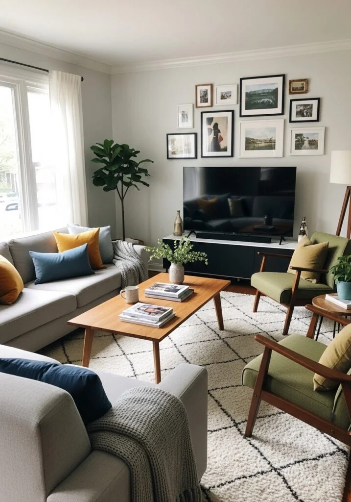
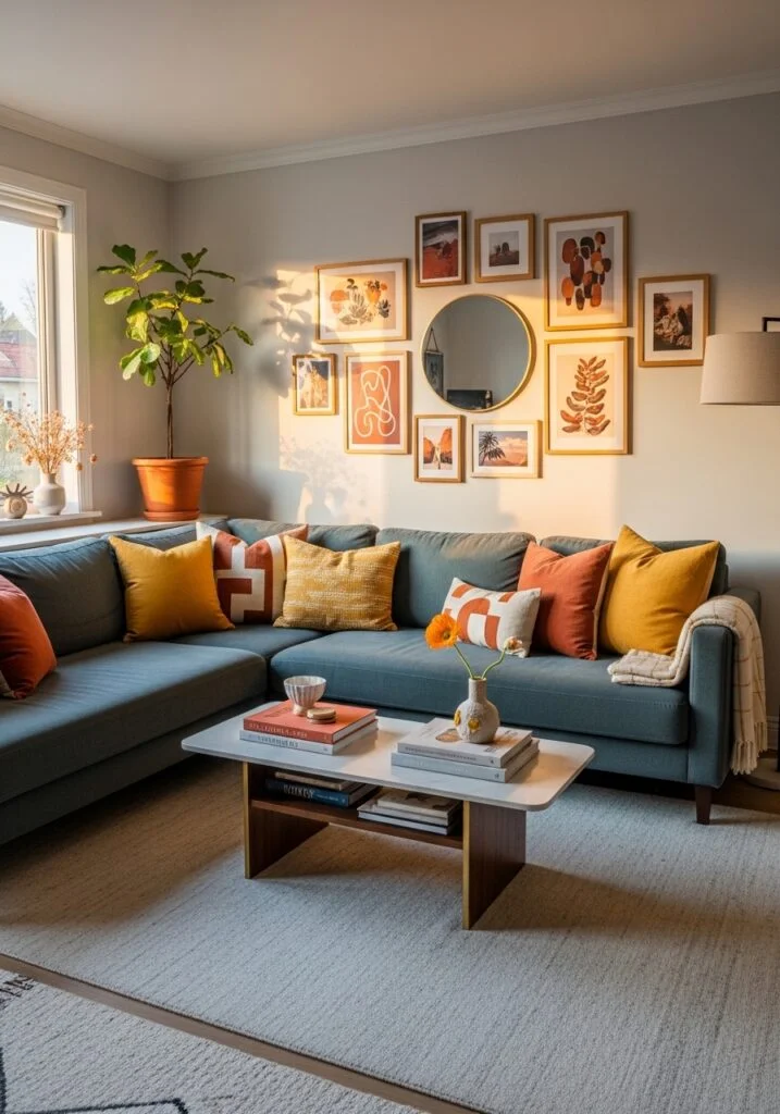
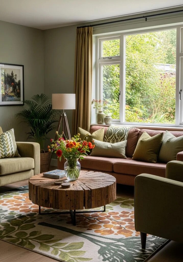
Elevate your living room’s architectural flow by drawing color inspiration from your existing furniture, a high-impact interior design strategy that guarantees a cohesive, professionally curated aesthetic. By treating a primary investment piece—such as a neutral sectional, a vintage-style rug, or a large-scale textile tapestry—as your “anchor,” you can effortlessly extract a sophisticated palette that feels both intentional and grounded. For instance, if your room features a soft gray sofa, you might introduce warmth through light oak wood tones and sophisticated gold accents to balance the cool undertones. This home styling method is a favorite among minimalist and Scandinavian designers because it utilizes pieces you already love to dictate the room’s energy, preventing the visual “clutter” of mismatched hues. Building your color story around a statement artwork or a textured area rug not only prevents costly decor mistakes but also ensures that every element, from the wall-mounted shelving to the coffee table, feels structurally unified. This approach is particularly effective for small space optimization, as a harmonized color palette makes a room feel more expansive and thoughtfully curated. Whether you are highlighting the subtle threads in a woven throw or the metallic finish of a sculptural wall clock, using existing furniture as a color guide is the ultimate designer-grade shortcut to a balanced, visually stunning sanctuary that perfectly reflects your personal taste.
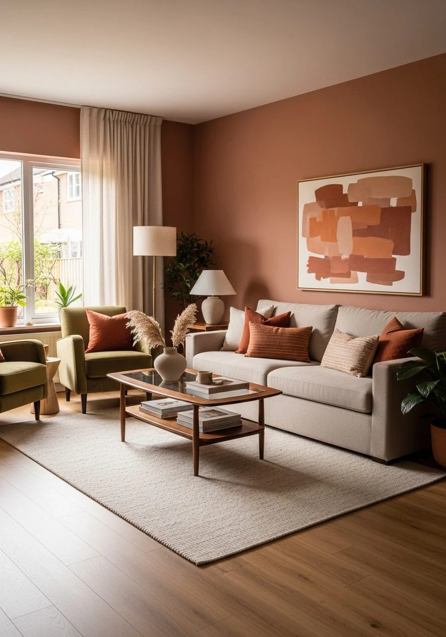
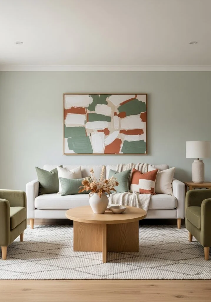
5. Choose Colors that Reflect Your Style
To truly personalize your home, you must choose colors that reflect your unique design style, a process that involves translating the desired “mood” of a room into a tangible color story. For those gravitating toward minimalist or Scandinavian aesthetics, a palette of soft neutrals—such as oatmeal, stone, and hushed whites—is essential for creating a clean, high-clarity environment. Conversely, if your goal is modern luxury, deep jewel tones like emerald green or sapphire navy provide a dramatic, sophisticated backdrop that highlights metallic accents and rich textures. This color psychology approach ensures that your living room doesn’t just look “decorated,” but feels intentionally aligned with your lifestyle. For homeowners seeking a “hygge” or cozy sanctuary, incorporating warm earthy tones like terracotta, caramel, and olive green can instantly ground a large space and make it feel more inviting. On the other end of the spectrum, light pastel shades are the gold standard for creating a fresh and airy atmosphere, making them ideal for coastal or cottage-core designs. By identifying the emotional resonance you want your living room to have—whether it’s energized and bold or calm and restorative—you can narrow down your choices and build a visually cohesive palette that feels like a natural extension of your personality.
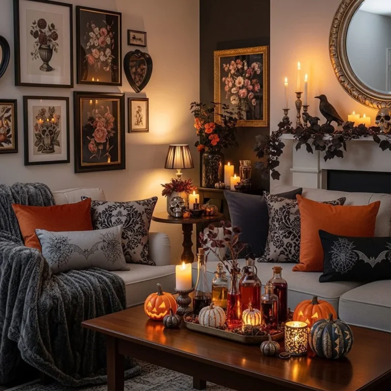
6. Incorporate Accent Colors Thoughtfully
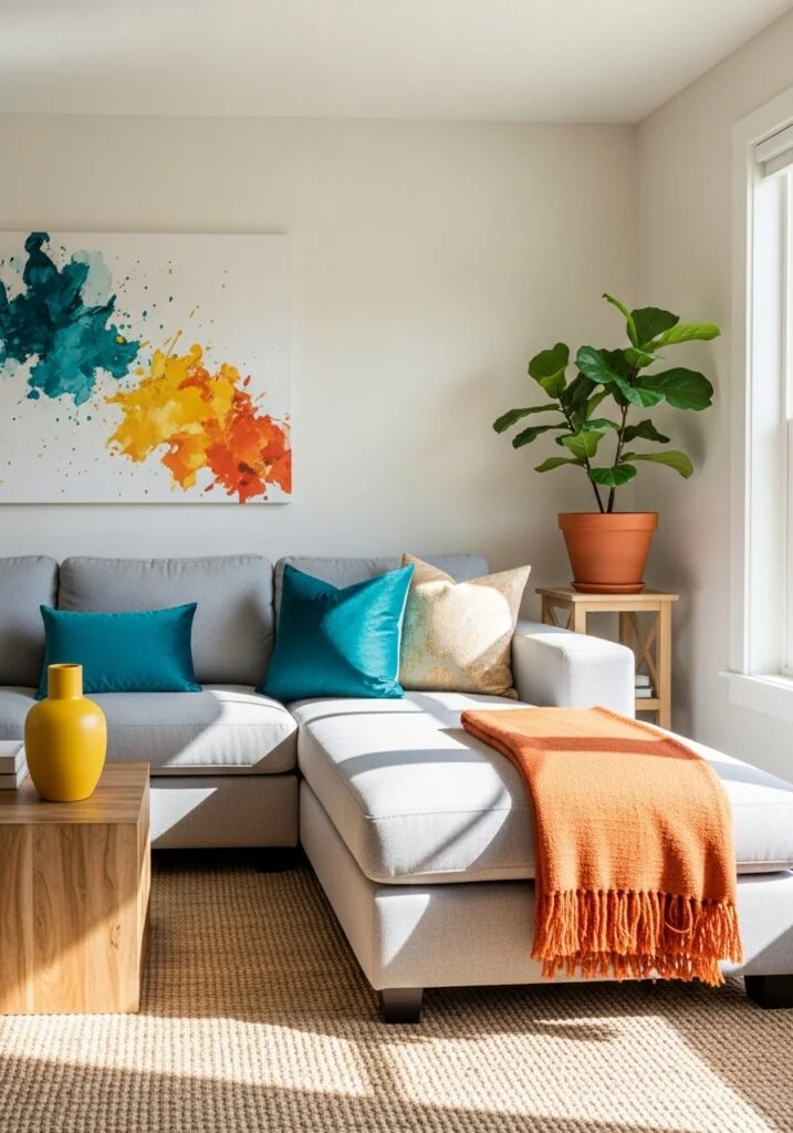
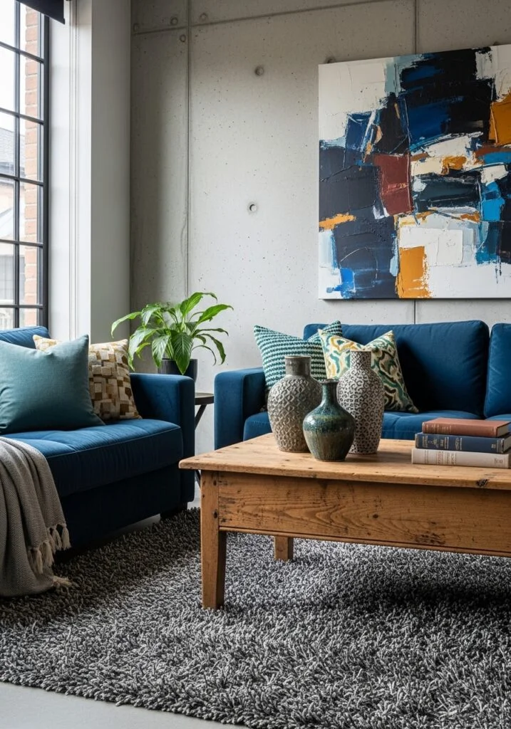
Infuse your home with vitality by incorporating accent colors thoughtfully, a high-impact design technique that prevents neutral spaces from feeling flat while reflecting your unique personality. As the final “10%” in a professional 60-30-10 color story, accent shades like mustard yellow, emerald green, or deep navy provide the essential visual “pop” needed to draw the eye and create focal points. By strategically layering these colors through low-commitment decor elements—such as plush throw blankets, sculptural vases, or vibrant wall art—you can dramatically shift the energy of a room without the permanent commitment of paint or large-scale upholstery. The secret to a designer-grade finish lies in moderation and repetition; for instance, repeating a soft blush tone in both a sofa cushion and a small decorative object on a bookshelf creates a sense of “visual rhythm” that feels intentional rather than cluttered. This color layering approach is particularly effective for modern and minimalist interiors, where a single, well-placed accent can highlight architectural lines and elevate the room’s perceived luxury. Whether you are aiming for a moody, sophisticated vibe or a bright, energetic atmosphere, using accent colors as your “finishing touch” ensures your living room remains a dynamic, visually cohesive sanctuary that is easy to update as your style evolves.
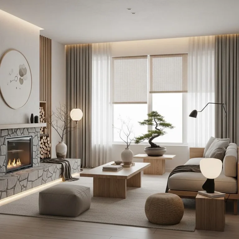
7. Use Textures to Enhance Color Depth
Elevate the sensory appeal of your home by using textures to enhance color depth, a sophisticated interior design technique that transforms a simple palette into a rich, multi-dimensional experience. Even within a strictly neutral or monochromatic scheme, the interplay of light and shadow on different surfaces—such as plush velvet, raw linen, natural wood, and sleek metal—creates visual “weight” and prevents a room from feeling flat or clinical. By strategically layering materials like a soft wool area rug against a smooth leather sofa or a reclaimed wood coffee table, you introduce a designer-grade complexity that makes your living room feel intentionally curated and high-end. This textural styling strategy is essential for modern minimalist and Scandinavian interiors, where “quiet” colors rely on tactile variety to provide warmth and interest. For instance, a cream-colored room gains architectural depth when you pair a chunky knit throw with a matte-finished ceramic vase and a high-gloss metallic floor lamp. These contrasting finishes change how light interacts with your chosen hues, making a single color appear as multiple shades throughout the day. Ultimately, incorporating varied textures is the most effective way to maintain a calm, sophisticated sanctuary while ensuring your decor remains visually stimulating and professionally balanced.
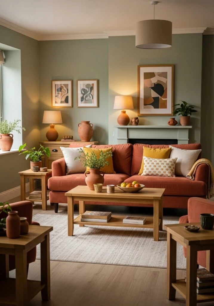
8. Look at Nature for Color Inspiration
Connect your home to the outdoors by drawing color inspiration from nature, a master-level interior design strategy for creating a balanced and organic living room atmosphere. Because earthy greens, warm wood browns, sandy beiges, and sky blues naturally coexist in the environment, they possess an inherent visual harmony that feels instantly relaxing to the human eye. Incorporating these “biophilic” hues into your home styling creates a restorative sanctuary that promotes mental well-being and calmness, a core tenet of modern Jandapi and Organic Modern interiors. By layering these natural tones through high-quality materials—such as a jute rug, a forest green velvet sofa, or oak shelving—you mimic the effortless beauty of a landscape. To truly elevate this aesthetic, professional designers recommend “bringing the outside in” by adding vibrant indoor plants like a Fiddle Leaf Fig or an Olive Tree, which provide both literal life and a dynamic pop of texture. This approach ensures your color palette feels grounded and timeless, transforming a standard living area into a sophisticated, nature-inspired retreat that feels both expansive and intimately connected to the world outside.
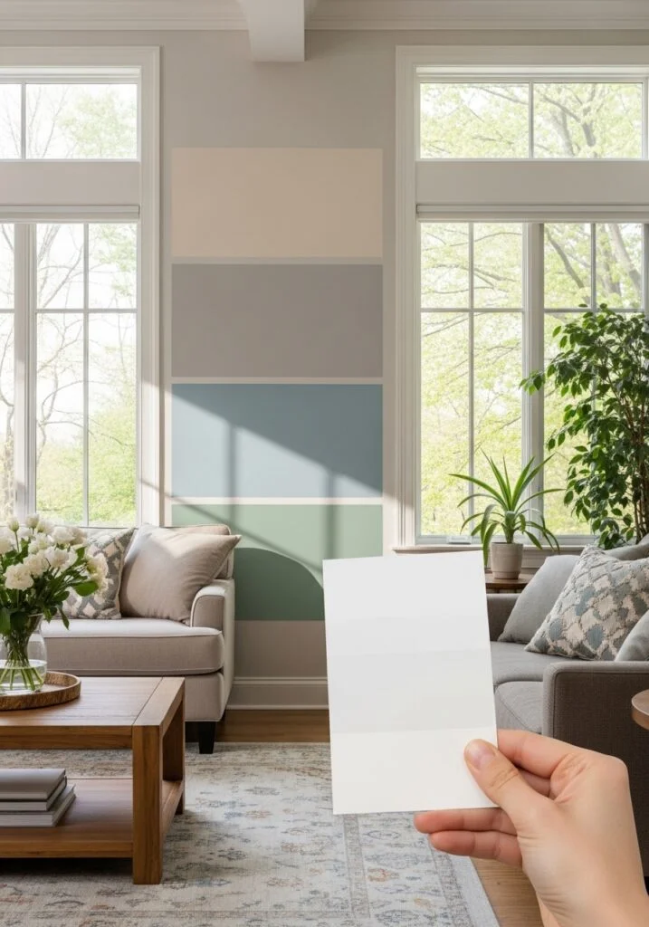
9. Test Paint Samples Before Finalizing
Avoid the “paint regret” trap by testing paint samples directly on your living room walls before committing to a full-scale renovation. This is a non-negotiable step in professional interior design because paint is a “metameric” substance—meaning its appearance shifts dramatically depending on the specific CRI (Color Rendering Index) of your light bulbs and the movement of natural sunlight throughout the day. A sophisticated “greige” that looks perfect in a bright showroom can easily turn into a muddy purple in a North-facing room by late afternoon. To execute this color testing strategy, designers recommend painting large 2-foot by 2-foot swatches on at least two different walls: one that receives direct sunlight and one that stays in the shadows. This allows you to observe how the pigment interacts with your specific furniture, rugs, and flooring over a 24-hour cycle. By taking the time to live with these samples, you prevent the costly and frustrating mistake of repainting, ensuring your final palette creates the exact visually cohesive sanctuary you envisioned. This deliberate approach is the hallmark of a professionally styled home, turning a simple DIY project into a high-end architectural transformation.
10. Keep the Palette Consistent Throughout the Room
Achieve a high-end, designer-grade aesthetic by keeping your color palette consistent, a fundamental interior design principle that ensures every element of your living room feels unified and intentional. Visual continuity is the secret to transforming a collection of furniture into a professionally curated sanctuary; by ensuring your wall colors, upholstery fabrics, rugs, and drapes share a harmonious tonal language, you eliminate visual “noise” and create a sense of architectural calm. This home styling strategy relies on the subtle repetition of hues—such as matching the navy thread in a patterned area rug to a velvet accent pillow or a piece of wall art—to guide the eye seamlessly through the space. Consistency does not mean monotony; rather, it creates a rhythmic flow that makes a room feel “thoughtfully designed” rather than randomly decorated. In modern minimalist or transitional interiors, repeating a specific metallic finish or wood tone alongside your primary colors reinforces the room’s structural identity. By anchoring your decor in a visually cohesive narrative, you ensure that even small additions feel like a natural extension of the original vision. This disciplined approach to color distribution is the most effective way to create a polished, high-impact living area that radiates balance, comfort, and sophisticated style.
Conclusion
Choosing the perfect living room color palette is about creating harmony between colors, textures, and lighting. By starting with a neutral base, using the 60-30-10 rule, considering lighting conditions, and adding thoughtful accents, you can design a living room that feels balanced and inviting. Remember that color should enhance the mood of the space while reflecting your personal style. Taking time to test colors and coordinate decor elements ensures a cohesive design that looks polished and timeless. With the right color palette, your living room can become a beautiful and comfortable space that truly feels like home.